Apple Core
Behr's yellow-family cream, reviewed honestly: the kitchens it softens, the west sun that turns it butter, and what to pick instead.

Jessica has spec'd whites and neutrals for more than 300 rooms and keeps a sample wall of painted drawdowns in her studio. Every color review is checked against real reader rooms in the comments and re-tested when a formula changes. About the testing process →
- 1First Star69
- 2Classic Gray74
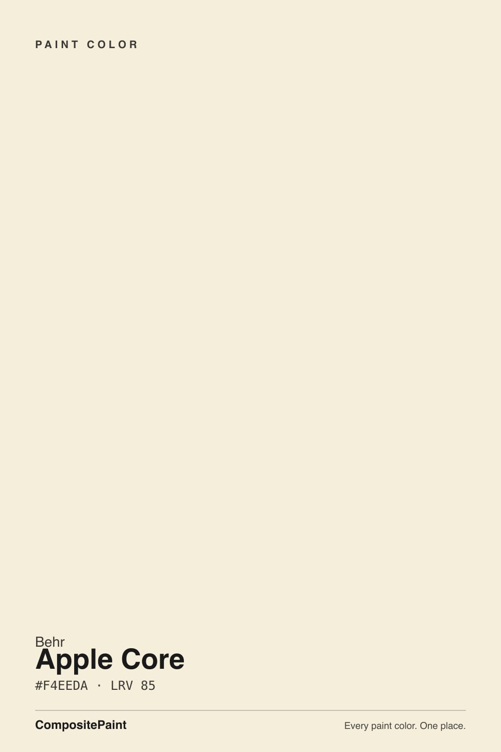
- 3Apple Core85
- 4Chantilly Lace91
- 5Ultra Pure White97
The Fast Verdict
Apple Core is the cream you pick when a cooler white goes gray and you want the room to feel soft, not painted. At LRV 85 it is bright enough to bounce light, yellow enough that nobody will call it white. Behr files it in the yellow family and Home Depot sells the SKU as a cabinet-and-trim enamel — that is the honest job. Use it on kitchens, doors, and millwork with warm wood. Do not buy it hoping for White Dove calm.
Kitchen cabinets and walls with warm wood and brass · trim and doors when a cooler white looks gray · north and east rooms that need a little sun · anyone who actually wants cream, not white
The room faces west and takes hard afternoon sun · trim stays Polar Bear or Ultra Pure White · counters or floors are cool grey · you wanted a true white
- Real cream — warm enough that a cooler white looks gray next to it
- Cabinet and trim enamel is the SKU Home Depot already mixes
- At LRV 85 it hides scuffs better than Polar Bear or Ultra Pure White
- Flatters oak, walnut, brass, and butcher block
- The one-color kitchen (walls + boxes, sheen change only) actually works
- Not a white — buyers who wanted white see yellow by the second wall
- Reads dirty next to Polar Bear, Ultra Pure White, or Chantilly Lace
- West afternoon sun turns it butter
- Cool grey stone and grey LVP pull a green-gold cast
What Color Is Apple Core, Really?
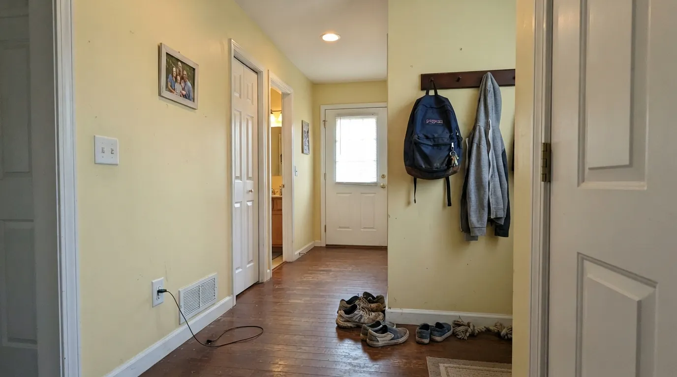
A light cream built on yellow, not on gray. Most Home Depot off-whites either dump the warmth (Ultra Pure White, Polar Bear) or gray it out (Smoky White). Apple Core does neither. It sits in Behr's yellow family as a low-chroma cream — pale gold, closer to the inside of a cut apple than to butter or banana. The official page calls it an off-white that brightens a room; that is half true. It brightens by staying warm, not by staying white. The moment you park it next to Polar Bear, the yellow is the whole story.
At LRV 85 it shares a number with White Dove, and that is the comparison shoppers actually make. The number is where the similarity ends. Dove carries a drop of gray that keeps the cream from reading yellow; Apple Core leaves the yellow in. On a wall that gap is useful — the room feels finished and a little sunlit even on a gray morning. On trim next to a cooler white it is a problem: the woodwork looks stained. There is almost no headroom above it for a brighter neighbor. The one-color rule is not a style preference here. It is how you keep the yellow from looking like a mistake.
Undertone in one line: warm yellow with a green-gold whisper — never pink, never gray. In east light and under 2700K lamps it reads as quiet cream. In cool north light or against grey stone the green-gold can flash, the way apple flesh does next to a white plate. If your sample looks dingy, look at the trim next to it before you blame the gallon.
Where It Shines
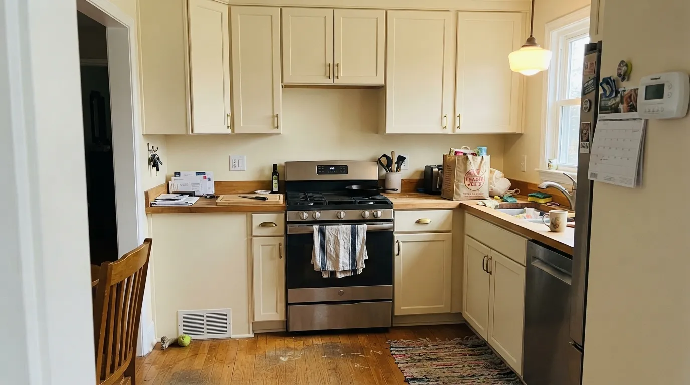
Give it warm wood, brass, and no brighter white nearby, and it does the job cooler whites fail at: it keeps a kitchen or a north room from going gray without tipping into decorator-yellow. Cabinets are its best surface. Home Depot mixes this SKU as a satin enamel for doors, trim, and boxes, and at LRV 85 the cream hides knuckle marks a Polar Bear door would broadcast. The one-color kitchen — Apple Core on walls and cabinets, only the sheen changing — is the version that works, because the yellow has nothing cleaner to lose to.
Where It Fails
Almost every unhappy Apple Core story is a cream story in a yellow-family can. The yellow is real, it is the point of the color, and three situations make it loud. None of them are a bad mix — but if your room matches one, this is not your cream, and another coat will not hide it.
The most common pairing mistake in a Home Depot house: Apple Core walls or cabinets, Polar Bear (W-F-200, LRV 94) or Ultra Pure White (W-B-500, LRV 97) on the trim. The brighter white wins, and Apple Core looks like unwashed yellow. Chantilly Lace trim does the same trick from the other aisle. Run Apple Core on walls, trim, and ceiling and let eggshell / semi-gloss / flat separate the planes, or drop it and paint the whole room the cleaner white.
The yellow has nowhere to hide once the afternoon flood hits. Owners of every yellow-leaning cream describe the same 4-to-6 o'clock shift: quiet cream at noon, distinctly butter by dinner. Apple Core starts yellower than White Dove, so the shift is louder. If the room you live in faces west, sample at 5pm or pick a grayed white — White Dove (PM-19, LRV 85) holds the same light without going fruit.
Cool stone and grey plank sit at the opposite temperature and shove the green-gold into the open. Cabinets that looked softly cream on the chip read nicotine-yellow next to grey-veined quartz; walls above grey LVP pick up a faint apple-flesh cast that some people call green. With cool floors and counters, use a cleaner white — Ultra Pure White on cabinets, or Chantilly Lace if you want the gallery version — and keep Apple Core for a warmer room.
Room by Room
This is the job the can is mixed for. Satin Apple Core on shaker boxes with brass and butcher block is the cheap good look — cream, not stark, hiding the scuffs around handles. Warm quartz, soapstone, terracotta: all fine. Grey quartz and a wall of stainless: the yellow shows, and you will wish you had sampled a door against the slab. Same color on the walls in eggshell so the cabinets do not grow a dingy halo.
Semi-gloss Apple Core on casings and six-panel doors is the move when Polar Bear makes the house look cold. It reads as painted woodwork rather than plastic-bright, and it is kind to oak and walnut. The rule is the same as for any cream: do not park a cooler white next to it. One color, two sheens. If the walls are a warm greige, Apple Core trim is a quieter cream edge than a true white.
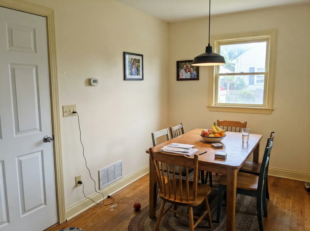
East and south dining rooms take it beautifully: cream walls, wood table, brass or black fixture, leftover homework still on the runner. Eggshell; same color on trim in semi-gloss. A west dining room with a picture window is the skip — dinner light will yellow the walls right when guests sit down.
North and east living rooms are why this color exists: a cooler white would go gray, and Apple Core keeps the plane soft and a little sunlit. South is lovely until mid-afternoon, when it creams up a step. A west living room is the skip. Eggshell walls; same color on trim so the room does not grow a yellow halo around the casings.
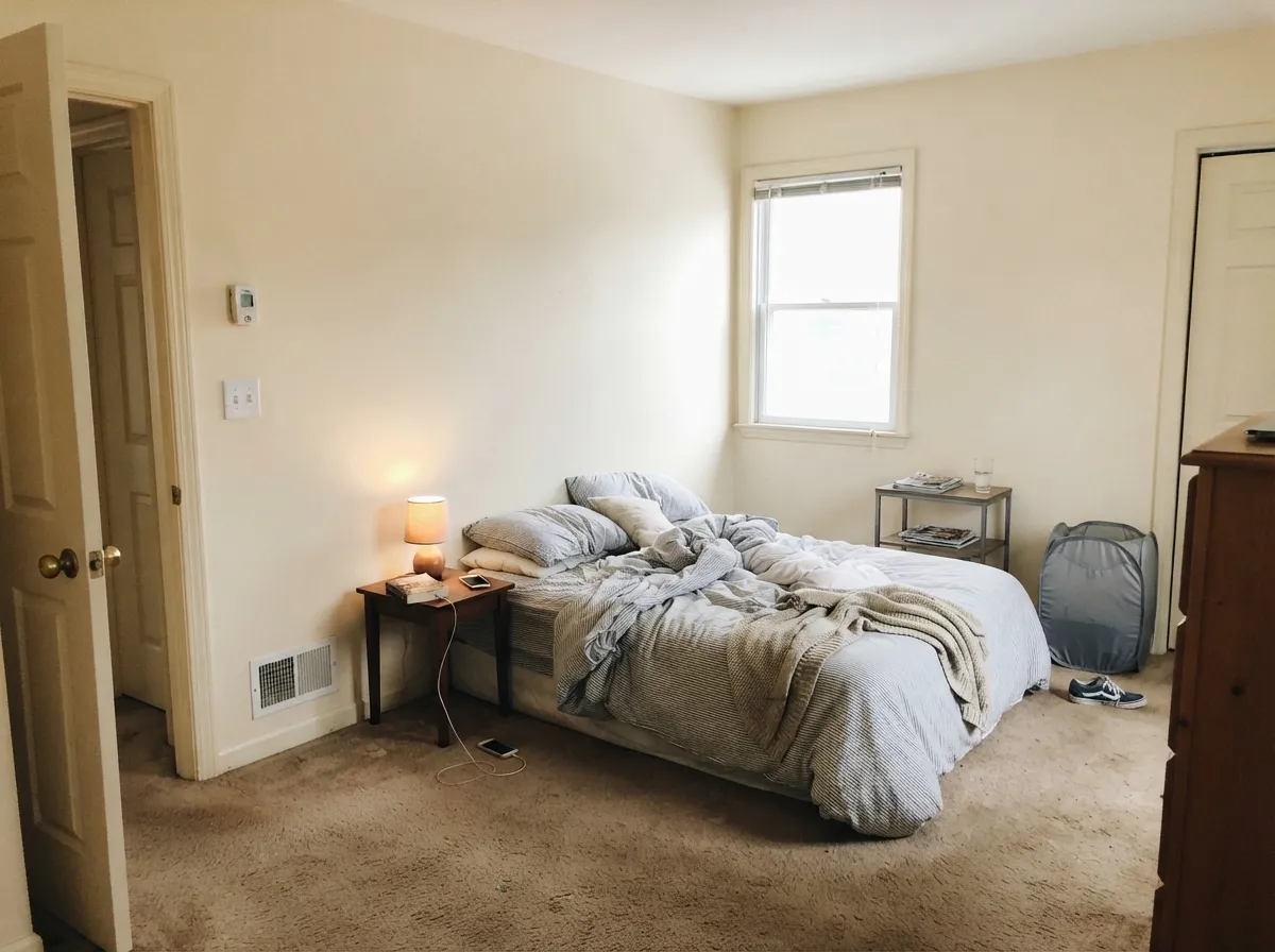
North and east bedrooms stay restful and slightly warm. Under 2700K lamps it turns creamier at night, which is the point of buying cream. Cool LEDs flash the green-gold and the walls look faintly sickly — swap the bulbs, not the paint. If the bedroom faces west, this is not the gallon.
With warm stone, a wood vanity and brass: a pretty cream bath, including satin on the vanity doors. With cool grey marble or blue-grey tile: it argues, and the green-gold comes forward. Use a cleaner white on the walls and keep Apple Core off the wet room. Satin or eggshell; a fan that actually runs.
Your Light Is the Risk
This is the light the yellow was mixed for. Cooler whites go gray here; Apple Core stays a soft cream and the room feels finished. Whole-room walls are safest on these exposures.
From about four o'clock the yellow has nowhere to hide. Walls go butter, then fruit. Sample at 5pm before you commit a west room.
Quiet cream at midday, distinctly more yellow as the sun slides west. Most people who bought cream like the shift; if yellow is your dealbreaker, this is not your white.
2700K lamps: creamier, cozier, the version you wanted. Cool white LEDs: the green-gold flashes and the walls look faintly sickly — swap the bulbs, not the paint.
Most complaints about Apple Core are a light mismatch. Upload a photo of your actual room and see it on your walls — then ask for the same wall in north light or evening lamps before you buy a single sample.
Need It From Another Brand?
Any paint counter can custom-tint Behr PPU7-14 directly. If you would rather stay in one brand's own deck, these are the closest stock matches, measured as ΔE2000. Under 2 is a difference you will not see on the wall.
| Brand | Closest color | ΔE | LRV | |
|---|---|---|---|---|
| Sherwin-Williams | Venetian LaceSW 7119 · Sherwin-Williams | 2.1 | 86 | Color page → |
| Benjamin Moore | White Rock918 · Benjamin Moore | 0.7 | 86 | Color page → |
| Valspar | Dairy BelleV164 · Valspar | 2.1 | 85.1 | Color page → |
| PPG / Glidden | Satin WeavePPG1209-1 · PPG / Glidden | 0.4 | 85 | Color page → |
| Glidden | Spice IvoryPPG1204-1 · Glidden | 0.8 | 86 | Color page → |
| Dutch Boy | Split Banana118-1DB · Dutch Boy | 1.2 | 86 | Color page → |
Similar Behr Colors
The nearest shades to Apple Core within Behr's own range, ranked by perceptual color distance — useful when you want the same look a touch lighter, darker, or warmer.
WCAG 2.1: AA is 4.5 : 1 for normal text, 3 : 1 for large text, AAA is 7 : 1.
Apple Core vs the Colors You're Also Considering
Every Apple Core sample board has the same rivals on it. The numbers show the real lightness gap — then it comes down to which risk you would rather live with.
Pick this when you actually want the yellow Dove mutes, mixed at Home Depot.
Benjamin Moore PM-19 · LRV 85White DovePick this if you want the same LRV with the yellow grayed out — the safest warm white in the BM deck, and the one that will not go fruit in west sun.
Pick this for a tighter fruit-flesh yellow instead of milky coffee cream.
Behr W-B-700 · LRV 87Swiss CoffeePick this when you want the warmest of the safe off-whites — creamier, milkier, and it shows, especially at night.
Pick this when you want more cream on the boxes and you are already at Home Depot.
Sherwin-Williams SW 7008 · LRV 82AlabasterPick this if your painter works in Sherwin-Williams and the job is cabinets — a superb cabinet white, a touch deeper, with less yellow on the door.
Pick this when cream is the goal, not a white that accidentally creams up. Apple Core is honest about the yellow from the first chip.
Benjamin Moore OC-117 · LRV 90Simply WhitePick this for a brighter kitchen white that still leans warm — brilliant, until west sun hits the yellow.
The Behr neighbors are extremely close. Cottage White 13 at #F5EEDA and LRV 86 is a fraction brighter and nearly indistinguishable. Moonstruck ECC-64-2 at #F3EDDA and LRV 85 is a shade deeper. Water Chestnut BXC-14 at #F7EED9 and LRV 86 is brighter and marginally more yellow, while Cottage White 1813 at #F4ECD9 and LRV 84 is the slightly softer, lower-reflectance option. At this lightness, sampling side by side is the only reliable way to choose.
Across brands, Glidden Spice Ivory PPG1204-1 at LRV 86 has a deltaE of 0.76 and C2 Spell Check C2-594 at LRV 84 is 0.58, so both sit in the same place. Sherwin-Williams Venetian Lace SW 7119 at LRV 86 comes in at 2.08 and Farrow and Ball Tallow No. 203 at LRV 84 at 2.27, both very close but worth sampling first. Dunn-Edwards Glisten Green DE5491 is a deltaE of 1.36 but carries an LRV of 79, so it will read noticeably less bright on a wall even though the hue is similar.
Apple Core Coordinating Colors
The rule for coordinating with Apple Core is simple: stay on the warm side of the fence, and do not put a brighter white next to it. It flatters warm greiges, warm woods, deep navies, and muted sages — and it argues with icy whites, cool greys, and blue-grey stone. These are the partners that keep showing up in rooms that work:
The Cabinet Can: Why Home Depot Mixes This SKU as Enamel
Apple Core is not a Color of the Year and it has no TV-show credit. What it does have is a very specific Home Depot product slot: PPU7-14 is stocked as a satin and semi-gloss enamel for cabinets, doors, and trim, not just as a wall chip in the yellow family. That is the tell. Behr is not selling this as a gallery white. It is selling a cream that can take a knuckle, a splash, and a wet rag.
Treat that as the brief. On boxes and millwork the yellow reads as painted wood, the way cream enamel always has. On four walls of a west living room the same yellow reads as a decision you have to defend. If you came to the chip wall looking for White Dove and walked out with Apple Core because the names felt adjacent, put the can back and walk toward Smoky White or Swiss Coffee. If you came looking for cream cabinets, you are already in the right aisle.
Apple Core With Wood Tones and Floors
Warm wood loves it, and that is the pairing that makes the yellow look intentional. Oak — red, white, honey — walnut, butcher block, and cedar all sit comfortably against Apple Core because the cream meets their warmth halfway. Honey oak, the floor that fights half the deck, is one of the few cases where a yellow cream actually helps: it softens the orange instead of amplifying it the way a cool white would.
The one flooring that needs a sample first is cool grey LVP or grey-washed wood. Grey plank pulls the green-gold into relief, and the wall can read faintly apple-sick next to it. It is not always a dealbreaker — a large warm rug and brass lamps fix it in most rooms — but test a big sample above the actual floor before painting the whole kitchen. Metals are easy: unlacquered brass, antique bronze, and matte black all work; polished chrome is the one that leans cold against it.
Three Ready Palettes Built on Apple Core
A color is never alone on the wall. These are complete combinations in the 60-30-10 pattern, with the reason each one holds together. Every one opens in the visualizer.
Accessible Beige is the safest warm wall next to a yellow cream — the beige stays quiet so the cabinets can carry the fruit-flesh. Hale Navy on the island grounds the room and loves brass. Keep the counters warm; cool quartz will push the doors yellow.
Try this palette in your roomOne cream at two sheens is the only pairing that does not make Apple Core look dirty. Iron Ore on the door is the single dark note — LRV 6, so treat it as a black and give it daylight. A brighter trim white would undo the whole scheme.
Try this palette in your roomThe green-gold in Apple Core is why sage works here: Evergreen Fog is the cabinet sage that sits next to cream without going mint. Kendall Charcoal is the quiet dark — best-behaved in the BM deck — so the dining room reads finished, not themed.
Try this palette in your roomApple Core FAQ
Is Apple Core white or yellow?
Yellow — quietly, but unmistakably. Behr files it in the yellow family, and on four walls nobody will call it white. In north light it can pass as a soft cream; in west sun and under 2700K lamps the yellow is the whole story. If white is what you actually want, this is the wrong can.
Is it good for kitchen cabinets?
That is its best job. Home Depot already mixes PPU7-14 as a satin cabinet-and-trim enamel. It flatters brass and wood, hides scuffs better than Polar Bear, and does not fight warm quartz or butcher block. Only cool grey stone argues with it. Use a satin urethane-fortified cabinet paint.
What trim color goes with Apple Core walls?
Apple Core itself, in semi-gloss. Polar Bear and Ultra Pure White are the usual suggestions and the usual mistake: both are so much brighter that the walls look yellow. If you insist on contrast, go darker (a greige or charcoal), never brighter.
Will it look green?
Sometimes, in the wrong light. The yellow sits on the green-gold side of the family — apple flesh, not banana. Cool north light, cool LEDs, and grey stone can flash that whisper. Warm wood and 2700K bulbs cancel it. If green is your dealbreaker, sample on the actual wall at 10am and at 6pm before you buy the gallons.
Is it a match for White Dove?
Same LRV, different paint. White Dove (PM-19, LRV 85) is the grayed warm white; Apple Core leaves the yellow in. Side by side, Dove looks quieter and more finished, Apple Core looks creamier and more sunlit. Polar Bear is the color people search as a budget Dove, and it is not either of these.
Does it work on exteriors?
Not as a confident whole-house body. Full sun will read it brighter and more yellow than indoors, and the shaded north elevation can pull the green-gold from the street. If you try it, keep it on trim or a small outbuilding, pair it with charcoal or black, and walk around the house with a board first.
Have you painted with Apple Core?
Rate it — one tap helps the next reader decide.
Ask a Question