Hirshfield's Red All 61, sorted honestly.
Every red in the Historic Collection deck: 61 colors, LRV 32 down to 7, grouped by undertone and depth.
All 61 Hirshfield's Red Paint Colors
Every red in the Historic Collection deck, LRV 32 down to 7. Grouped by undertone, warm to cool. Filter by depth or change the order.
Hex values are display approximations from Hirshfield's's published swatch tools, not a physical sample under controlled lighting. Order a brand-direct sample before specifying.
Upload a photo of the room. We paint it in the red you chose with your light and your floor, and you can swap colors until one holds.
Hirshfield's Red, Room by Room
Each room page shows red picks from every US brand side by side, so you can compare in context.
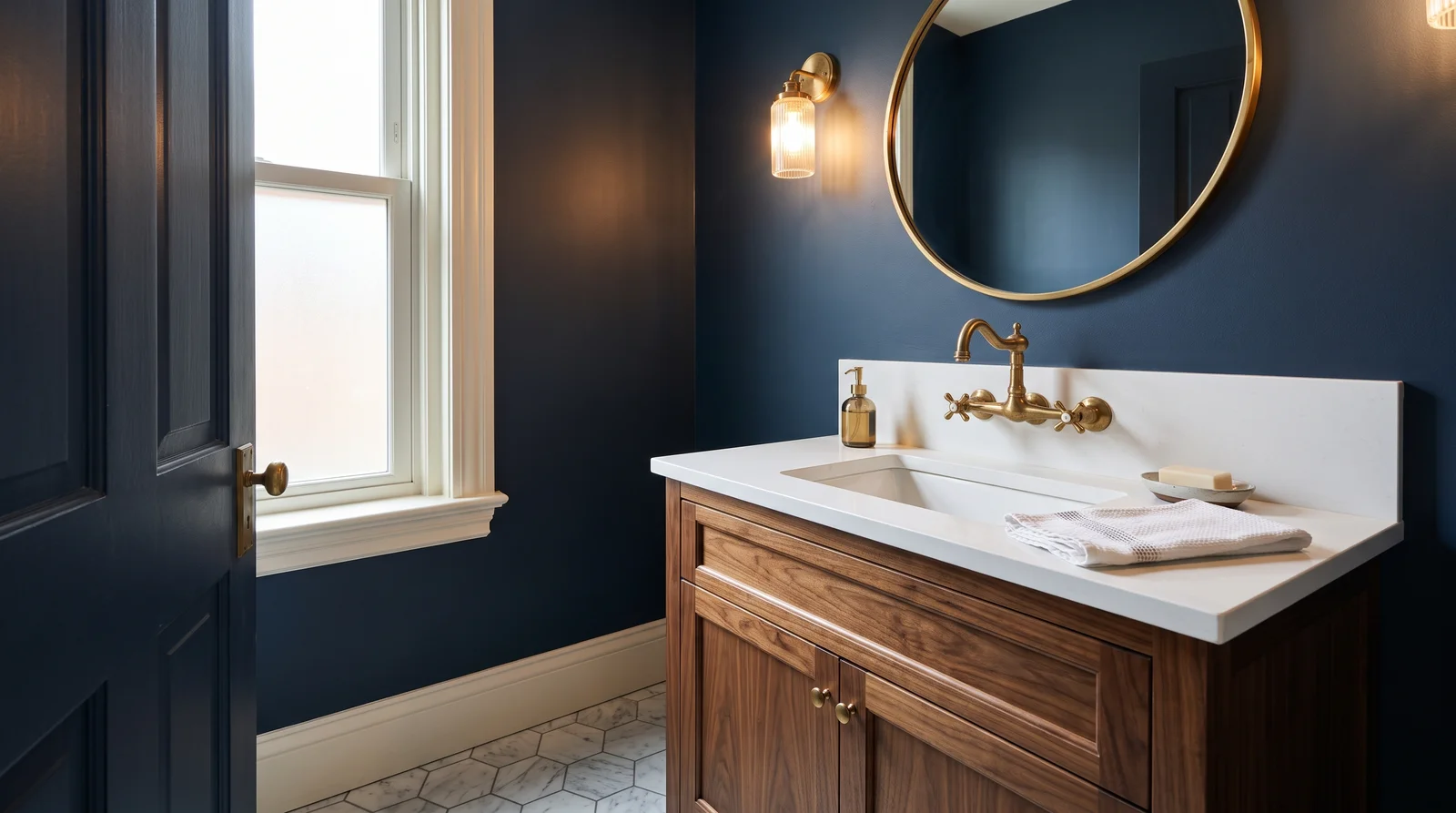
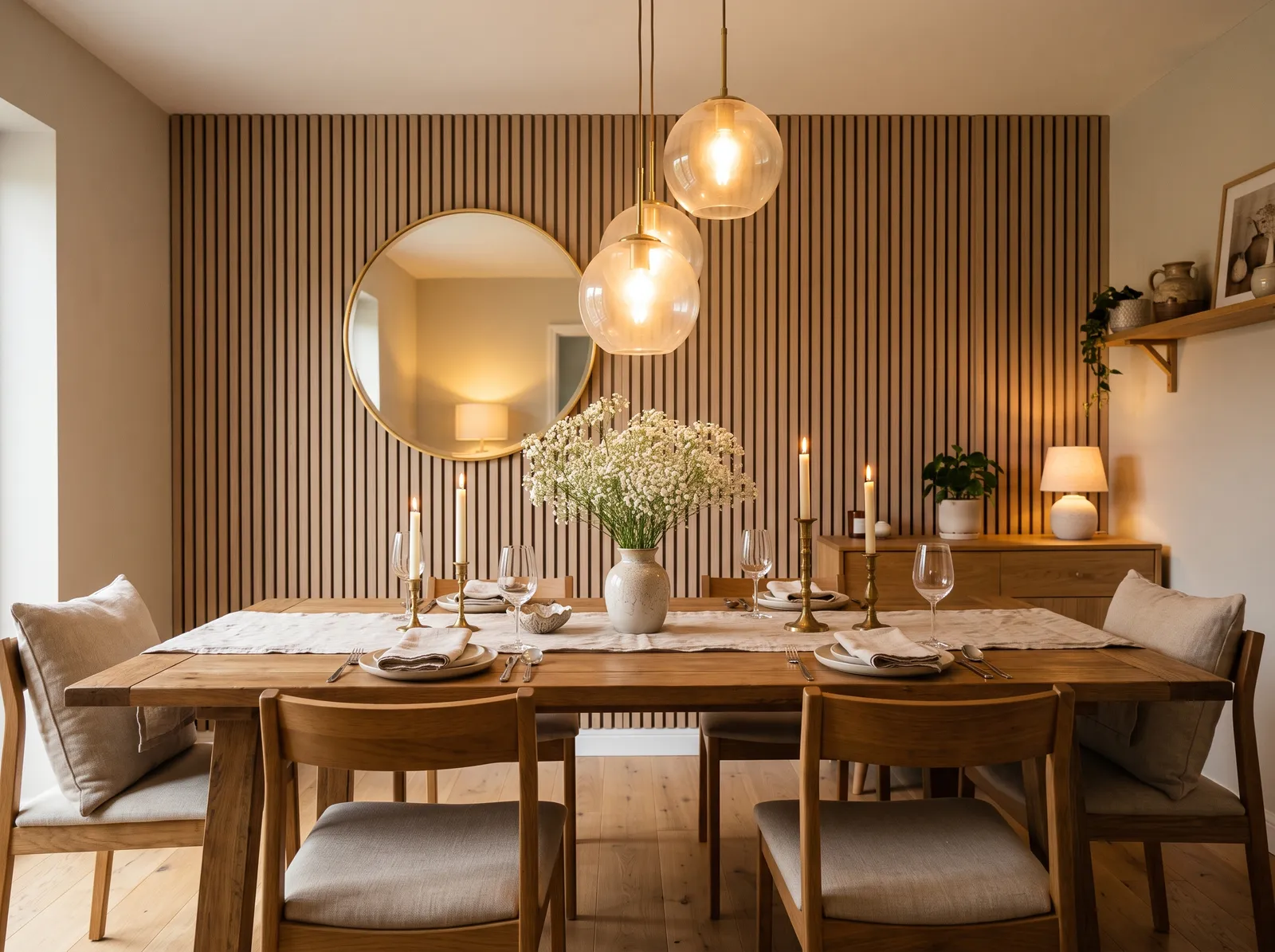
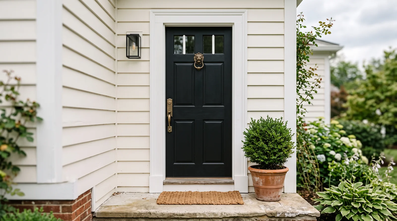
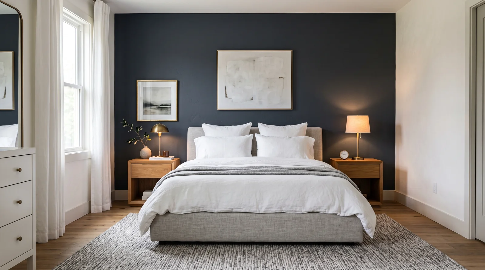
How Deep Each Red Deck Goes
How many red colors each brand carries, drawn with that deck's own reds from light to dark. Pick your store first, then the color. Every brand equal, no favorites.
More on Hirshfield's red paint colors
What Hirshfield's Reds Actually Look Like
Red is where the Historic angle shows most clearly, because Hirshfield's reds are deep, muted, and barn-and-brick rather than fire-engine bright. The heritage names are the heart of it: Shaker Red and Codman Claret are dusty, brick-toned deep reds with real history behind the look, Richardson Brick reads like aged masonry, and Madder draws on the old natural dye. Stagecoach and Roseland keep that earthy, faded-red character. For a clearer, more saturated red you can step up to something like Party Time, but most of this family stays restrained and low in LRV, the kind of color that grounds a dining room or a front door on a colonial or farmhouse. These are warm, period-correct reds made by a 130-year-old Minnesota company, drawn from tones that already proved themselves on old buildings.
How to Choose a Hirshfield's Red
Reds run dark in this deck, so the published LRV matters less for brightness and more for setting your expectations: most of these heritage reds sit in the low teens, which means they read rich and deep, not light. Use them where depth is the point, an accent wall, a dining room, cabinetry, or an exterior door, rather than as a whole-room wall color in a small space. Watch the undertone: Codman Claret and Shaker Red lean brick and brown, while a color like Moonrose pushes a touch pinker. Reds shift hard with light, glowing in warm evening lamplight and reading flatter under cool daylight, so brush out a generous sample and check it at night too. Two coats over a tinted primer keep deep reds even.
Hirshfield's Red Paint FAQ
Are Hirshfield's reds bright or muted?
Most are muted and deep, true to the heritage collection. Shaker Red and Codman Claret are dusty, brick-toned reds rather than bright primaries, though a clearer red like Party Time is there if you want more saturation.
What is a good red for a heritage front door?
A muted, brick-leaning red reads most period-correct on an older home. Shaker Red and Richardson Brick both have that aged, settled quality, which is exactly why they suit a colonial or farmhouse door better than a glossy bright red.
Why does a red look different at night?
Deep reds shift strongly with light, glowing warmer under evening lamplight and reading flatter in cool daylight. Brush a sample of a color like Codman Claret on the wall and check it both by day and at night before you commit the whole surface.
Ask a Question