Hirshfield's Purple All 126, sorted honestly.
Every purple in the Historic Collection deck: 126 colors, LRV 80 down to 5, grouped by undertone and depth.
All 126 Hirshfield's Purple Paint Colors
Every purple in the Historic Collection deck, LRV 80 down to 5. Grouped by undertone, warm to cool. Filter by depth or change the order.
Hex values are display approximations from Hirshfield's's published swatch tools, not a physical sample under controlled lighting. Order a brand-direct sample before specifying.
Upload a photo of the room. We paint it in the purple you chose with your light and your floor, and you can swap colors until one holds.
Light to Dark
The whole Hirshfield's purple range by depth. LRV is the number to trust: the same purple looks two steps darker on a wall than on a chip.
Hirshfield's Purple, Room by Room
Each room page shows purple picks from every US brand side by side, so you can compare in context.
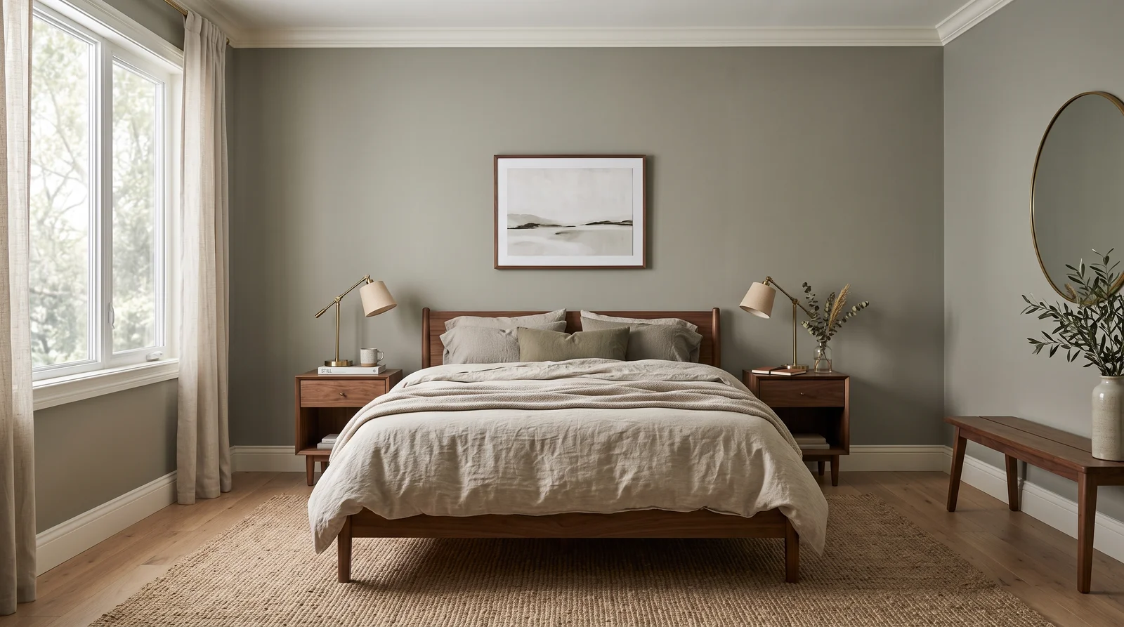
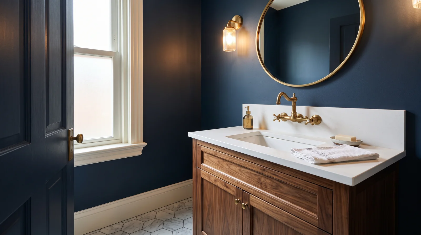
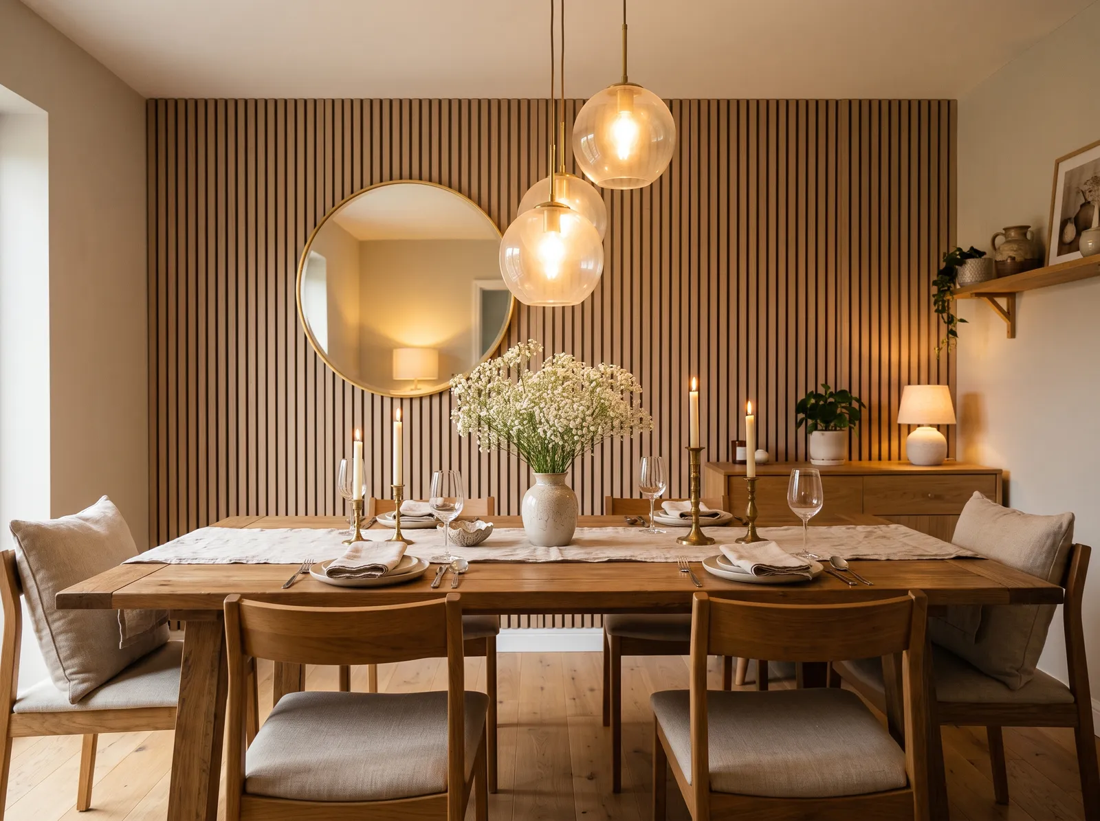
How Deep Each Purple Deck Goes
How many purple colors each brand carries, drawn with that deck's own purples from light to dark. Pick your store first, then the color. Every brand equal, no favorites.
More on Hirshfield's purple paint colors
What Hirshfield's Purples Actually Look Like
Hirshfield's purples lean soft, dusty, and grayed rather than bright violet, which fits the restrained heritage character of the collection. The deep heritage anchors like Concord Grape and Plum Island read as rich, near-aubergine purples with real depth, while mid tones such as Orchid Orchestra and Enthroned Above carry a quiet, mauve-leaning grace. Lighter members like Fragrant Snowbell and Vienna Dawn drift toward a pale, almost lavender-gray, the kind of barely-there purple that softens a bedroom. There are clearer, more playful picks such as Blossoms in Spring for those who want more color, but most of this Minnesota-made family stays muted and aged. These are the purples that read sophisticated rather than sweet, an elegant accent on a dining room, a powder room, or a study, with enough gray in them to feel collected and grown-up.
How to Choose a Hirshfield's Purple
Purple is a bold hue, so a smaller, more muted dose is usually the safe play. Use the published LRV to judge it: pale grayed picks near 60 and up like Fragrant Snowbell work as soft full-room walls and read almost neutral, while deep tones such as Concord Grape in the single digits belong on an accent wall, cabinetry, or a powder room where drama is welcome. Watch the undertone, since some Hirshfield's purples lean pink-mauve and others lean blue-gray, and that lean reads strongest in north light, which can cool a purple toward gray. A south room warms purple and brings out its richness. Brush a generous sample and live with it day and night, because purple shifts more than most colors between daylight and lamplight.
Hirshfield's Purple Paint FAQ
Are Hirshfield's purples bright or muted?
Most are muted and grayed, true to the heritage collection. Orchid Orchestra and Fragrant Snowbell read as soft, dusty purples rather than bright violets, though clearer picks like Blossoms in Spring are available if you want more color.
Which purple is subtle enough for whole walls?
A pale, higher-LRV grayed purple reads almost neutral on full walls. Fragrant Snowbell and Vienna Dawn stay soft and easy, where a deep tone like Concord Grape is better suited to an accent or a powder room.
Does purple change a lot under different lighting?
Yes, purple shifts more than most colors, cooling toward gray in north light and warming under lamplight. Brush a sample of your pick and view it both by day and at night before committing, since the undertone can swing noticeably.
Ask a Question