Portola Paints Red All 1, sorted honestly.
Every red in the Portola Paints deck: 1 colors, LRV 6 down to 6, grouped by undertone and depth.
All 1 Portola Paints Red Paint Colors
Every red in the Portola Paints deck, LRV 6 down to 6. Grouped by undertone, warm to cool. Filter by depth or change the order.
Hex values are display approximations from Portola Paints's published swatch tools, not a physical sample under controlled lighting. Order a brand-direct sample before specifying.
Upload a photo of the room. We paint it in the red you chose with your light and your floor, and you can swap colors until one holds.
Poe ships direct from portolapaints.com in New Standard acrylic or Roman Clay, and a sample is worth ordering before you commit a room to it — a color this dark and specific can shift noticeably between different bulbs and light angles. Since it's Portola's only red, there's no alternate shade to fall back on within the brand if it isn't quite right.
Like any Portola color, Poe can be color-matched at a paint counter and mixed into another brand's paint if you want the hue in a different sheen or a more affordable line. The match will capture the color but not the burnished depth a Roman Clay finish adds to it.
Portola Paints Red, Room by Room
Each room page shows red picks from every US brand side by side, so you can compare in context.
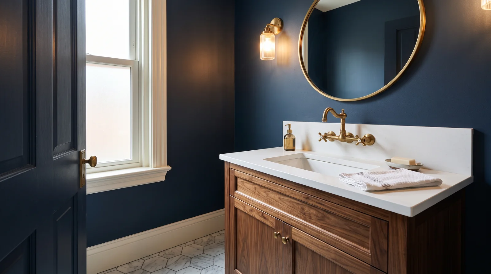
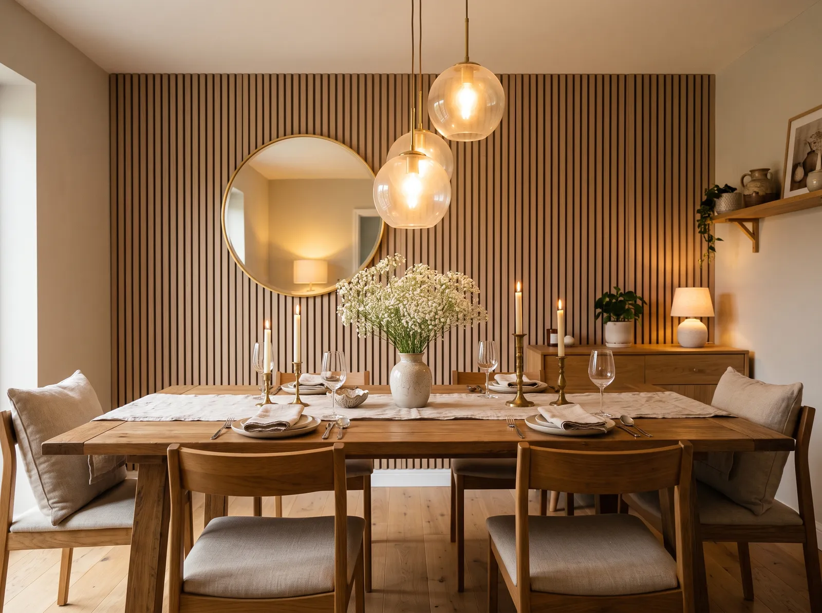
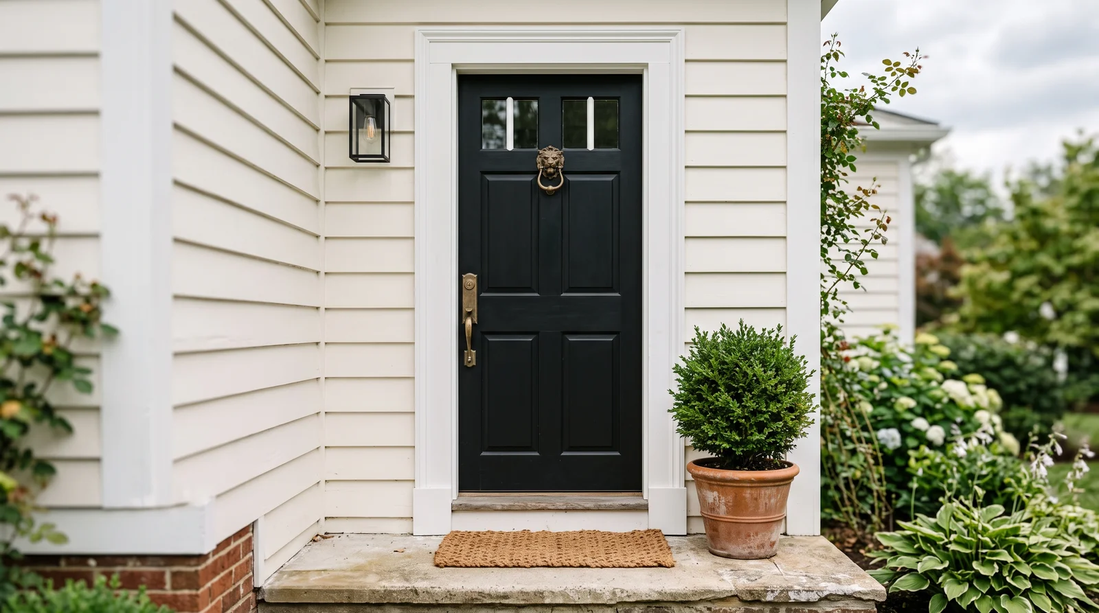
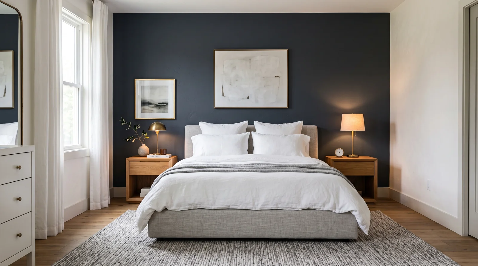
At LRV 6, Poe absorbs most of the light that hits it, so it reads best as a contained, deliberate surface — a powder room, a library, a bar nook, or a single accent wall — rather than a color for an entire large room. It pairs naturally with warm woods, brass, and Portola's own deep browns and blacks.
Because it sits so close to black in terms of reflected light, Poe works well as a moody alternative to a true black or navy when you want a hint of warmth without a true red statement. It's a sophisticated, library-and-study kind of color rather than a bold, playful one.
How Deep Each Red Deck Goes
How many red colors each brand carries, drawn with that deck's own reds from light to dark. Pick your store first, then the color. Every brand equal, no favorites.
More on Portola Paints red paint colors
Portola's One Red: Poe
Red is the smallest family in Portola's deck alongside yellow, with a single color: Poe, at LRV 6. It's a deep, brownish wine-red, dark enough that it borders on black in low light — closer to aged leather or dried wine than a bright, true red. It's not a color you'd reach for if you wanted a classic barn-red or a saturated crimson.
That single, dark, muted entry is consistent with how Portola treats color generally. The brand doesn't stock loud primaries; even its one red leans earthy and subdued, built to sit alongside the deep browns, blacks, and purples elsewhere in the deck rather than stand apart as a bright accent.
Poe in Roman Clay and Flat Acrylic
In New Standard flat acrylic, Poe goes on as one deep, even wine-red-brown — a straightforward, dramatic wall color. Ordered as Roman Clay, the troweled layers add depth and shadow to an already dark color, so the wall reads closer to aged, burnished leather than a flat painted surface, which suits Poe's moody character well.
Lime Wash is less common at this depth; its chalky, mottled look tends to read more clearly on paler and mid-tone colors than on something this dark and saturated, so most people choose flat acrylic or Roman Clay for Poe.
Portola Paints Red Paint FAQ
How many red paint colors does Portola offer?
Just one: Poe, at LRV 6. It's a deep, brownish wine-red rather than a bright, true red, and it's the only entry in Portola's red family — the brand's palette leans earthy and muted rather than toward bold primary colors.
Is Poe a bright red or a dark, muted one?
Dark and muted. At LRV 6, Poe reads more like aged wine or leather than a bold, saturated red. It absorbs most of the light that hits it, so it works best as a deliberate, contained accent rather than a color you'd wash across a whole bright room.
What rooms suit Poe best?
Poe's depth suits a powder room, library, bar nook, or single accent wall, where its moody warmth can register without overwhelming the space. It pairs naturally with warm woods, brass hardware, and Portola's own deep browns and blacks for a cohesive, sophisticated look.
Does Poe work as Roman Clay?
Yes, and it suits the finish well — the troweled layers add shadow and burnished depth to an already dark color, so a Roman Clay wall in Poe reads closer to aged leather than a flat painted surface. Lime Wash is less common at this depth, since its chalky look shows up more clearly on lighter colors.
Can I match Poe into another brand's paint?
Yes. Any paint store can color-match Poe from a chip or photo and mix it into another brand's flat paint, which is useful if you want the color in a different sheen or a more affordable line. The match reproduces the hue, not the burnished depth a Roman Clay finish adds to the same color.
Ask a Question