Portola Paints Yellow All 1, sorted honestly.
Every yellow in the Portola Paints deck: 1 colors, LRV 77 down to 77, grouped by undertone and depth.
All 1 Portola Paints Yellow Paint Colors
Every yellow in the Portola Paints deck, LRV 77 down to 77. Grouped by undertone, warm to cool. Filter by depth or change the order.
Hex values are display approximations from Portola Paints's published swatch tools, not a physical sample under controlled lighting. Order a brand-direct sample before specifying.
Upload a photo of the room. We paint it in the yellow you chose with your light and your floor, and you can swap colors until one holds.
Patisserie ships the same way as the rest of Portola's deck, direct from portolapaints.com, with a sample jar or drawdown board worth ordering before you commit a whole room. Because it's such a soft, close-to-neutral color, lighting matters a lot — it can look nearly white under some bulbs and clearly yellow under others, so test it in the actual room at different times of day.
If you want this exact color in a different sheen, a trim enamel, or a cheaper line, any paint store can color-match it from a chip or photo and mix it into another brand's paint.
Portola Paints Yellow, Room by Room
Each room page shows yellow picks from every US brand side by side, so you can compare in context.
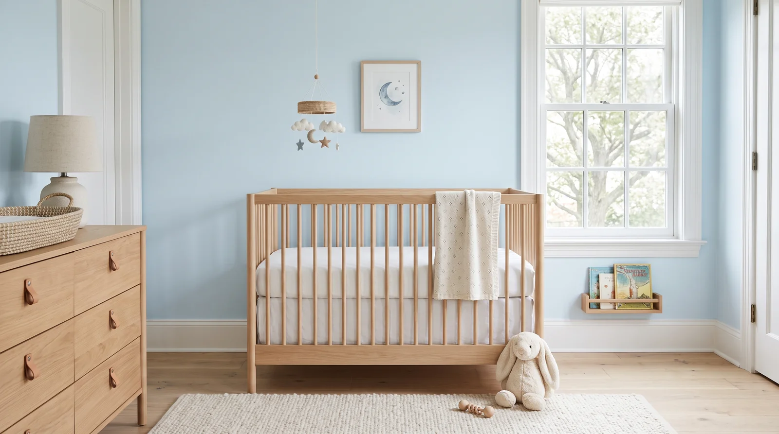
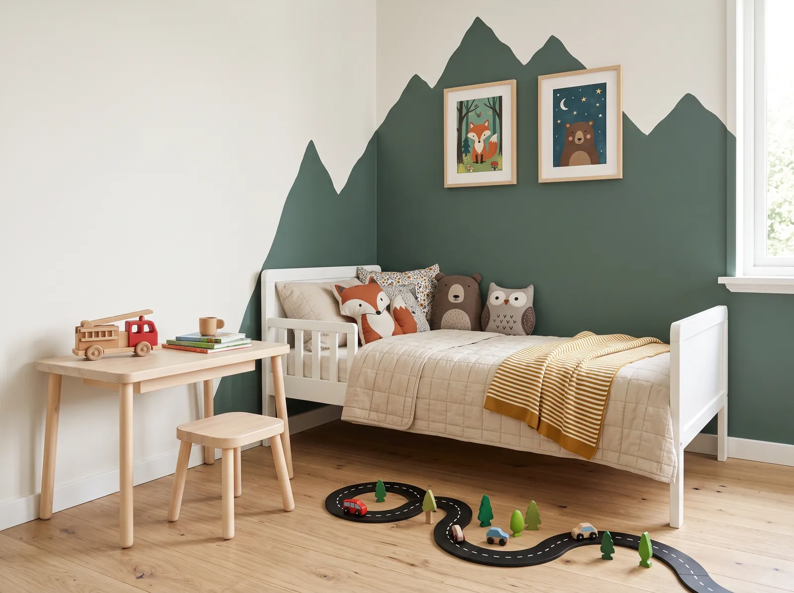
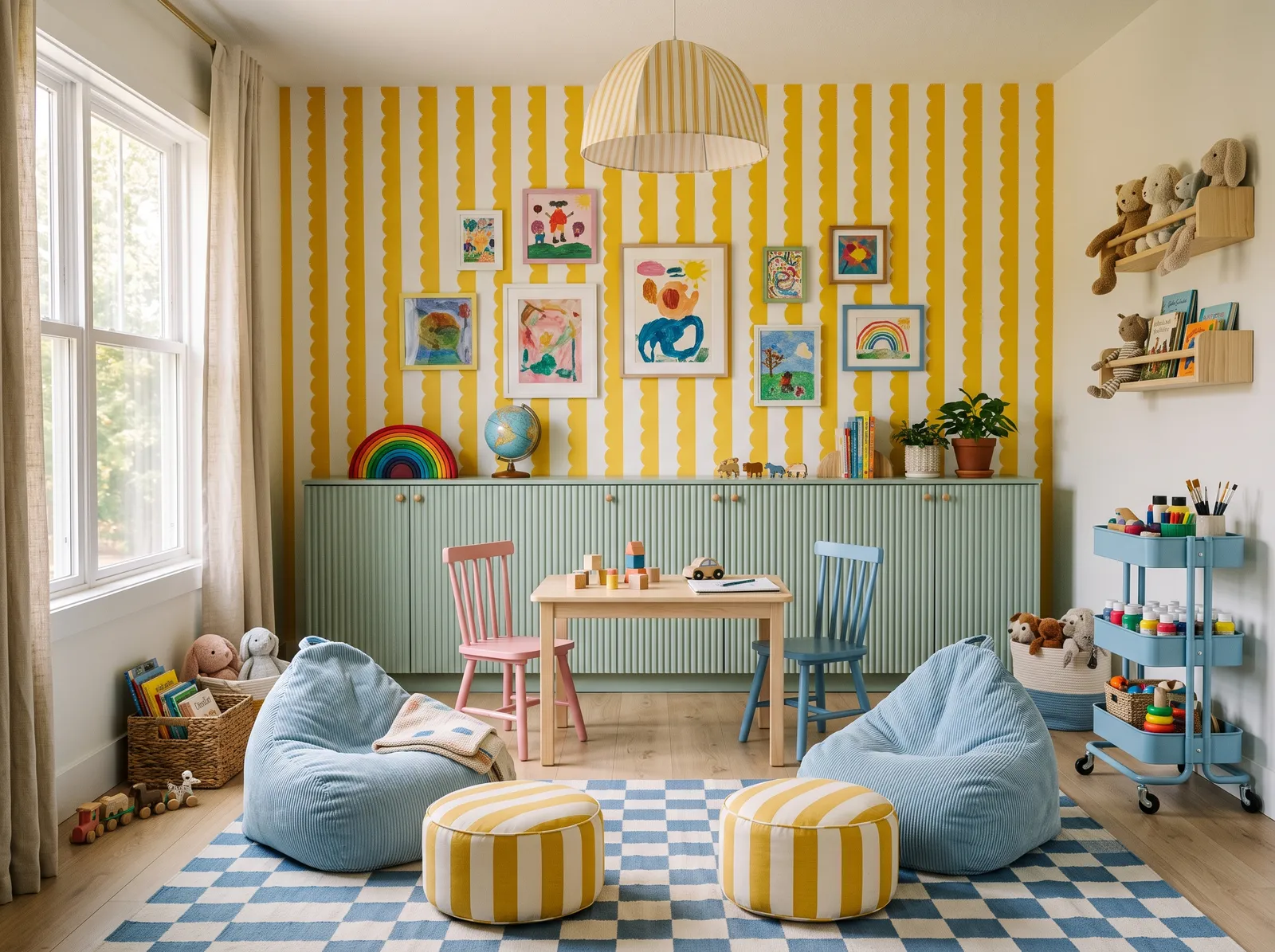
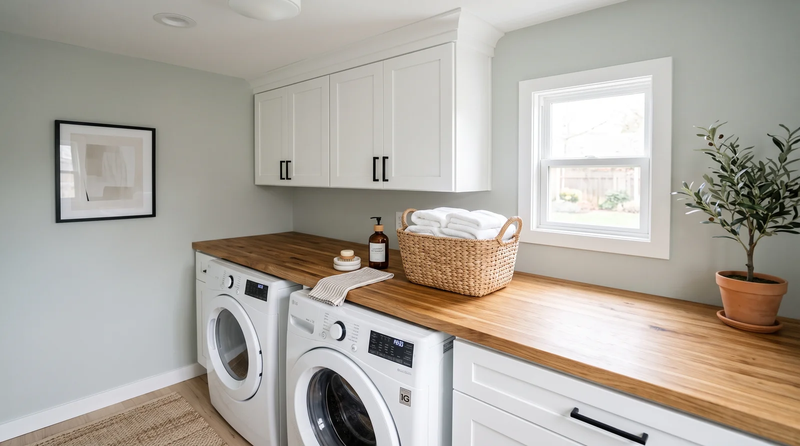
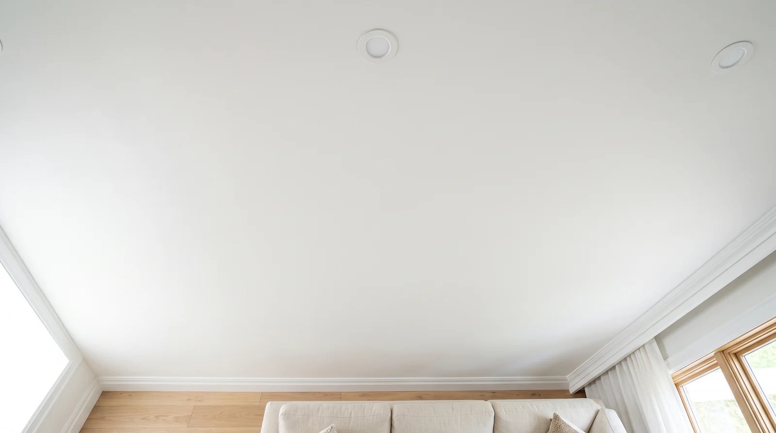
At LRV 77, Patisserie behaves more like a warm off-white than a color statement. It works well as a whole-wall color in a kitchen, breakfast nook, or sunroom where you want warmth without committing to a bold yellow, and it plays nicely against white trim or a deeper neutral from elsewhere in Portola's deck.
Because it's so light, Patisserie doesn't carry the same risk that a saturated yellow does — it won't dominate a small room or clash hard with wood tones. It's a gentle, easy color, which fits a brand whose real specialty lies in texture and earth tones rather than bright, primary-feeling hues.
How Deep Each Yellow Deck Goes
How many yellow colors each brand carries, drawn with that deck's own yellows from light to dark. Pick your store first, then the color. Every brand equal, no favorites.
More on Portola Paints yellow paint colors
Portola's One Yellow: Patisserie
Portola keeps exactly one color in its yellow family: Patisserie, at LRV 77. It's a pale, creamy, butter-yellow — soft and warm rather than bold or saturated, closer to a tinted cream than a punchy accent color. At LRV 77 it's genuinely light, so it reads more like a warm neutral with a yellow cast than a statement color you'd notice from across the yard.
That single color tells you something honest about Portola's palette as a whole: the brand's strength is its earthy neutrals, grays, and browns, not bright, saturated hues. If you're specifically hunting for a range of yellows to compare against each other, this isn't the deck for it — Patisserie is a lone, soft option rather than a family to browse.
Patisserie in Roman Clay, Lime Wash, and Flat Acrylic
In New Standard flat acrylic, Patisserie goes on as one even, pale wash of color — straightforward and predictable. Ordered as Lime Wash, the same color takes on a chalkier, more mottled character, which suits its soft, creamy tone well; a lime-washed Patisserie wall reads closer to aged plaster than a painted kitchen wall.
Roman Clay is a less typical choice for a color this pale and warm — the technique's stone-like movement tends to show up more dramatically on deeper, more saturated colors — but it's still available if you want a subtly textured, low-key wall rather than a flat one.
Portola Paints Yellow Paint FAQ
How many yellow paint colors does Portola offer?
Just one: Patisserie, at LRV 77. Portola's deck leans heavily toward earthy neutrals, grays, and browns rather than bright colors, so yellow is one of the smallest families in the brand — a single soft, creamy option rather than a range to choose between.
Is Patisserie a bold yellow or a soft one?
Soft. At LRV 77, Patisserie is a pale, buttery, warm-cream yellow rather than a bold or saturated color. It reads closer to a warm off-white with a yellow cast than a statement hue, which makes it easy to use across a whole wall without it taking over a room.
What rooms does Patisserie work well in?
Its light, warm character suits kitchens, breakfast nooks, and sunrooms where a gentle pop of warmth is welcome without going bold. Because it's so pale, it also works as a soft, easy wall color in living rooms or bedrooms for anyone who wants warmth without committing to a saturated color.
Can Patisserie be ordered as Lime Wash or Roman Clay?
Yes, the same color name generally spans Portola's lines. Lime Wash suits Patisserie especially well, since its chalky, mottled finish plays nicely with a soft, creamy base color. Roman Clay is available too, though the technique's stone-like movement tends to show up more on deeper, more saturated colors.
Can I match Patisserie into another paint brand?
Yes. Any paint store can color-match Patisserie from a chip or photo and mix it into another brand's flat paint or a more durable trim enamel. That reproduces the color at a different price point; it won't reproduce the chalky texture of a Lime Wash finish in the same color.
Ask a Question