Portola Paints Neutral All 19, sorted honestly.
Every neutral in the Portola Paints deck: 19 colors, LRV 82 down to 28, grouped by undertone and depth.
All 19 Portola Paints Neutral Paint Colors
Every neutral in the Portola Paints deck, LRV 82 down to 28. Grouped by undertone, warm to cool. Filter by depth or change the order.
Hex values are display approximations from Portola Paints's published swatch tools, not a physical sample under controlled lighting. Order a brand-direct sample before specifying.
Upload a photo of the room. We paint it in the neutral you chose with your light and your floor, and you can swap colors until one holds.
With nineteen colors to choose from, sampling matters more here than in Portola's smaller families — two sand tones like Antigua and La Conchita can look nearly identical on a screen and noticeably different once you see a physical drawdown next to your floor and trim. Order a few sample jars or boards before committing, especially if you're deciding between Roman Clay and Lime Wash for the same color, since the finish changes how the color reads as much as the pigment does.
All nineteen neutrals can be color-matched at essentially any paint counter and mixed into another brand's line if you want the hue at a lower price or in a sheen Portola doesn't carry. That gets you the color; it won't get you the troweled depth of a mineral finish, which is the part of this family that's genuinely hard to replicate elsewhere.
Light to Dark
The whole Portola Paints neutral range by depth. LRV is the number to trust: the same neutral looks two steps darker on a wall than on a chip.
With nineteen colors spanning LRV 28 to 82, this family covers nearly the brand's full lightness range in one bucket, so the number does real work here. Above LRV 60 — Kashmir, Mariposa, Figueroa (63), San Fernando (63), High Cliff (60) — these read as soft, livable wall colors that still feel light in most rooms. In the 45-58 range you get the bulk of the family's warm sands and taupes: El Matador, La Conchita, Antigua, Lumiere (58), Sevilla (47), Tikal (46), Simmer down-adjacent tones like Piano Room (47).
Below LRV 40 — Bond Street, Bronson, La Catedral, Boondocks, Coda — these behave more like deep accent colors than everyday wall colors, best used on a single wall, a vanity, or trim rather than washed across an entire room where they'd absorb most of the light.
Portola Paints Neutral, Room by Room
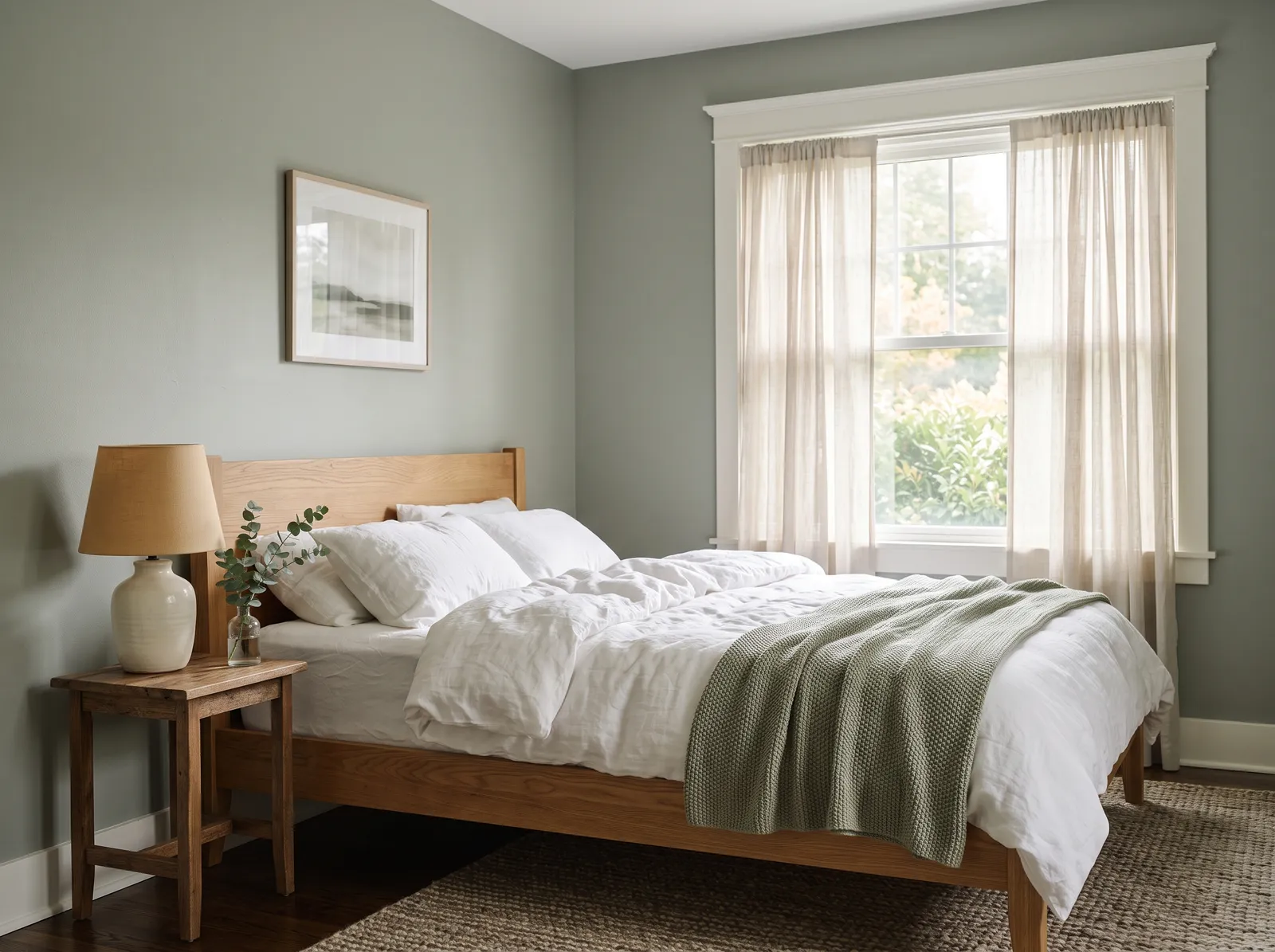
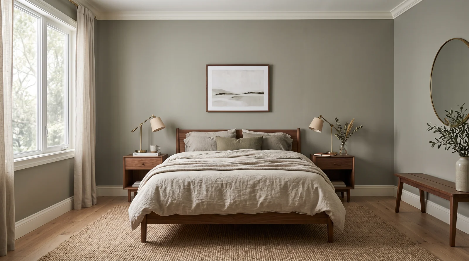
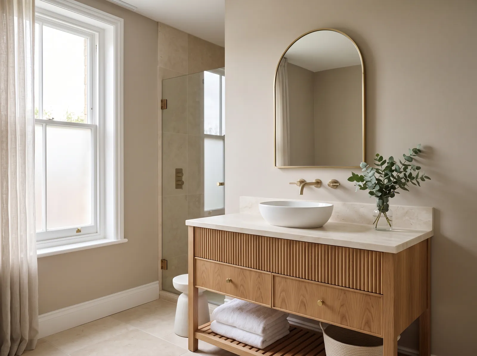
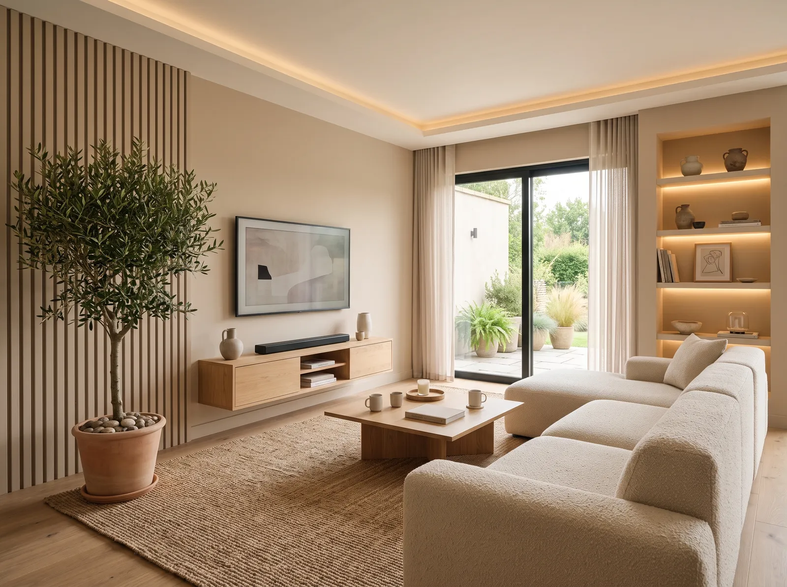
Each room page shows neutral picks from every US brand side by side, so you can compare in context.
How Deep Each Neutral Deck Goes
How many neutral colors each brand carries, drawn with that deck's own neutrals from light to dark. Pick your store first, then the color. Every brand equal, no favorites.
More on Portola Paints neutral paint colors
What Portola's Neutrals Actually Look Like
Neutral is Portola's biggest single family at nineteen colors, and it's the closest thing to the brand's signature look — warm, sandy, plaster-toned colors that feel lifted from a Mediterranean hillside. Kashmir (LRV 82) and Mariposa (LRV 76) sit at the pale end, soft creams with just enough warmth to avoid reading as white. El Matador (LRV 58), La Conchita (LRV 57), and Antigua (LRV 56) form a tight cluster of warm sand tones in the high-50s, while Angel's Landing (LRV 55) and Topanga (LRV 55) both lean a bit more terracotta.
The deeper end of the family is where Portola's earthy identity really shows: Bond Street (LRV 28) is a dark olive-taupe, Bronson (LRV 31) and La Catedral (LRV 34) sit close behind as grounded, muted taupes, and Boondocks (LRV 35) and Coda (LRV 38) split the difference between the pale sands above and the dark taupes below. Piano Room (LRV 47) — one of the colors the brand's own hub calls out as a designer favorite — sits almost exactly in the middle of the range.
Neutrals in Roman Clay, Lime Wash, and Flat Acrylic
This is the family where Portola's mineral finishes make the most sense, because the earthy, sand-and-clay palette was clearly built with texture in mind. A color like El Matador or La Conchita in Roman Clay reads like an actual plastered wall — warm and stone-like, with the color shifting gently as you move past it, which is exactly the look that made the brand's reputation. The pale creams — Kashmir, Mariposa — also work well as Lime Wash, since the chalky, weathered patina suits a soft, pale finish.
The deeper taupes in this family — Bond Street, Bronson, La Catedral — tend to work best as New Standard flat acrylic on a whole wall, since a deep color spread across a big troweled surface can look muddy if the technique isn't handled well; they're a safer bet as a confident, even flat coat, or as Roman Clay on a smaller, more contained surface like a fireplace or powder room.
Portola Paints Neutral Paint FAQ
How many neutral paint colors does Portola offer?
Neutral is Portola's largest family, with nineteen colors ranging from the pale, creamy Kashmir (LRV 82) down to the dark, olive-toned Bond Street (LRV 28). It's the family that most reflects Portola's signature warm, sandy, plaster-leaning identity, so it's worth browsing closely if that's the look you're after.
Which Portola neutral is the lightest?
Kashmir is the lightest at LRV 82, a soft, pale cream that reads warm rather than stark. Mariposa follows close behind at LRV 76. Both work well as whole-room wall colors that still feel light and airy rather than heavy or saturated.
Which Portola neutral is the darkest?
Bond Street is the deepest neutral at LRV 28, a dark olive-taupe. Bronson (LRV 31) and La Catedral (LRV 34) sit close behind it. These deeper tones work better as an accent wall, vanity, or trim color than washed across a whole room, where they'd absorb most of the available light.
What's the difference between Portola's neutrals in Roman Clay versus flat acrylic?
In New Standard flat acrylic, a neutral like El Matador or Antigua goes on as one even color. Ordered as Roman Clay, the same color is troweled on in layers, so it picks up shadow and stone-like movement as light crosses it — the sandy, plaster look Portola is best known for.
Which Portola neutrals work best as Lime Wash?
The paler, creamier colors in this family — Kashmir, Mariposa, and similar high-LRV picks — tend to suit Lime Wash well, since its chalky, weathered patina reads naturally soft against a light base. Deeper taupes like Bond Street are usually safer as flat acrylic or a smaller Roman Clay surface.
Ask a Question