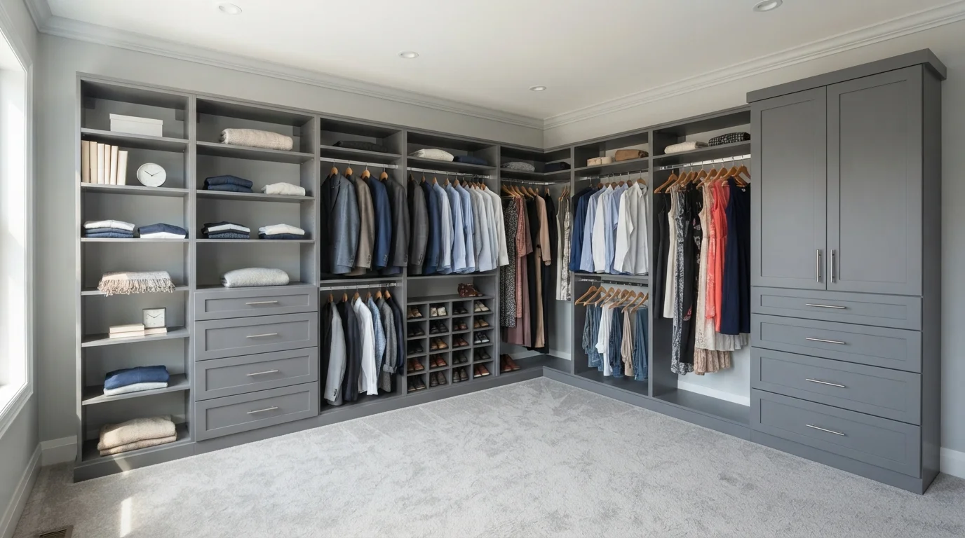
Room Colors · Neutral Closet
8 Best Neutral Closet Paint Colors for 2026
ideas, combinations, and real rooms
8 curated picks from real neutral closets — with the exact colors, honest reasons why, and the combinations that hold the room together.

Former interior stylist who can spot a green undertone from across a room. Jessica writes the color and mood pieces — what to choose, what pairs, and why your "white" looks pink.
The Fast Answer
Don't want to read 8 picks? These four are the safe answers.

Top Picks for the Neutral Closet
Tap a shade to see the neutral closet in it, then try it on your own room.
Neutral Closet Color Trends 2026 — What's In, What's Out


- Cool Blue-Gray Everything — The icy blue-gray neutrals that dominated closets for a decade now read cold and dated next to 2026's warmer palette.
- Stark Builder White — Flat, high-reflectance builder white in closets feels sterile and unfinished compared to the warm, tinted neutrals now favored.
- Matching Every Surface One Shade — Painting shelves, walls, and trim the exact same neutral is losing ground to subtle tonal layering within one closet.
The 8 Best Neutral Closet Paint Colors
Every pick below is a real rendered neutral closet, not a chip. The lead color first; the swatches are the full scheme in the photo — walls, furniture, textiles, accent.

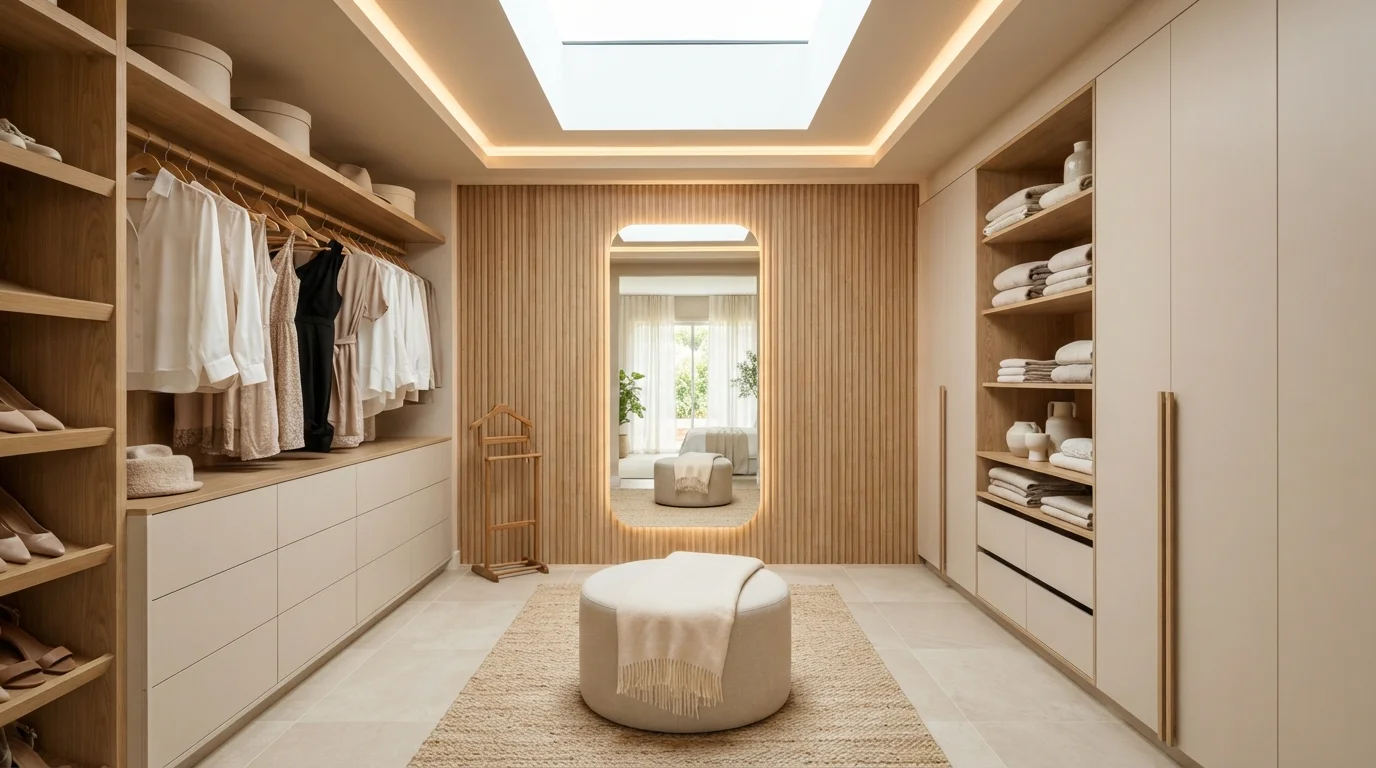
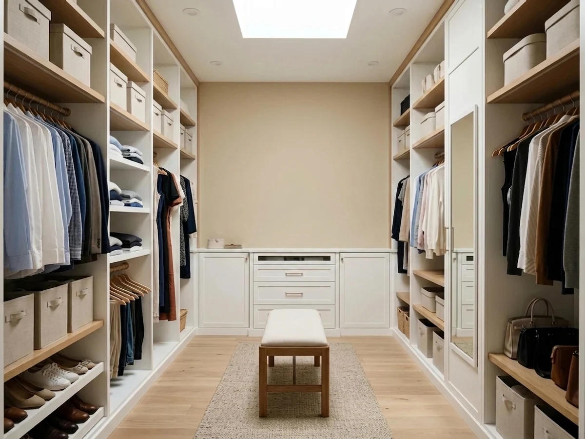
Soft oat beige cabinetry and glowing natural oak shelves turn your daily dressing routine into a calm, luxurious ritual.
Oat beige is a gentle, soothing neutral with a warm sandy touch. In this closet, it covers the sleek wardrobe fronts, built-in drawer units, and surrounding ceiling trims, paired with a soft linen ottoman and woven floor runner. The entire space feels peaceful, tidy, and deeply relaxing. Layering creamy beige tones with light natural oak woodwork keeps everything feeling organic rather than cold or flat. This look is perfect for anyone who loves an organized, high-end hotel feel at home.
SEE IT ON YOUR WALLS →
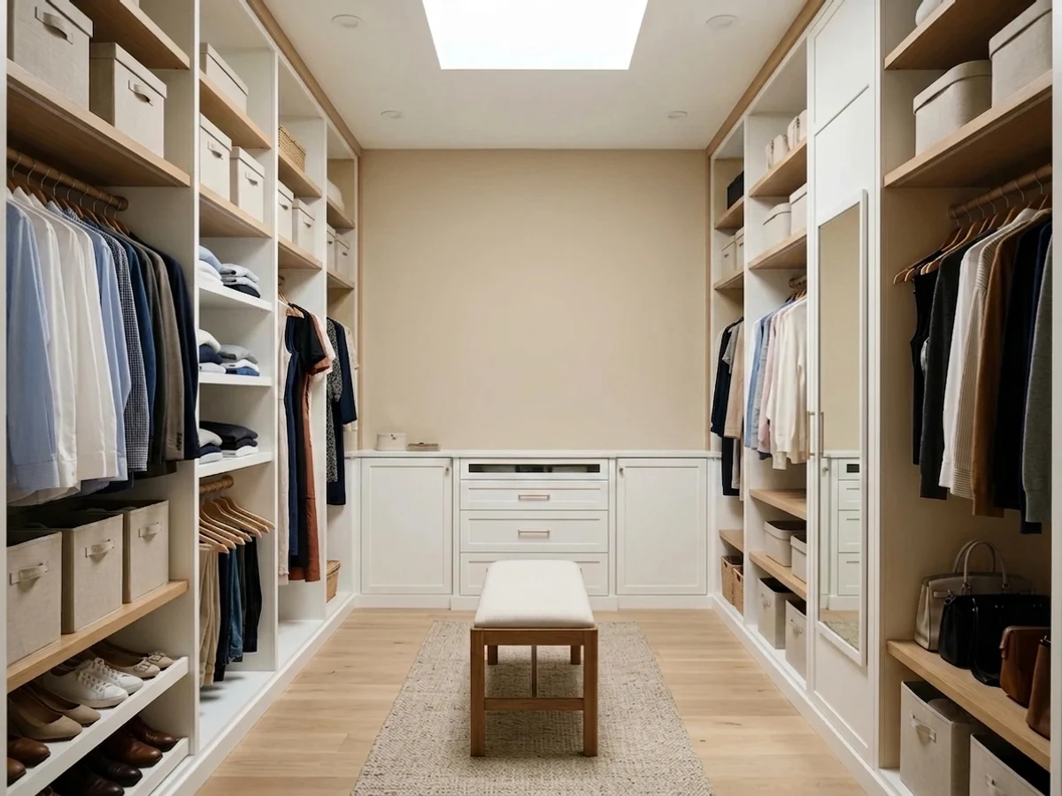
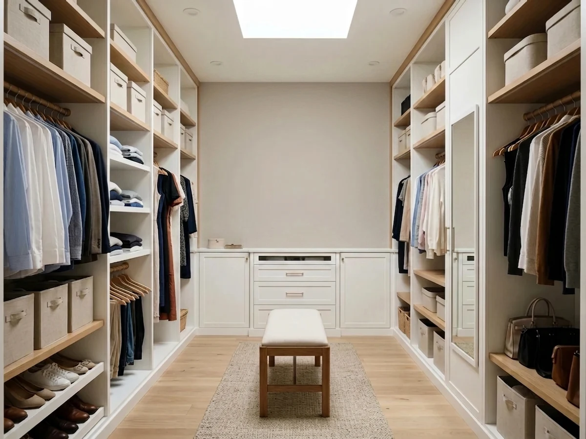
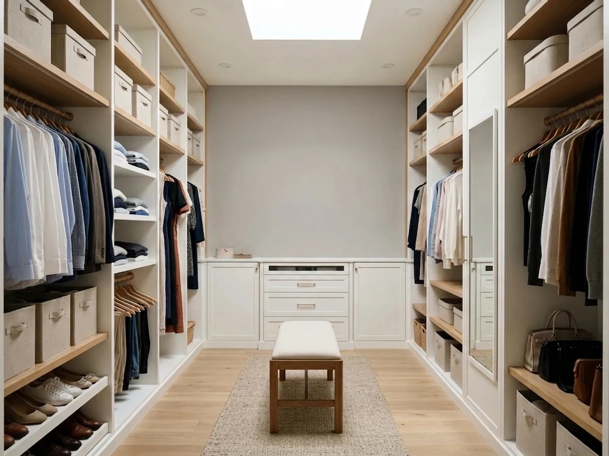
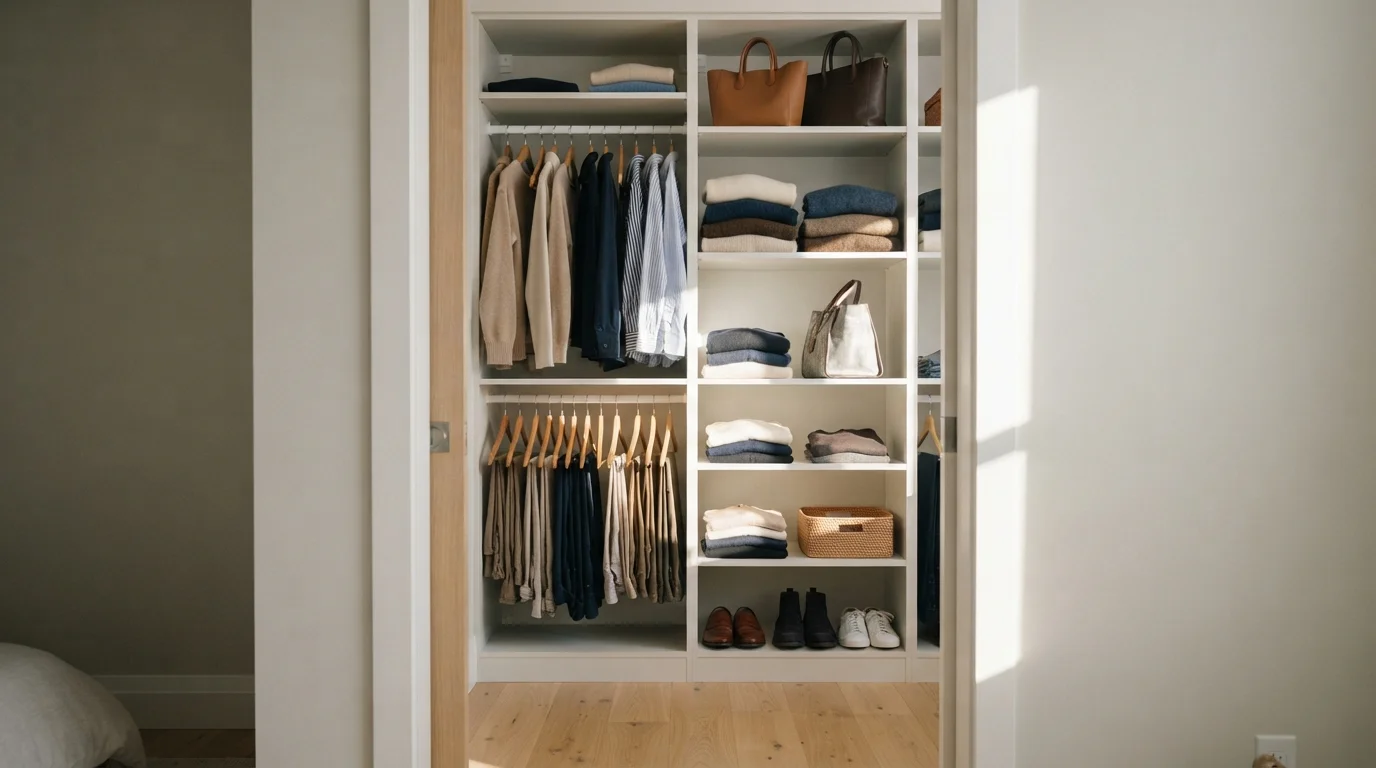
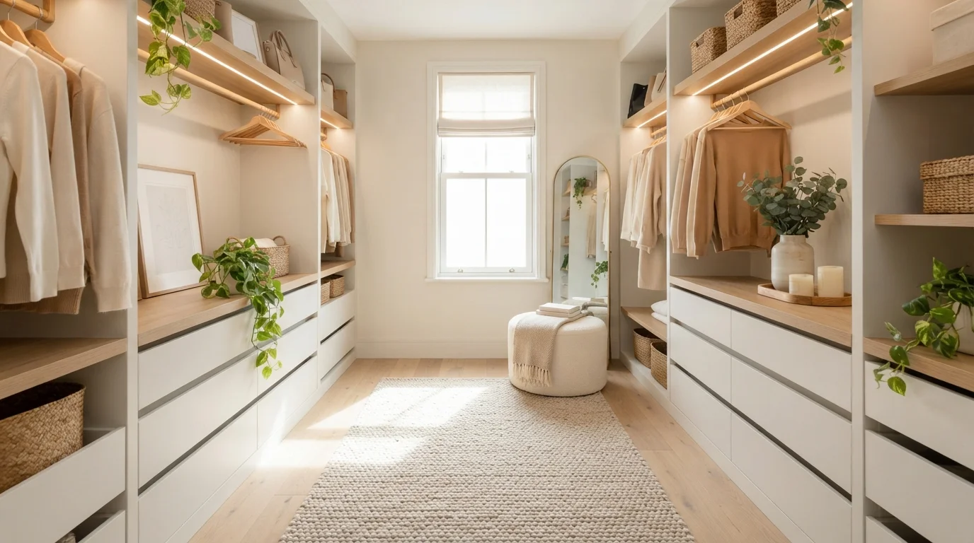
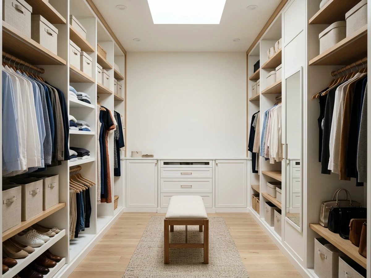
Golden afternoon sun streams across crisp warm white shelving and soft textured fabrics for a peaceful, organized dressing space.
Creamy off-white is a gentle, soothing neutral that never feels harsh. In this closet, soft warm white coats the built-in wardrobe frames and walls, setting a clean backdrop for textured beige knits, crisp shirts, and leather bags. The space feels bright, calm, and effortlessly orderly. This combo works because the light background lets clothing textures and rich earth tones stand out without any visual clutter. It is ideal for anyone dreaming of a quiet, boutique-style closet.
SEE CITY LOFT ON YOUR WALLS →
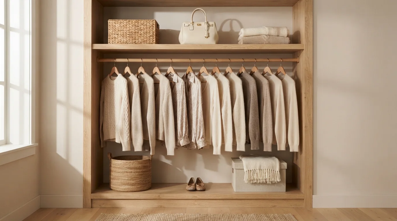
A soothing wash of creamy white and warm wood creates a snug, organized haven bathed in gentle afternoon light.
Soft linen white is a warm, gentle cream with a cozy feel. In this space, it coats the interior back wall, creating a serene background for honey oak shelving and neatly hung knitwear in oat and beige. The closet feels calm, tidy, and delightfully snug. This combo works because warm naturals and soft neutral paint effortlessly blend together. It is perfect for anyone wanting an organized, boutique-style closet that makes everyday dressing a peaceful ritual.
SEE POWDER CAKE ON YOUR WALLS →
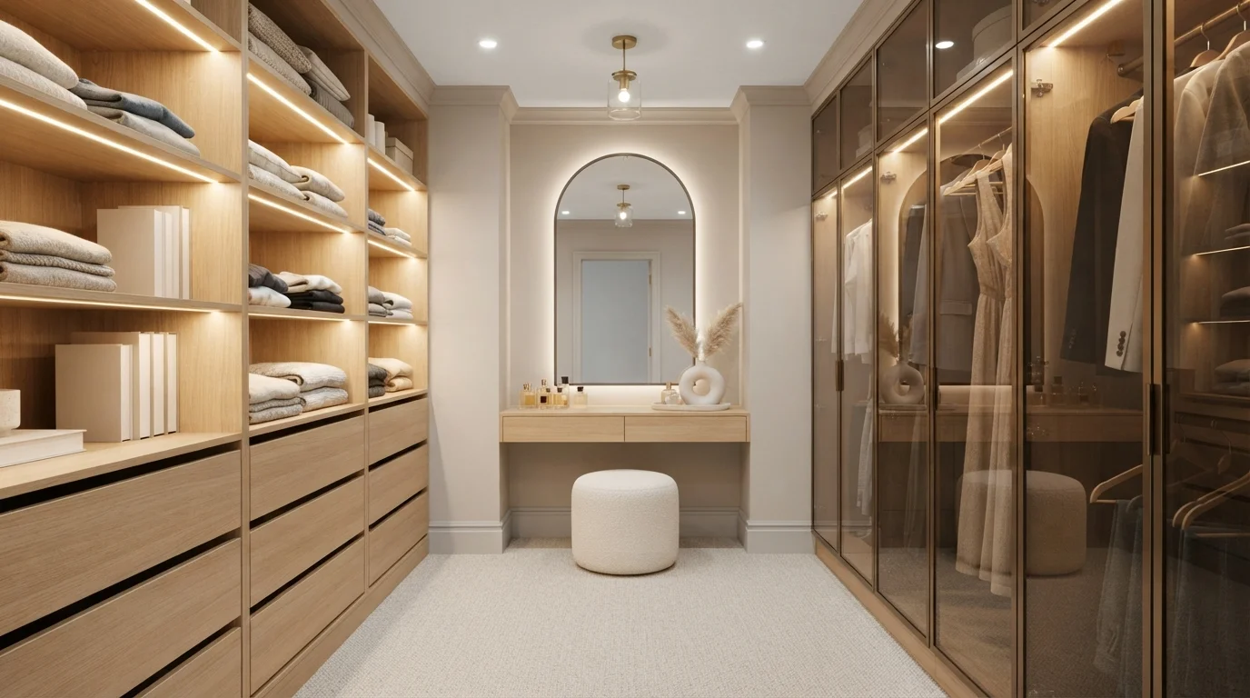
Warm integrated lighting and soft greige walls create an endlessly calm, boutique-hotel dressing experience.
Soft greige is a soothing blend of gentle gray and warm creamy beige. In this dressing room, greige coats the accent wall and ceiling, framing light oak cabinetry and textured cream carpeting. The space feels quiet, calm, and effortlessly sophisticated every time you step inside. This neutral palette works because soft earth tones pair naturally with pale wood and warm glowing lights, keeping the narrow hall bright and welcoming. It is the ultimate design for anyone who wants their morning routine to feel like a luxury retreat.
SEE IT ON YOUR WALLS →
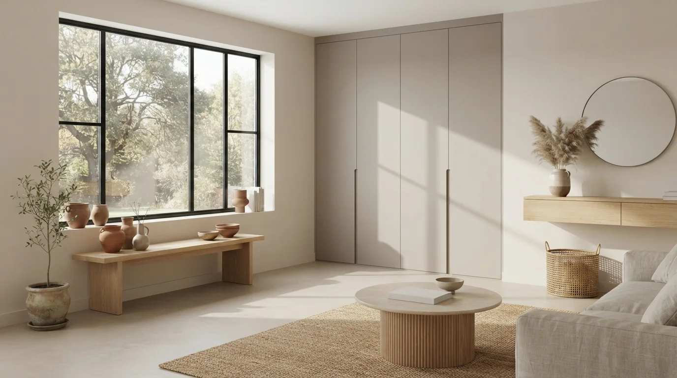
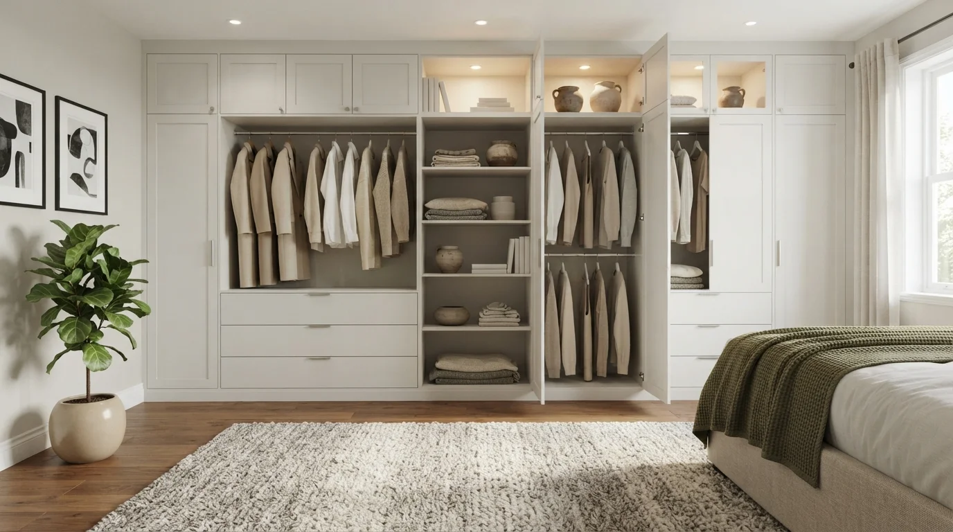
Soft natural sunlight and tactile earthy textures wrap this quiet room in gentle, calming warmth.
Mushroom taupe is a soft, earthy blend of warm gray and beige. In this space, the sleek floor-to-ceiling cabinets wear this quiet neutral, framed by creamy off-white walls, a textured jute rug, and a low fluted oak table. The room feels incredibly calm, grounding, and light. This mix works so well because subtle earthy tones and organic textures naturally harmonize together without feeling flat. It is a fantastic look for anyone who loves an organized, nature-inspired modern home.
SEE ASIAGO ON YOUR WALLS →
Soft morning sunlight, creamy walls, and natural oak combine to create a calm boutique-style space for your everyday routine.
Warm linen white is a gentle, sunlit cream that softens any room. In this closet, it covers the walls while crisp creamy white finishes the sleek pull-out drawers. Light oak open shelves, a chunky textured runner rug, and a plush bouclé ottoman make the space feel calm, snug, and beautifully organized. The combination works because blending soft pale tones with natural blonde wood keeps narrow dressing areas feeling bright and open. It is perfect for anyone wanting a peaceful, clutter-free start to their morning.
SEE IRISH CREAM ON YOUR WALLS →
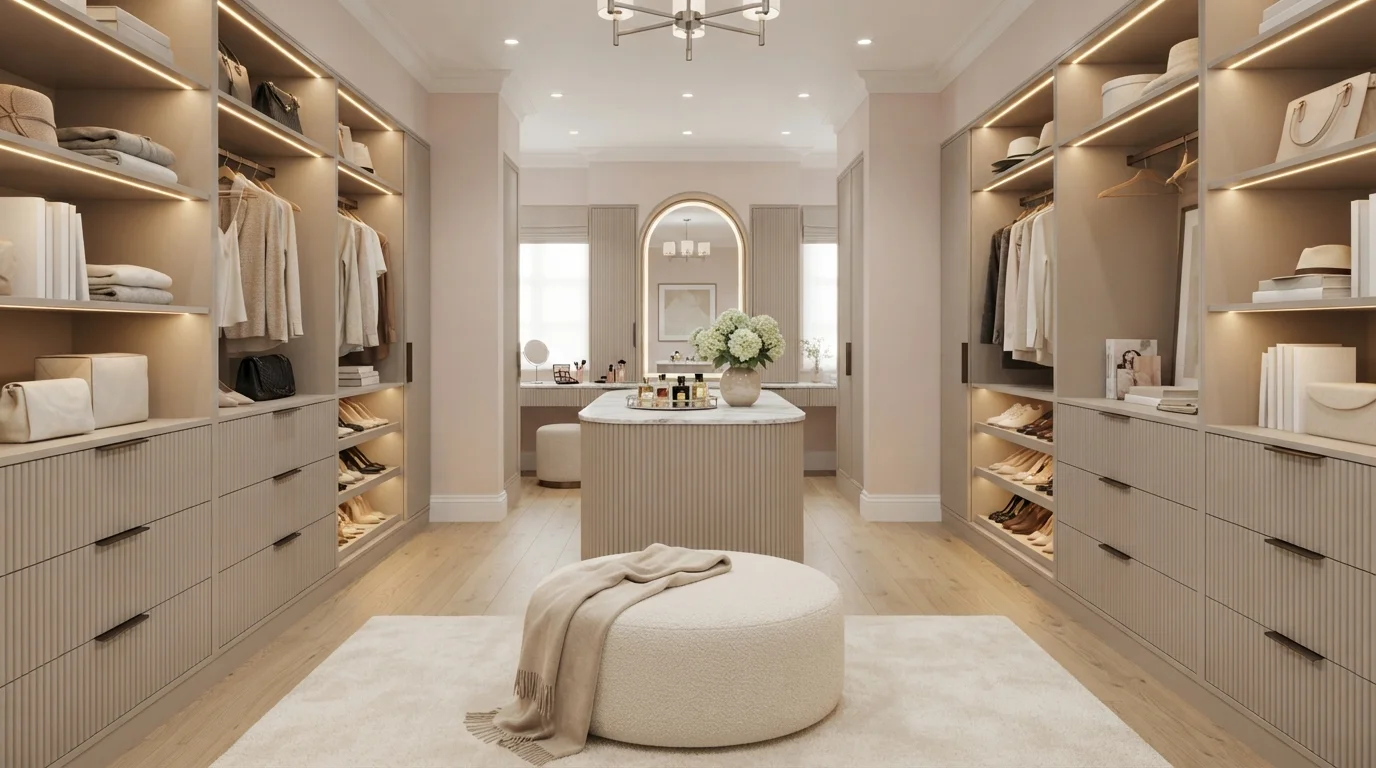
Bathed in soft ambient glow and creamy neutral tones, this dressing suite feels deeply calming, refined, and effortlessly organized.
Cashmere beige is a soft, soothing neutral with gentle taupe warmth. In this closet, smooth cashmere tones cover the built-in cabinetry, vanity arches, and fluted central island, paired with a pale off-white ceiling and a plush ivory area rug underfoot. The room feels serene, tidy, and quietly luxurious. Sticking to a calm monochromatic scheme lets the soft lighting and marble surfaces shine without creating visual clutter. It is ideal for anyone who wants a high-end boutique hotel feeling in their everyday morning routine.
SEE PALE PINK ON YOUR WALLS →
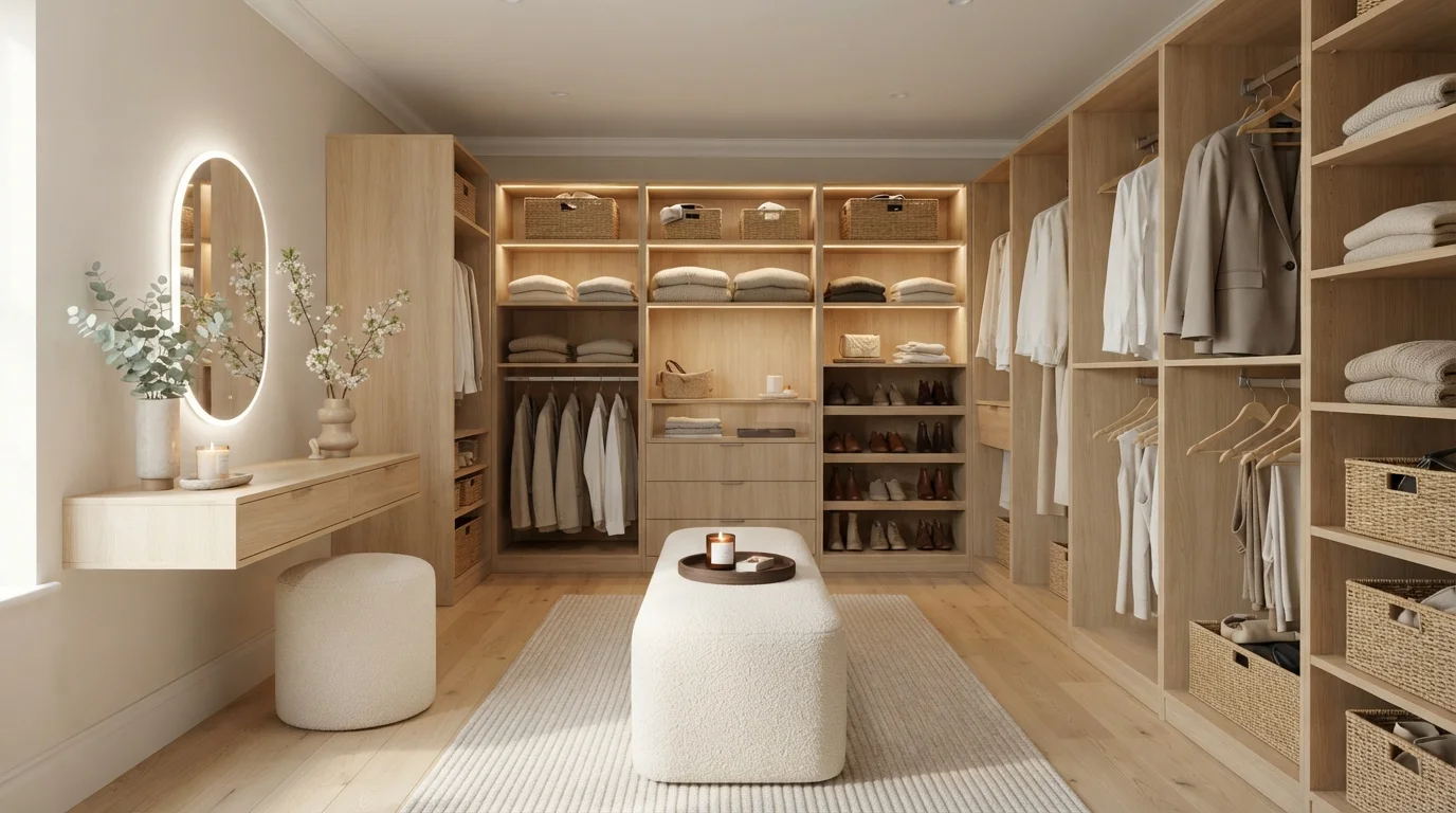
Soft warm LED lighting illuminates natural oak built-ins and cozy bouclé textures for a peaceful dressing experience.
Soft warm beige is a gentle, cozy neutral with subtle creamy depth. Here, the soothing beige walls provide a quiet backdrop for light natural oak custom shelving, a floating makeup vanity, and plush off-white bouclé seating. The room feels incredibly serene and organized, like stepping into a private luxury boutique. This pairing works because the pale wall color lets the glowing wood tones and textured fabrics take center stage without visual clutter. It is perfect for anyone who wants an orderly, spa-like dressing space.
SEE CHERUBIC ON YOUR WALLS →Neutral Closet Wall Color Combinations
A wall color never works alone. These are the full schemes from the rooms above — the lead color first, then the supporting colors that make the photo work.
Soft oat beige cabinetry and glowing natural oak shelves turn your daily dressing routine into a calm, luxurious ritual.
TRY THIS PALETTE →Golden afternoon sun streams across crisp warm white shelving and soft textured fabrics for a peaceful, organized dressing space.
TRY THIS PALETTE →A soothing wash of creamy white and warm wood creates a snug, organized haven bathed in gentle afternoon light.
TRY THIS PALETTE →Warm integrated lighting and soft greige walls create an endlessly calm, boutique-hotel dressing experience.
TRY THIS PALETTE →The simplest combination in this lineup is Kilim Beige or Repose Gray on the walls with the closet's existing white trim and shelving left alone — both are warm enough to read as intentional without fighting the wood tone of a stained closet system. If your closet has natural wood shelving or a cedar-lined section, Manchester Tan pulls the warmth of the wood into the wall color instead of clashing with it, which is the mistake a cooler gray like Graceful Gray can make against orange-toned wood.
For a walk-in that wants a boutique moment, use Wind's Breath on the main walls and reserve Deep Desert Shadow or Thunderstruck for a single accent wall — usually the one behind an island or a jewelry/accessory display — rather than painting the whole closet dark. That keeps the light-reflecting benefit of the cream on the walls doing the daily work of helping you see clothes, while the dark wall does the styling work.
More Closet Color Ideas
Set on a color family already? Each page has its own real rooms and picks.
Light or Dark Neutral Closet Colors?
Go Light (LRV 60+) If…
The room is small, faces north, or has to work at every hour. Light warm colors make it feel bigger and stay calm in evening light — the light you actually live in.
Go Dark (LRV Under 20) If…
You want the cocoon effect and the room has real daylight. Dark works best on one feature wall — or fully color-drenched in a large room with good windows.
Closets break the usual light-vs-dark rule because most have no window and one light source, so the LRV number matters more here than in almost any other room. If your closet relies on a single bulb or a dim fixture, stay at LRV 47 or higher — Wind's Breath (70) is the brightest and safest choice, and Kilim Beige (49) and Graceful Gray (47) still bounce enough light to keep hanging clothes visible instead of guessing at navy versus black in a dim corner.
Dark only works in a closet that's earned it with real light — an upgraded LED strip, a window, or a walk-in large enough to feel like a room rather than a box. Deep Desert Shadow and Thunderstruck both read as sophisticated in a well-lit walk-in but will make a small reach-in closet feel like a cave and swallow your ability to tell dark gray from black on laundry day. If you're not sure your fixture is strong enough, that's the sign to stay with Kilim Beige or Repose Gray instead.
See It. Love It.
Paint It.
Upload one photo of your neutral closet and try every color on this page on your own walls — in your own light, before you buy a drop of paint.

Manchester TanBeforeLighting Changes How These Neutrals Read
A closet almost never gets daylight, so the color temperature of your bulb decides whether Kilim Beige leans golden or muddy, and whether Graceful Gray looks soothing or flat. Warm bulbs (2700K–3000K) push beige and tan neutrals like Kilim Beige and Manchester Tan further into their warm side, which most people like in a closet. Cooler bulbs (4000K+) are worth pairing with Repose Gray or Graceful Gray if you want the space to feel more like a boutique fitting room and less like a bedroom extension.
Before buying a full quart, paint a swatch and check it with the closet door closed and only the closet's own fixture on — daylight from an open door will make even Deep Desert Shadow look lighter than it actually reads once the door shuts.
Sheen for Closet Walls
Closet walls take more contact than people expect — shoulder bags brushing past, hangers bumping the wall, shoes stacked against the baseboard. Satin is the standard choice for all seven of these colors because it wipes clean without the glare a semi-gloss would throw back at you under a bright closet bulb. If the closet doubles as a dressing area with a mirror and you want a slightly more polished look, semi-gloss works too, but expect it to show every roller mark, so a professional-quality roller matters more here than in a bedroom.
The Mistake That Wastes Half This List
The most common closet paint mistake is picking a color that looks great on the chip and then never testing it under the closet's actual light — a warm neutral like Kilim Beige can look convincingly gray under cheap fluorescent light, and a true gray like Graceful Gray can look lavender under certain warm LEDs. The second most common mistake is going dark (Deep Desert Shadow, Thunderstruck) in a closet that hasn't had its lighting upgraded first, which leaves you squinting at black versus navy every morning instead of enjoying the look.
About Neutral Closet Paint Colors
A closet is a small, often windowless box you stand in for thirty seconds while you decide what to wear, so the paint has to do one job well: let you actually see your clothes. That's why neutral wins here more than almost any other room — Sherwin-Williams Kilim Beige (SW 6106, LRV 49) and Behr Graceful Gray (PPU18-12, LRV 47) sit in that mid-tone band that reads calm without swallowing the light bouncing off a single overhead bulb, while Benjamin Moore Wind's Breath (981, LRV 70) is closer to a soft cream than a true white, so it stays bright without the sterile, showroom look flat white can give a small enclosed space.
The rest of this lineup covers the two directions people actually ask for. Manchester Tan and Repose Gray are the safe warm-neutral middle ground — the kind of color you'd also use in the bedroom, so the closet feels like a continuation of the room instead of a leftover utility space. Deep Desert Shadow (Valspar) and Thunderstruck (Glidden) go the other way: both are deep, grounded neutrals meant for a walk-in that already has good lighting and wants to feel more like a dressing room than a storage closet — think boutique fitting room, not linen closet.
Because a closet is buyable in a quart from any of these brands, there's no reason to guess. Pick two finalists — one light, one darker — and hold both against your actual clothes and shelving under the closet's own light fixture before committing to a gallon.
The Questions Everyone Asks
What color should I paint my neutral closet?
If you want one answer, start with the safe picks above — City Loft, Cappuccino Foam, Powder Cake, Shadowbox Beige. They read well in any light and survive furniture changes. Then check the light: strong afternoon sun wants a step cooler, a north-facing room wants a step warmer.
what color should i paint a closet?
For most closets, stay in the LRV 47–70 range so the walls bounce enough light to see your clothes clearly — Sherwin-Williams Kilim Beige (LRV 49) or Benjamin Moore Wind's Breath (LRV 70) both do this well. Go with Wind's Breath if your closet is dim or windowless; go with Kilim Beige or Repose Gray if you want more warmth and already have decent light.
should a closet be the same color as the bedroom?
It doesn't have to be, but matching creates a seamless look when the closet door is open, which is why Manchester Tan and Repose Gray work well — both are common bedroom-wall colors too. A separate closet color, like Deep Desert Shadow or Thunderstruck, reads more intentional in a large walk-in that functions as its own room rather than an extension of the bedroom.
what color makes a closet look bigger?
Lighter, higher-LRV neutrals expand a small closet visually — Wind's Breath at LRV 70 is the strongest choice here because it reflects the most light without looking stark white. Graceful Gray and Kilim Beige, both in the high-40s LRV range, still open the space up more than any color below LRV 40, which is where rooms start to feel smaller instead of bigger.
is it okay to paint a walk-in closet a dark color?
Yes, but only if the closet already has good lighting — a dark neutral like Deep Desert Shadow or Thunderstruck works in a walk-in with an upgraded fixture or natural light, giving it a boutique, dressing-room feel. In a small reach-in closet lit by one dim bulb, the same colors make it harder to tell your clothes apart and the space will feel cramped instead of stylish.
what paint finish is best for a closet?
Satin is the standard for closet walls — it wipes clean from bag straps and shoe scuffs without throwing glare back under the closet's bulb. Semi-gloss is a fine step up if the closet has a mirror and functions as a dressing area, but it will show roller marks more, so plan on a smooth application regardless of which of these seven colors you pick.
What two-color combination works best in a neutral closet?
The reliable pattern is a quiet main color plus one deep accent on a single wall. Keep trim and ceiling in one warm white so the two colors are the only event in the room — the combination cards above show complete schemes from real rooms.
What colors make a neutral closet look bigger?
High-LRV, slightly warm colors — LRV 60–75 is the sweet spot. Paint the walls and trim close to the same light color so the corners blur, and keep the ceiling white. Stark cool white actually works against you; it creates hard shadows that show the room's edges.

Ask a Question