CP

Sky Color Palette — Cedar Dawn

A soft five-color sky scheme of pale blue, cloud white, and dawn pink warmed by a quiet cedar tone — every color matched to real paint you can buy.

By Emily Roberts · DIY Editor & First-Timer's Guide

Pale Sky Blue
Dominant
Kompozit Serene Setting · 0622
#C5D2D9
LRV 63
Cloud White
Secondary
Kompozit Cyprus Spring · 0411
#F2F2EA
LRV 88
Dawn Pink
Base
Kompozit Velvet Blush · 1217
#E3D5D8
LRV 69
Dusk Lavender
Support
Kompozit Orchid Fragrance · 1287
#C9C1D0
LRV 55
Warm Cedar
Accent
Kompozit Cavern Sand · 0165
#947054
LRV 19
View palette in

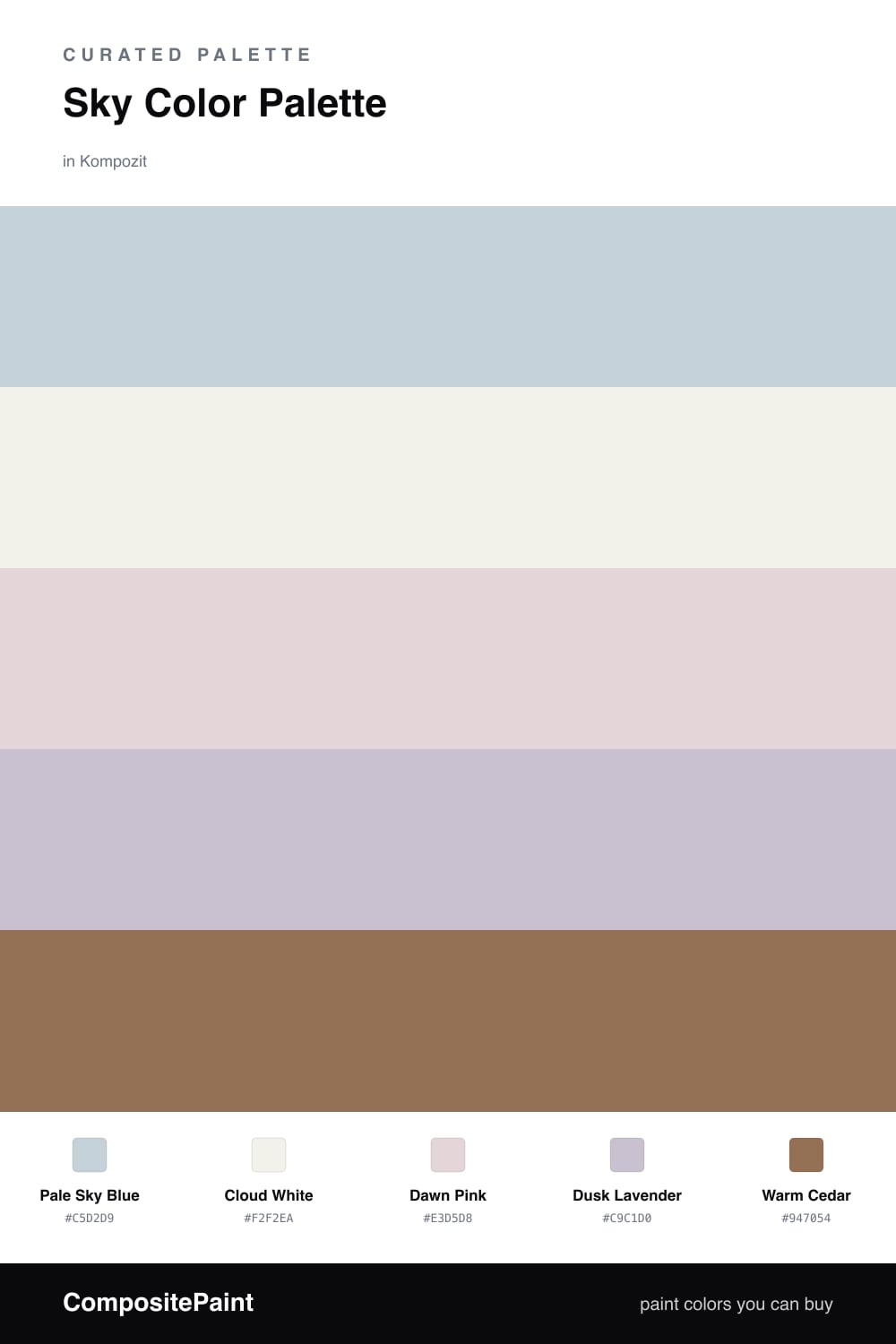
This is the palette I reach for when someone tells me they want a room that feels like a deep breath. It starts with Pale Sky Blue, the soft, slightly grayed blue you see in an early-morning sky, and lets it carry most of the space.

Around it, Cloud White keeps everything light and open, while Dawn Pink adds the faintest warm blush so the blue never turns cold. Dusk Lavender is the in-between color that ties the cool and warm tones together — you almost do not notice it, which is exactly the point.

Then comes Warm Cedar, the one color with some real weight. Use it in small doses on a door, a wooden bench, or a single shelf. That little bit of warmth is what makes the whole soft, airy scheme feel current and lived-in rather than washed out.

Buy These Colors

Each color matched to the closest real paint in every brand, by ΔE2000. Kompozit first; take any SKU to the store — these mix on demand.

Pale Sky Blue
#BFD3DE · LRV 63 · Dominant
Kompozit Serene Setting · 0622 ΔE 2.53
Backdrop Real Real · BD-RR ΔE 15.25
Behr Icicles · N490-2 ΔE 3.41
Benjamin Moore Under the Big Top · 1675 ΔE 1.96
Clare Nairobi Blue · PNT100-LT-36 ΔE 4.68
Dunn-Edwards Two Harbors · DE5813 ΔE 1.24
Farrow & Ball Skylight · No. 205 ΔE 7.95
Magnolia Home Dark Moon · JG-74 ΔE 7.55
PPG / Glidden Sentimental Lady · 1159-2 ΔE 1.7
Sherwin-Williams Breathtaking · SW 6814 ΔE 5.67
Valspar Pale Flowers · 4008-5A ΔE 1.69
Cloud White
#F4F1EA · LRV 88 · Secondary
Kompozit Cyprus Spring · 0411 ΔE 1.67
Backdrop Tabula Rasa · BD-TR ΔE 2.02
Behr Nano White · HDC-MD-06 ΔE 1.4
Benjamin Moore Gardenia · AF-10 ΔE 0.21
Clare Wing It · PNT100-LT-24 ΔE 2.46
Dunn-Edwards Fossil · DE6225 ΔE 0.48
Farrow & Ball Wimborne White · No. 239 ΔE 1.78
Magnolia Home Silos White · JG-107 ΔE 0.68
PPG / Glidden Delicate White · 1001-1 ΔE 2.13
Sherwin-Williams White Flour · SW 7102 ΔE 1.48
Valspar Santa's Beard · 8007-6E ΔE 1.18
Dawn Pink
#E8D2CE · LRV 68 · Base
Kompozit Velvet Blush · 1217 ΔE 4.07
Backdrop Cookies & Cream · BD-CC ΔE 12.76
Behr Conch Shell · S200-1 ΔE 1.49
Benjamin Moore Pleasant Pink · 2094-60 ΔE 1.6
Clare Neutral Territory · PNT100-LT-20 ΔE 7.32
Dunn-Edwards Whirlwind · DE6030 ΔE 3.4
Farrow & Ball Calamine · No. 230 ΔE 1.17
Magnolia Home Ella Rose · JG-24 ΔE 4.39
PPG / Glidden Birthday Cake · 1059-2 ΔE 0.93
Sherwin-Williams Innocence · SW 6302 ΔE 1.85
Valspar Charmed · 8003-9A ΔE 1.71
Dusk Lavender
#C9C2D1 · LRV 56 · Support
Kompozit Orchid Fragrance · 1287 ΔE 0.46
Backdrop Lost in the 80s · BD-LO ΔE 16.27
Behr Pastel Violet · 100E-3 ΔE 1.85
Benjamin Moore North Cascades · 1411 ΔE 2.8
Clare Motor City · PNT100-LT-09 ΔE 10.44
Dunn-Edwards Dangerous Robot · DE6387 ΔE 6.53
Farrow & Ball Calluna · No. 270 ΔE 4.53
Magnolia Home Cement Pots · JG-93 ΔE 7.23
PPG / Glidden Northern Exposure · 1165-3 ΔE 7.51
Sherwin-Williams Grape Mist · SW 6548 ΔE 2.9
Valspar Pebbles · 8004-48B ΔE 4.46
Warm Cedar
#9A6B4E · LRV 18 · Accent
Kompozit Cavern Sand · 0165 ΔE 3.5
Backdrop Old Soul · BD-OS ΔE 18.95
Behr Toasted Chestnut · 240F-5 ΔE 2.34
Benjamin Moore Penny · 2163-30 ΔE 2.02
Clare Big Apple · PNT100-DP-30 ΔE 11.91
Dunn-Edwards Brown Eyes · DE5265 ΔE 1.46
Farrow & Ball Picture Gallery Red · No. 42 ΔE 9.78
Magnolia Home Remote Trail · JG-165 ΔE 12.71
PPG / Glidden Foxfire Brown · 1069-6 ΔE 1.84
Sherwin-Williams Wheat Penny · SW 7705 ΔE 1.77
Valspar Chestnut Beach · 3002-7A ΔE 2.65

Questions

Why do these colors feel so calm together?

They all sit in the same soft, low-saturation family, like a sky just before sunrise. Nothing shouts, so your eye relaxes and the warm cedar gives it just enough grounding.

How much of each color should I use?

Let the pale blue lead on big surfaces, keep the white and pink as the quiet middle, and save the cedar for small touches like a door or shelf — roughly a 60/30/10 feel.

Similar Palettes

Closest schemes by color — not by label.