Palette · Dining Room

Mint Dining Room PaletteGarden Mist & Spiced Clay

A fresh five-color dining room scheme led by soft mint walls, warmed by oak and a deep clay accent — every color matched to real paint you can buy.

By Jessica Williams · Color Stylist & Interior Editor
View palette in

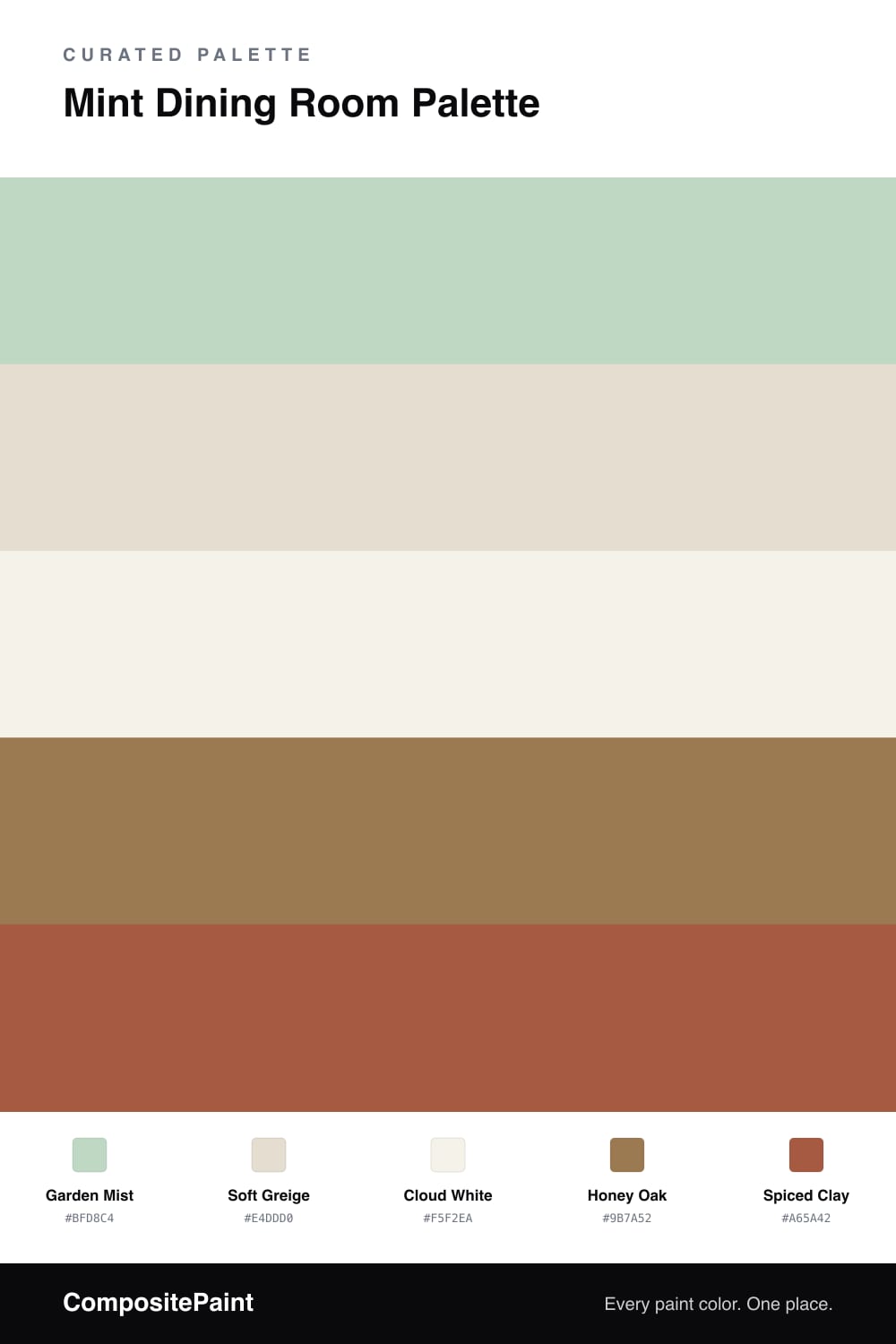
Mint has grown up. The chalky pastel of a few years ago has given way to softer, dustier greens that feel calm instead of cute, and that is exactly the mood here. Garden Mist carries the walls with a quiet, leafy freshness that makes a dining room feel like a good place to slow down and linger over a meal.

The neutrals do the steadying. Soft Greige on the trim and ceiling has enough warmth to keep the mint from drifting cold, and Cloud White brightens cabinets and built-ins without going stark. Underfoot, Honey Oak brings the warmth that every cool green needs, tying the table and floor into the scheme.

Then comes the spark. Spiced Clay is the color I would reach for on a sideboard, a set of chair seats, or a single piece of pottery on the table. It is warm and a touch terracotta, the natural opposite of mint, and even in small doses it makes the green look deliberate and current — right where 2026 dining rooms are heading.

Buy these colors

Every Color, Matched to Real Paint

Each color matched to the closest paint in every brand we track, by ΔE2000. Tap a swatch for its full guide. Take any code to the store, they mix on demand.

Questions people actually ask

Questions

Why does mint feel right in a dining room?

Mint reads clean and a little garden-fresh, which keeps the table feeling light and the air easy. It flatters food and candlelight without ever taking over the room.

How do I stop mint from looking too sweet?

Ground it with warm wood and one earthy accent. Here the honey oak floor and a clay note keep the mint grown-up rather than candy-like.