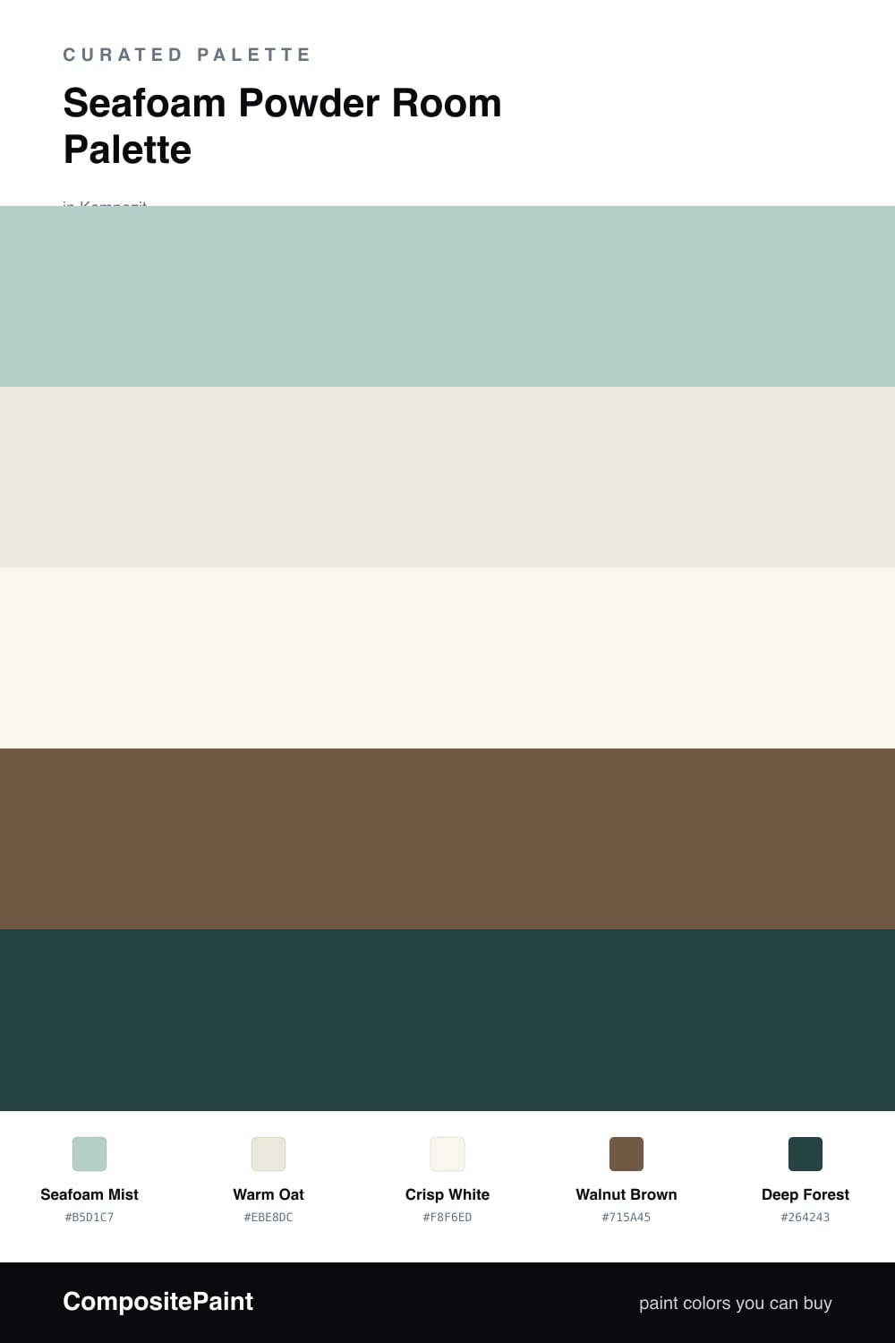
Seafoam Powder Room Palette — Seafoam Mist & Warm Oat
A calm, light-filled 5-color scheme for a powder room: seafoam walls, a warm oat backdrop, crisp trim, grounding walnut, and a deep forest accent — every color matched to real paint you can buy.
By Maya Patel · Reviews Editor & Product Tester
A powder room is the one space where you can take a risk, and seafoam is the smart way to do it. This palette leads with Seafoam Mist, a soft gray-green that feels clean and a little spa-like without ever tipping into mint. On the walls of a small room it makes the space feel calm and a touch bigger than it is.
I kept the supporting cast warm on purpose. Warm Oat carries the vanity and any backdrop so the seafoam never feels clinical, and Crisp White on the trim and ceiling keeps the edges sharp. Walnut Brown is the grounding move here — a real wood tone on the vanity top or floating shelf that pulls the whole scheme out of cool territory.
For the finish, Deep Forest is your one bold note. Put it behind the mirror or inside a niche and let it do its job in a small dose. That contrast is what makes a powder room memorable, and because every shade maps to a paint you can actually mix at the store, this is a scheme you can build, not just admire.
Buy These Colors
Each color matched to the closest real paint in every brand, by ΔE2000. Kompozit first; take any SKU to the store — these mix on demand.
Questions
Not when you pair it the way this palette does. Seafoam Mist is soft and slightly grayed, so against the Warm Oat and Walnut Brown here it reads fresh and spa-like rather than chilly. The warm wood tone is what keeps it cozy in a tight space.
Keep it on the smallest surface — one accent wall behind the vanity, the inside of a niche, or the back of open shelving. A powder room is tiny, so anything darker than the seafoam should cover no more than about one-fifth of the walls or it stops feeling like an accent.
Similar Palettes
Closest schemes by color — not by label.