Seafoam Kitchen Palette — Soft Seafoam & Warm Oat
A calm, sunlit 5-color scheme for kitchens: soft seafoam cabinets, warm oat walls, crisp trim, grounding walnut, and a deep moss anchor — every color matched to real paint you can buy.
By David Chen · Formulation Lead & Resident Chemist
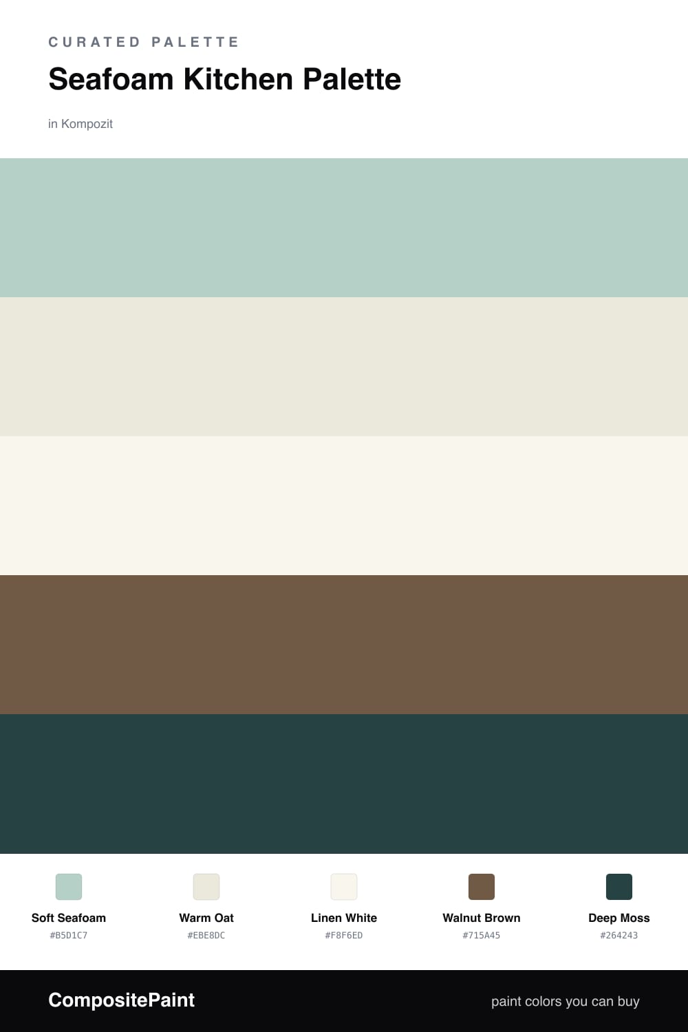
Think of Soft Seafoam as a color that can’t decide whether it’s green or gray, and that indecision is exactly what makes it work on cabinets. In flat morning light it reads almost dove-gray; when the sun comes through it warms into a gentle green. Because the pigment load is muted, it never tips into mint, which is the failure mode most people fear with a seafoam kitchen.
To keep that green honest, I surround it with warmth. Warm Oat on the walls is a creamy off-white with a beige undertone, so it carries light without going sterile. Linen White on the trim and ceiling is just a step cleaner, enough to draw a crisp line where cabinet meets wall. Then Walnut Brown on the floors and any open wood does the grounding — it’s the dark, roasted note that tells your eye the room is built on something solid.
The last move is restraint. Deep Moss is the anchor, a forest green so deep it nearly reads black across the room. Put it on one surface only — the island, say — and it pulls the whole scheme together without shouting. Used everywhere it would cocoon the room into shadow; used once it just gives the eye a place to rest.
Buy These Colors
Each color matched to the closest real paint in every brand, by ΔE2000. Kompozit first; take any SKU to the store — these mix on demand.
Questions
Not here. Seafoam sits between green and gray, so on its own it can read chilly, but the warm oat walls and walnut floors push it back toward soft and sunlit. The trick is keeping warm tones nearby so the green never goes minty.
Keep the darkest color on the smallest surface — an island front, one base cabinet run, or open shelving. Past roughly one-fifth of the room it stops being an accent and starts competing with the seafoam for the lead.
Similar Palettes
Closest schemes by color — not by label.