CP

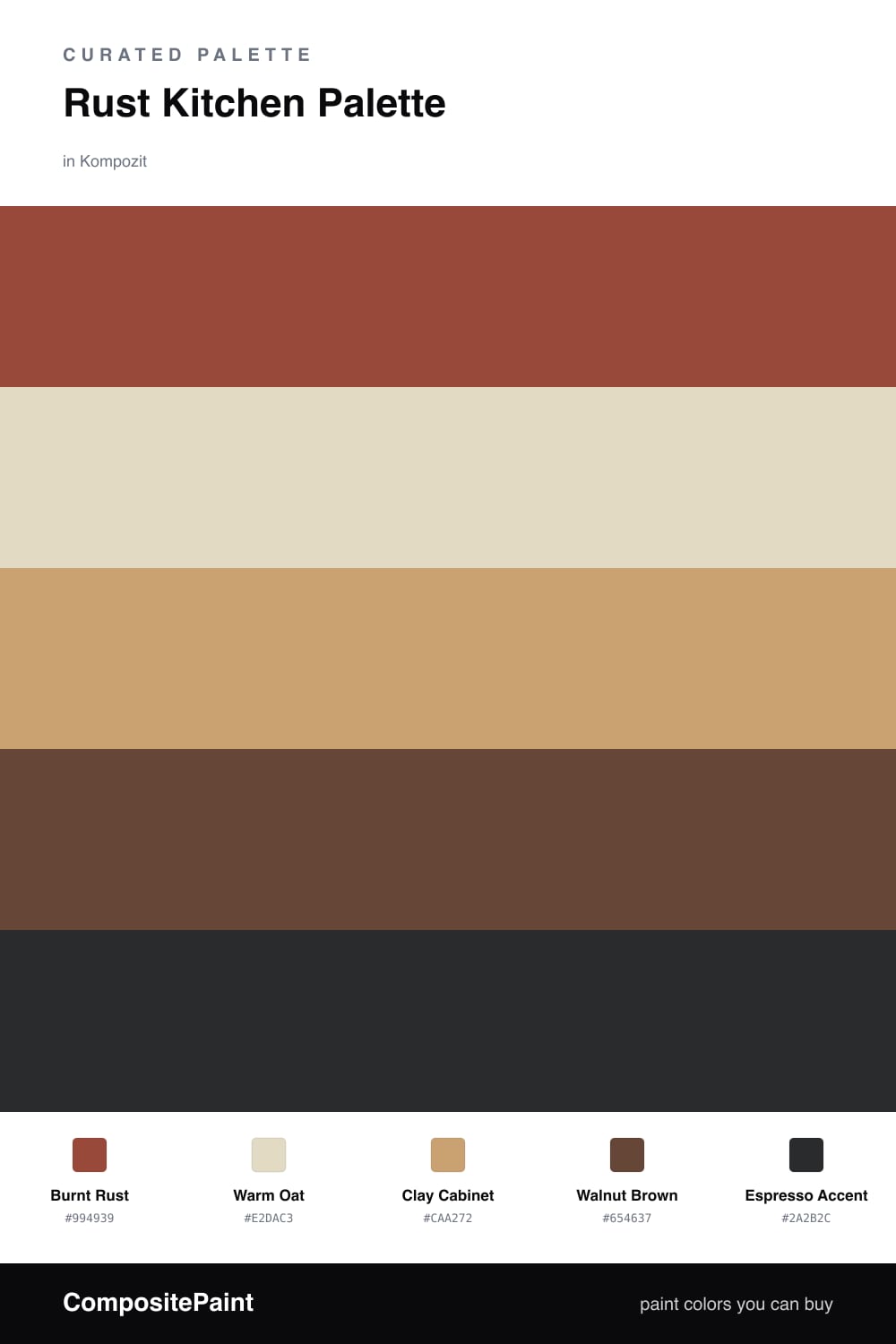
Rust Kitchen Palette — Burnt Rust & Warm Oat

A five-color kitchen scheme led by burnt rust walls, softened with warm oat and a clean white, then grounded by walnut wood and a deep espresso accent — every color matched to real paint you can buy.

By Jessica Williams · Color Stylist & Interior Editor

Burnt Rust
Walls
Kompozit Dark Marmalade · 1040
#994939
LRV 12
Warm Oat
Trim & Ceiling
Kompozit Mission Hills · 0363
#E2DAC3
LRV 70
Clay Cabinet
Cabinets
Kompozit Cinnamon Toast · 0246
#CAA272
LRV 40
Walnut Brown
Wood & Floors
Kompozit Hideaway · 0137
#654637
LRV 7
Espresso Accent
Accent
Kompozit Silent Sea · 0515
#2A2B2C
LRV 2
View palette in

Rust is having a real moment in the kitchen, and for good reason. Burnt Rust on the walls feels like late-afternoon light caught in clay, warm and a little spicy, the kind of color that makes a room feel lived-in from the first day. I like it as the lead on one strong surface, with Warm Oat softening the trim and ceiling so nothing closes in.

The cabinets carry Clay Cabinet, a sandy mid-tone that bridges the rust and the wood without competing with either. Underfoot and on open shelving, Walnut Brown grounds everything with honest, grainy warmth.

For the finishing notes, Espresso Accent shows up where you want a little weight, on a kitchen island, a band of lower cabinets, or hardware. It keeps the palette feeling current for 2026, where earthy and grounded beats glossy and cold every time.

Buy These Colors

Each color matched to the closest real paint in every brand, by ΔE2000. Kompozit first; take any SKU to the store — these mix on demand.

Burnt Rust
#9C4A2E · LRV 12 · Walls
Kompozit Dark Marmalade · 1040 ΔE 4.04
Backdrop Bahaus · BD-BH ΔE 9.69
Behr Smokin Hot · MQ1-24 ΔE 6.12
Benjamin Moore Rich Chestnut · 2090-20 ΔE 3.66
Clare Big Apple · PNT100-DP-30 ΔE 11.97
Dunn-Edwards Arabian Red · DEA155 ΔE 5.36
Farrow & Ball Incarnadine · No. 248 ΔE 9.93
Magnolia Home On Bosque · JG-36 ΔE 3.3
PPG / Glidden Rojo Colonial · 13-15 ΔE 5.69
Sherwin-Williams Spicy Hue · SW 6342 ΔE 2.03
Valspar Tropical Nut · 2003-5A ΔE 3.61
Warm Oat
#E6DAC4 · LRV 71 · Trim & Ceiling
Kompozit Mission Hills · 0363 ΔE 2.09
Backdrop Cookies & Cream · BD-CC ΔE 1.86
Behr Moongaze · MQ3-41 ΔE 1.3
Benjamin Moore Pale Almond · 951 ΔE 0.78
Clare Greenish · PNT100-LT-68 ΔE 4.56
Dunn-Edwards Cream Wave · DE6198 ΔE 0.55
Farrow & Ball Lime White · No. 1 ΔE 1.21
Magnolia Home Morning Snow · JG-167 ΔE 0.93
PPG / Glidden Almond Paste · 1103-2 ΔE 0.96
Sherwin-Williams Eaglet Beige · SW 7573 ΔE 1.72
Valspar Daybreak · 6008-3A ΔE 0.96
Clay Cabinet
#C9A47A · LRV 40 · Cabinets
Kompozit Cinnamon Toast · 0246 ΔE 1.64
Backdrop Rosita · BD-RO ΔE 14.23
Behr Butter Nut · HDC-AC-13 ΔE 0.7
Benjamin Moore Roxbury Caramel · HC-42 ΔE 0.61
Clare Good as Gold · PNT100-DP-59 ΔE 4.19
Dunn-Edwards Medallion · DEC729 ΔE 3.16
Farrow & Ball India Yellow · No. 66 ΔE 6.28
Magnolia Home Juniper Tree · JG-166 ΔE 9.86
PPG / Glidden Outback · 1088-5 ΔE 1.1
Sherwin-Williams Vintage Gold · SW 9024 ΔE 1.35
Valspar Roasted Cashew · M147 ΔE 0.94
Walnut Brown
#5A4030 · LRV 6 · Wood & Floors
Kompozit Hideaway · 0137 ΔE 3.26
Backdrop It's a Date · BD-IT ΔE 1.51
Behr Breakfast Blend · 280F-7 ΔE 3.21
Benjamin Moore Deep Taupe · 2111-10 ΔE 1.9
Clare Blackish · PNT100-DP-54 ΔE 12.88
Dunn-Edwards Northern Territory · DEA158 ΔE 3.52
Farrow & Ball Mahogany · No. 36 ΔE 8.33
Magnolia Home Wooded Acres · JG-122 ΔE 7.83
PPG / Glidden Racy Raisin · 16-24 ΔE 6.68
Sherwin-Williams Van Dyke Brown · SW 7041 ΔE 4.4
Valspar Roasted Coffee · 2009-10 ΔE 3.31
Espresso Accent
#2C211B · LRV 2 · Accent
Kompozit Silent Sea · 0515 ΔE 8.47
Backdrop Hocus Pocus · BD-HP ΔE 9.35
Behr Beluga · 770F-7 ΔE 12.95
Benjamin Moore Black · PM-9 ΔE 8.56
Clare Blackish · PNT100-DP-54 ΔE 13.28
Dunn-Edwards Black · DEA187 ΔE 9.97
Farrow & Ball Pitch Black · No. 256 ΔE 9.27
Magnolia Home Blackboard · JG-05 ΔE 11.54
PPG / Glidden Black Magic · 1001-7 ΔE 11.49
Sherwin-Williams Raisin · SW 7630 ΔE 6.6
Valspar Antique Burgundy · 1011-8 ΔE 8.15

Questions

Is rust too dark for a kitchen?

Not when you keep it on one main wall and let warm oat carry the trim and ceiling. The light neutral lifts the room while the rust adds depth, so the space feels cozy instead of heavy.

What metal finish suits this palette?

Aged brass or matte black both look right. Brass warms the rust and clay tones, while black ties back to the espresso accent for a crisper, more contemporary edge.

Similar Palettes

Closest schemes by color — not by label.