Rose Color Palette — Rose Ember
A soft five-color scheme led by a glowing rose, warmed with terracotta and grounded in clay and greige neutrals — every color matched to real paint you can buy.
By Emily Roberts · DIY Editor & First-Timer's Guide
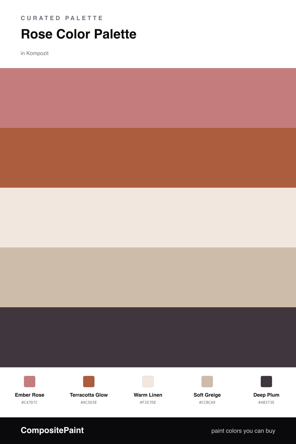
Rose has grown up. Ember Rose is the dusty, glowing heart of this scheme — warm enough to feel cozy but muted enough to read sophisticated, not sweet. It is the color you want on the biggest surfaces, where it can quietly set the mood.
From there, Terracotta Glow turns up the warmth like a low fire, while Warm Linen and Soft Greige give your eye somewhere calm to land. These two neutrals are the unsung heroes — they let the rose stay center stage without the room feeling like too much.
For the finishing touch, a little Deep Plum adds depth and a moody edge that feels very 2026. Use it sparingly, on a frame or a single accent, and the whole palette snaps into focus.
Buy These Colors
Each color matched to the closest real paint in every brand, by ΔE2000. Kompozit first; take any SKU to the store — these mix on demand.
Questions
Pair it with earthy partners instead of pastels. Here the rose leans dusty and slightly muted, and the terracotta and greige keep it grounded — that mix reads warm and current rather than girly.
Let rose lead at roughly two-thirds of the space, then bring in the linen and greige to rest your eye. Save the deep plum for the smallest touches like a frame, a pillow, or trim.
Similar Palettes
Closest schemes by color — not by label.