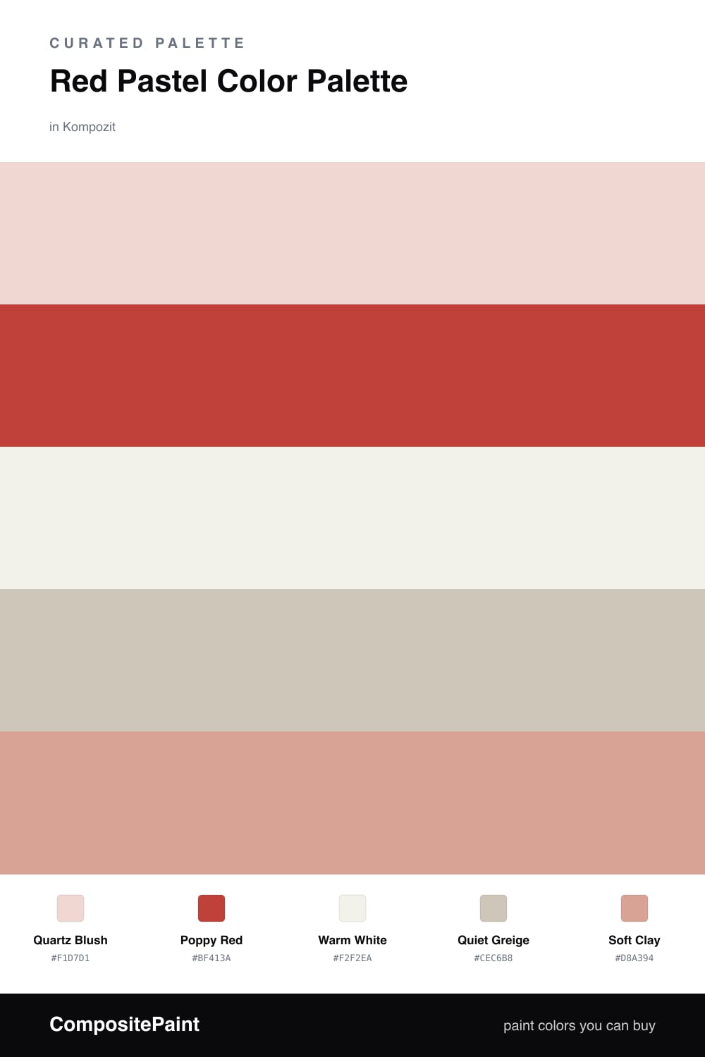
Red Pastel Color Palette — Quartz Blush
A soft four-color scheme pairing a true poppy red with a powdery quartz pink, calmed by warm white and a quiet greige — every color matched to real paint you can buy.
By Jessica Williams · Color Stylist & Interior Editor
Red can feel loud, but it does not have to. This scheme starts with Quartz Blush, a powdery, barely-there pink that reads soft and grown-up rather than sweet. It is the kind of pastel that feels current in 2026 because it carries a little warmth and a little dust, so it never tips into nursery territory.
Against that quiet field, Poppy Red is the spark. Use it in small, confident doses and it makes the whole room feel intentional. Warm White keeps everything breathing, Quiet Greige adds a grounded mid-tone, and Soft Clay bridges the gap between the blush and the red so the jump never feels abrupt.
The trick is restraint. Let the blush do the heavy lifting, keep the red to one chair, one door, or one stack of books, and you get a palette that feels both gentle and alive.
Buy These Colors
Each color matched to the closest real paint in every brand, by ΔE2000. Kompozit first; take any SKU to the store — these mix on demand.
Questions
They are the same family seen at two volumes. The pastel quartz is poppy red with most of its intensity dialed back, so the bright accent feels like a natural deepening rather than a clash.
Let the pastel quartz lead across the big surfaces and save the poppy red for one or two small moments. A rough 80/20 split keeps the red feeling like a treat, not a takeover.
Similar Palettes
Closest schemes by color — not by label.