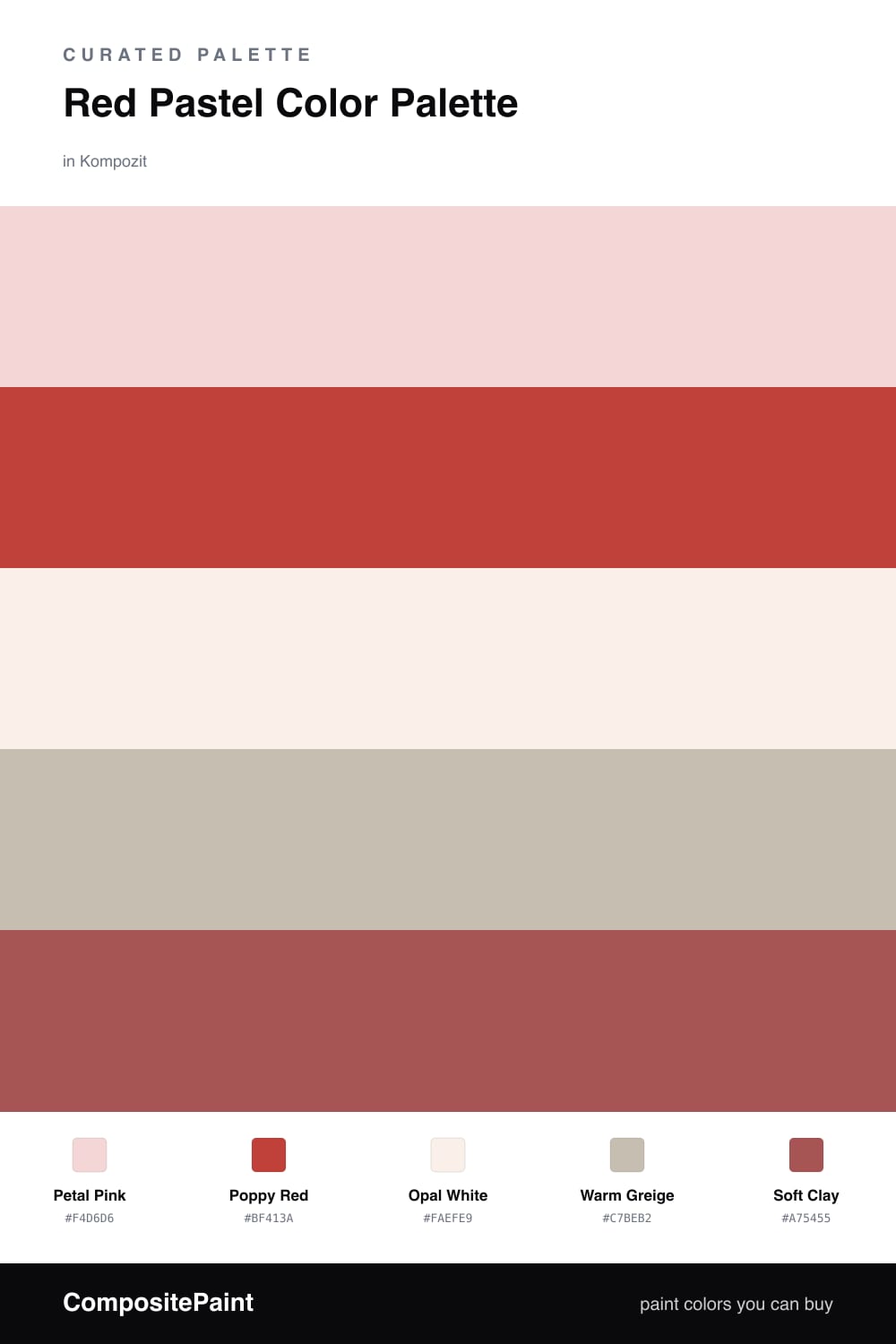
Red Pastel Color Palette — Opal Blush
A soft five-color scheme pairing a true poppy red with airy pastel pink, settled on warm whites and a smoky greige, every color matched to real paint you can buy.
By Maya Patel · Reviews Editor & Product Tester
Red can scare people, so here is the easy way in. Petal Pink carries most of the scheme as a soft, barely-there blush, and a confident Poppy Red shows up only where you want a punch. Same family, two volumes, zero fighting.
Opal White keeps everything light and current, while Warm Greige adds a grown-up shadow so the pink never tips into nursery territory. A little Soft Clay at the edges ties the pink and red together and reads very 2026, warm, earthy, and quietly polished.
My take, this is the most forgiving way to use red at home. Paint the walls pink, save the poppy for a door, a chair, or a single shelf, and let the neutrals breathe.
Buy These Colors
Each color matched to the closest real paint in every brand, by ΔE2000. Kompozit first; take any SKU to the store — these mix on demand.
Questions
They are the same hue at different strengths. Pastel pink is just red dialed way down, so a bold poppy red feels like a natural turn-up of the same note rather than a clash.
Let the pink lead and keep the red small. Think roughly a 70/30 split with the whites and greige doing the quiet work, so the red reads as a spark and never takes over.
Similar Palettes
Closest schemes by color — not by label.