CP

Red Pastel Color Palette — Marsh Blush

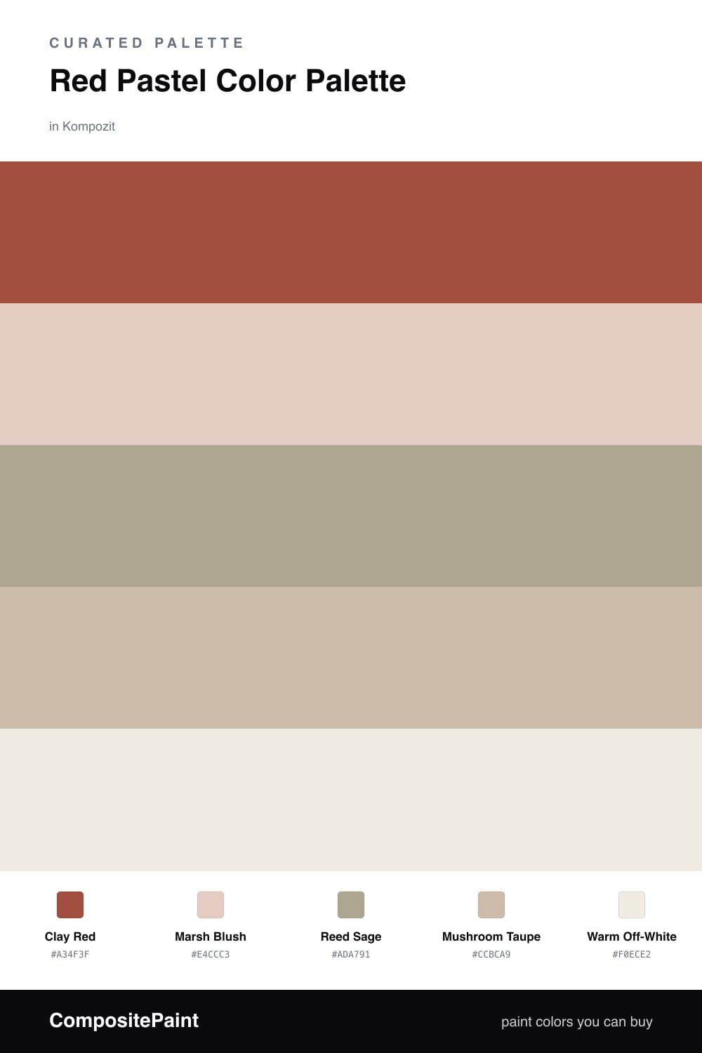
A soft five-color scheme pairing a true clay red with a tender blush pastel, settled into sage, mushroom, and off-white — every color matched to real paint you can buy.

By Jessica Williams · Color Stylist & Interior Editor

Clay Red
Dominant
Kompozit Carrot Cake · 1054
#A34F3F
LRV 14
Marsh Blush
Secondary
Kompozit Pout · 0125
#E4CCC3
LRV 64
Reed Sage
Base
Kompozit Historic Shade · 0372
#ADA791
LRV 39
Mushroom Taupe
Support
Kompozit Moth Wing · 0183
#CCBCA9
LRV 52
Warm Off-White
Accent
Kompozit Queen Anne's Lace · 0558
#F0ECE2
LRV 84
View palette in

This is a red that feels lived-in rather than loud. Clay Red has the dusty, earthen warmth of a sun-baked wall, and it sets the whole mood. Next to it, Marsh Blush does the soft work — a pale, powdery pink that reads like the red caught in morning light.

To keep the warmth honest, I lean on Reed Sage, a muted grey-green that cools the palette the way reeds soften the edge of water. Mushroom Taupe fills the quiet middle, and Warm Off-White opens everything back up so the red never feels heavy.

It is a 2026 kind of scheme — grounded, a little imperfect, more felt than styled. Give the clay red one confident moment, let the blush breathe around it, and the neutrals will carry the calm.

Buy These Colors

Each color matched to the closest real paint in every brand, by ΔE2000. Kompozit first; take any SKU to the store — these mix on demand.

Clay Red
#A8453C · LRV 13 · Dominant
Kompozit Carrot Cake · 1054 ΔE 3.27
Backdrop Bahaus · BD-BH ΔE 4.62
Behr Colorful Leaves · M190-7 ΔE 2.15
Benjamin Moore King's Red · CW-335 ΔE 0.83
Clare Big Apple · PNT100-DP-30 ΔE 9.1
Dunn-Edwards Red Revival · DEA154 ΔE 0.34
Farrow & Ball Incarnadine · No. 248 ΔE 4.11
Magnolia Home Hopscotch · JG-31 ΔE 1.41
PPG / Glidden Rum Punch · 1190-7 ΔE 0.76
Sherwin-Williams Antique Red · SW 7587 ΔE 3.34
Valspar Red Ochre · 2011-4 ΔE 1.11
Marsh Blush
#EBC9C2 · LRV 63 · Secondary
Kompozit Pout · 0125 ΔE 3.8
Backdrop August · BD-AU ΔE 5.42
Behr Tapestry Beige · S210-2 ΔE 2.87
Benjamin Moore Rose Blush · 037 ΔE 0.88
Clare Pop · PNT100-LT-26 ΔE 5.04
Dunn-Edwards Galveston Tan · DE6101 ΔE 4.34
Farrow & Ball Calamine · No. 230 ΔE 4.54
Magnolia Home Ella Rose · JG-24 ΔE 5.51
PPG / Glidden Tangy Taffy · 1058-3 ΔE 1.62
Sherwin-Williams Quaint Peche · SW 6330 ΔE 3.28
Valspar Harmony · 2001-8C ΔE 1.69
Reed Sage
#A7AD96 · LRV 40 · Base
Kompozit Historic Shade · 0372 ΔE 5.69
Backdrop Le Freak · BD-LF ΔE 0.81
Behr Garden Wall · 730D-4 ΔE 1.13
Benjamin Moore Weekend Getaway · 473 ΔE 0.99
Clare Mellow Mood · PNT100-DP-78 ΔE 7.94
Dunn-Edwards Shaggy Barked · DEC771 ΔE 7.07
Farrow & Ball French Gray · No. 18 ΔE 4.83
Magnolia Home Seasonal · JG-51 ΔE 2.46
PPG / Glidden Olive Sprig · 1125-4 ΔE 1.72
Sherwin-Williams Clary Sage · SW 6178 ΔE 2.26
Valspar Cool Pine · 8003-30D ΔE 1.75
Mushroom Taupe
#C9BBA8 · LRV 51 · Support
Kompozit Moth Wing · 0183 ΔE 1.02
Backdrop Boy Meets Girl · BD-BG ΔE 11.2
Behr Celery Powder · PPU8-18 ΔE 3.38
Benjamin Moore Brick House Tan · CW-145 ΔE 1.53
Clare Greige · PNT100-LT-13 ΔE 5.69
Dunn-Edwards Rustic Taupe · DE6129 ΔE 2.52
Farrow & Ball Drop Cloth · No. 283 ΔE 1.6
Magnolia Home Solid Wood · JG-109 ΔE 1.99
PPG / Glidden Stonington · 15-25 ΔE 1
Sherwin-Williams Dhurrie Beige · SW 7524 ΔE 1.22
Valspar Dust Bunny · 2005-10B ΔE 4.31
Warm Off-White
#F3EDE3 · LRV 85 · Accent
Kompozit Queen Anne's Lace · 0558 ΔE 1.04
Backdrop Jane · BD-JA ΔE 2
Behr Bleached Linen · PPU5-09 ΔE 0.81
Benjamin Moore White Dove · OC-17 ΔE 2.38
Clare Wing It · PNT100-LT-24 ΔE 2.16
Dunn-Edwards Tea Biscuit · DE6120 ΔE 1.96
Farrow & Ball Pointing · No. 2003 ΔE 1.92
Magnolia Home Silos White · JG-107 ΔE 2.05
PPG / Glidden Atrium White · 1020-1 ΔE 1.49
Sherwin-Williams Westhighland White · SW 7566 ΔE 0.79
Valspar Dove White · 7002-7 ΔE 0.5

Questions

Why do a deep red and a soft blush work together?

They are the same warm family, just turned up and turned down. The blush is a quiet echo of the clay red, so the pairing feels gathered rather than busy, and the sage keeps it from going too sweet.

How much of the red should I actually use?

Let it lead but stay in the minority — think one-fifth of the space. The red carries the mood on a single wall or a few pieces, while the off-white and taupe hold most of the room.

Similar Palettes

Closest schemes by color — not by label.