CP

Purple & Grey Color Palette — Purple Grey Fog

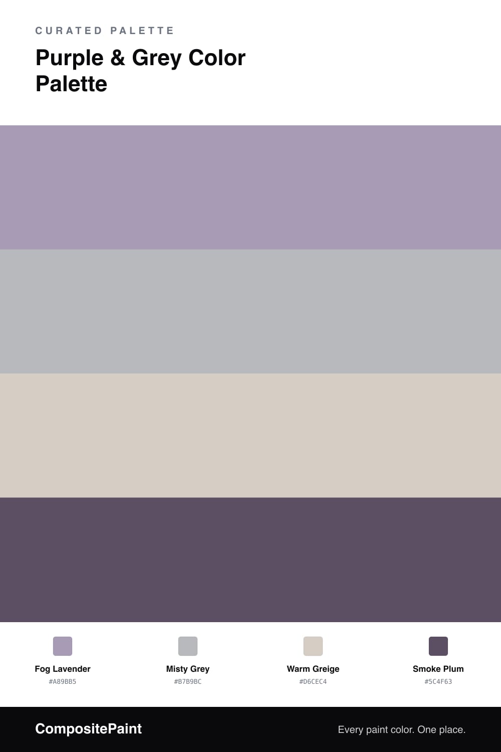
A soft four-color scheme pairing a muted lavender purple with cool fog grey, warmed by greige and a smoky plum accent — every color matched to real paint you can buy.

By Emily Roberts · DIY Editor & First-Timer's Guide

Purple and grey is one of those quiet, grown-up pairings that feels right at home in 2026 — soft, a little moody, and never loud. This scheme leads with Fog Lavender, a dusty purple that reads almost like a tinted grey in low light, so it never tips into sweet or girly.

Misty Grey sits right beside it as the steady second, close enough in tone that the two melt together instead of competing. A Warm Greige base keeps the whole thing grounded and stops the cool colors from feeling cold — that little bit of brown is what makes the palette feel cozy.

Then Smoke Plum comes in as the accent, the deepest note in the bunch. Save it for the small stuff — a door, some trim, a bit of cabinetry — and let the three softer colors carry the room. That balance is the whole trick here.

View palette in
Fog Lavender
Dominant
Dutch Boy Rosy Purple · 244-3DB
#A497B2
LRV 33
Misty Grey
Secondary
Rust-Oleum Aged Gray · 285143
#B6B9BE
LRV 48
Warm Greige
Base
Sherwin-Williams Modern Gray · SW 7632
#D6CEC3
LRV 62
Smoke Plum
Accent
Portola Paints Future Legend · Future Legend
#5E505E
LRV 9

Buy These Colors

Each color matched to the closest real paint in every brand, by ΔE2000. Tap a swatch for its full guide or + to save it — take any SKU to the store, they mix on demand.

Fog Lavender
#A89BB5 · LRV 35 · Dominant
Sherwin-Williams · SW 6549 · ΔE 4.86
Behr · PPU16-12 · ΔE 2.68
Benjamin Moore · 1383 · ΔE 2.66
Valspar · 4001-4A · ΔE 4.37
PPG / Glidden · PPG1179-5 · ΔE 6.85
Glidden · 10RB 36/082 · ΔE 4.4
Dutch Boy · 244-3DB · ΔE 1.27
HGTV Home by Sherwin-Williams · HGSW 2415 · ΔE 4.86
Dunn-Edwards · DE5955 · ΔE 2.46
Magnolia Home · JG-84 · ΔE 18.14
Farrow & Ball · NO. 265 · ΔE 15.29
Diamond Vogel · 1199 · ΔE 4.03
Hirshfield's · 1297 · ΔE 1.89
Rodda · R104 · ΔE 8.99
C2 Paint · C2-781 · ΔE 4.08
Clare · PNT100-LT-32 · ΔE 8.5
Portola Paints · TWIN PEAKS · ΔE 15.58
Annie Sloan · DUCK EGG BLUE · ΔE 23.19
Backdrop · BD-NU · ΔE 20.81
Rust-Oleum · 371675 · ΔE 22.27
Kompozit · 1297 · ΔE 1.89
Misty Grey
#B7B9BC · LRV 48 · Secondary
Sherwin-Williams · SW 2832 · ΔE 2.54
Behr · N460-3 · ΔE 1.89
Benjamin Moore · 1592 · ΔE 2.95
Valspar · 4006-1B · ΔE 1.92
PPG / Glidden · PPG0995-4 · ΔE 3.26
Glidden · PPG0995-4 · ΔE 2.73
Dutch Boy · 438-3DB · ΔE 3.81
HGTV Home by Sherwin-Williams · HGSW 1454 · ΔE 2.75
Dunn-Edwards · DE6367 · ΔE 1.63
Magnolia Home · JG-123 · ΔE 3.99
Farrow & Ball · NO. 22 · ΔE 6.08
Diamond Vogel · 0518 · ΔE 1.37
Hirshfield's · 0518 · ΔE 1.1
Rodda · CA183 · ΔE 5.88
C2 Paint · C2-990 · ΔE 3.36
Clare · PNT100-LT-13 · ΔE 6.56
Portola Paints · MAGIC POTION · ΔE 4.85
Annie Sloan · CHICAGO GREY · ΔE 2.23
Backdrop · BD-UD · ΔE 6.47
Rust-Oleum · 285143 · ΔE 1.03
Kompozit · 0518 · ΔE 1.1
Warm Greige
#D6CEC4 · LRV 62 · Base
Sherwin-Williams · SW 7632 · ΔE 0.47
Behr · MQ3-06 · ΔE 0.5
Benjamin Moore · 859 · ΔE 1.53
Valspar · 8005-2B · ΔE 1.47
PPG / Glidden · PPG18-02 · ΔE 2.08
Glidden · PPG18-02 · ΔE 1.72
Dutch Boy · 440-1DB · ΔE 0.52
HGTV Home by Sherwin-Williams · HGSW 2477 · ΔE 0.67
Dunn-Edwards · DEC786 · ΔE 1.42
Magnolia Home · JG-55 · ΔE 4.43
Farrow & Ball · NO. 300 · ΔE 1.38
Diamond Vogel · 0560 · ΔE 1.38
Hirshfield's · 0572 · ΔE 2.59
Rodda · CA032 · ΔE 1.27
C2 Paint · C2-912 · ΔE 3.29
Clare · PNT100-LT-17 · ΔE 0.88
Portola Paints · FIGUEROA · ΔE 2.07
Annie Sloan · OLD OCHRE · ΔE 8.39
Backdrop · BD-RR · ΔE 3.32
Rust-Oleum · 285142 · ΔE 8.32
Kompozit · 0572 · ΔE 2.59
Smoke Plum
#5C4F63 · LRV 9 · Accent
Sherwin-Williams · SW 9689 · ΔE 4.01
Behr · MQ5-38 · ΔE 2.86
Benjamin Moore · 2072-30 · ΔE 3.22
Valspar · 8004-47F · ΔE 8.52
PPG / Glidden · PPG1173-7 · ΔE 3.72
Glidden · PPG1173-7 · ΔE 3.6
Dutch Boy · 344-6DB · ΔE 3.6
HGTV Home by Sherwin-Williams · HGSW 3392 · ΔE 7.16
Dunn-Edwards · DE5958 · ΔE 2.68
Magnolia Home · JG-96 · ΔE 12.2
Farrow & Ball · NO. W40 · ΔE 5.83
Diamond Vogel · 1292 · ΔE 2.88
Hirshfield's · 1227 · ΔE 2.65
Rodda · R102 · ΔE 11.16
C2 Paint · C2-505 · ΔE 7.75
Clare · PNT100-DP-77 · ΔE 5.12
Portola Paints · FUTURE LEGEND · ΔE 2.6
Annie Sloan · RODMELL · ΔE 5.32
Backdrop · BD-WK · ΔE 15.5
Rust-Oleum · 391445 · ΔE 24.95
Kompozit · 1227 · ΔE 2.65

Questions

Will purple and grey look too cold together?

Not if you warm it up. The greige base in this scheme carries a little brown, so it softens the cool lavender and grey and keeps the room feeling calm rather than chilly. If you want even more warmth, lean on the greige for the largest surfaces.

Where should the plum accent go?

Use Smoke Plum in small, deliberate doses — a door, a single shelf, or trim. It is the deepest color here, so a little reads as intentional and a lot can feel heavy. Think one-fifth of the room at most.

KEEP EXPLORING

Similar Palettes

Closest schemes by color — not by label.