CP

Pink & Green Color Palette — Watermelon Crush

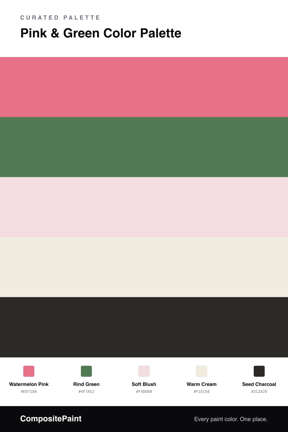
A fresh five-color scheme pairing juicy watermelon pink with leafy green, balanced by soft cream and a crisp charcoal seed — every color matched to real paint you can buy.

By David Chen · Formulation Lead & Resident Chemist

Pink and green is one of those pairings that feels risky until you see it done right, and then it just feels alive. The trick is in the temperature. A juicy Watermelon Pink leads here, warm and a little dusty rather than neon, so it sits comfortably next to a deep Rind Green that grounds it like the skin around the fruit.

The quiet work happens in between. Soft Blush and Warm Cream spread across the largest surfaces so the two brights have somewhere to rest, which is what keeps this scheme from tipping into something too sweet. A touch of Seed Charcoal does the rest, sharpening edges and giving your eye a place to land.

For a 2026 read, keep the pink slightly muted and let the green do more than you expect. Use the pink as your dominant color in confident but limited doses, bring the green in on the pieces you touch, and let the neutrals carry everything else.

View palette in
Watermelon Pink
Dominant
Valspar So Charming · 1005-1B
#EB768F
LRV 33
Rind Green
Secondary
Dunn-Edwards Spring Juniper · DEA128
#4A754A
LRV 14
Soft Blush
Base
Valspar Piglet · V005-1
#F4DEE0
LRV 77
Warm Cream
Support
C2 Paint Reflection · C2-676
#F0EBDF
LRV 83
Seed Charcoal
Accent
Portola Paints Factory Black · Factory Black
#262625
LRV 2

Buy These Colors

Each color matched to the closest real paint in every brand, by ΔE2000. Tap a swatch for its full guide or + to save it — take any SKU to the store, they mix on demand.

Watermelon Pink
#E8718A · LRV 31 · Dominant
Sherwin-Williams · SW 6858 · ΔE 1.76
Behr · 170D-5 · ΔE 2.17
Benjamin Moore · 1320 · ΔE 6.08
Valspar · 1005-1B · ΔE 1.33
PPG / Glidden · PPG1184-5 · ΔE 2.25
Glidden · 74RR 28/432 · ΔE 1.56
Dutch Boy · 103-5DB · ΔE 3.47
HGTV Home by Sherwin-Williams · HGSW 1034 · ΔE 4.34
Dunn-Edwards · DE5061 · ΔE 1.66
Magnolia Home · JG-35 · ΔE 21.06
Farrow & Ball · NO. 9811 · ΔE 13.94
Diamond Vogel · 1108 · ΔE 2.12
Hirshfield's · 1108 · ΔE 2.48
Rodda · CA223 · ΔE 22.1
C2 Paint · BD59 · ΔE 3.9
Clare · PNT100-MD-28 · ΔE 11.04
Portola Paints · MESA · ΔE 18.87
Annie Sloan · SCANDINAVIAN PINK · ΔE 13.84
Backdrop · BD-RO · ΔE 16.27
Rust-Oleum · 398640 · ΔE 26.59
Kompozit · 1108 · ΔE 2.48
Rind Green
#4F7A52 · LRV 16 · Secondary
Sherwin-Williams · SW 6445 · ΔE 3.38
Behr · 470F-6 · ΔE 2.73
Benjamin Moore · 434 · ΔE 6.06
Valspar · V062-5 · ΔE 3.6
PPG / Glidden · PPG1131-7 · ΔE 2.94
Glidden · PPG1131-7 · ΔE 3.11
Dutch Boy · 227-5DB · ΔE 6.12
HGTV Home by Sherwin-Williams · HGSW 2263 · ΔE 3.38
Dunn-Edwards · DEA128 · ΔE 2.18
Magnolia Home · JG-71 · ΔE 8.63
Farrow & Ball · NO. 9817 · ΔE 4.16
Diamond Vogel · 0725 · ΔE 3.5
Hirshfield's · 0725 · ΔE 2.38
Rodda · CA179 · ΔE 12.03
C2 Paint · C2-680 · ΔE 12.82
Clare · PNT100-DP-61 · ΔE 8.79
Portola Paints · WONDERLAND · ΔE 15.6
Annie Sloan · OLIVE · ΔE 16.45
Backdrop · BD-OS · ΔE 13.99
Rust-Oleum · 391445 · ΔE 14.07
Kompozit · 0725 · ΔE 2.38
Soft Blush
#F4DDE0 · LRV 76 · Base
Sherwin-Williams · SW 6588 · ΔE 2.1
Behr · 220E-1 · ΔE 1.36
Benjamin Moore · 1359 · ΔE 0.65
Valspar · V005-1 · ΔE 0.61
PPG / Glidden · PPG1181-1 · ΔE 0.79
Glidden · PPG1181-1 · ΔE 1.14
Dutch Boy · 103-2DB · ΔE 1.04
HGTV Home by Sherwin-Williams · HGSW 1057 · ΔE 2.51
Dunn-Edwards · DE6043 · ΔE 4.06
Magnolia Home · JG-22 · ΔE 12.85
Farrow & Ball · NO. 245 · ΔE 2.72
Diamond Vogel · 1139 · ΔE 0.68
Hirshfield's · 1139 · ΔE 1.36
Rodda · CA020 · ΔE 10.96
C2 Paint · C2-514 · ΔE 6.74
Clare · PNT100-LT-25 · ΔE 4.03
Portola Paints · ELLIE · ΔE 9.56
Annie Sloan · OLD OCHRE · ΔE 16.71
Backdrop · BD-JA · ΔE 12.95
Rust-Oleum · 285142 · ΔE 4.32
Kompozit · 1139 · ΔE 1.36
Warm Cream
#F1ECE0 · LRV 84 · Support
Sherwin-Williams · SW 7551 · ΔE 0.86
Behr · DC-003 · ΔE 0.52
Benjamin Moore · AF-35 · ΔE 1.19
Valspar · 7003-16 · ΔE 0.75
PPG / Glidden · PPG1208-1 · ΔE 0.99
Glidden · 50YY 83/057 · ΔE 0.77
Dutch Boy · 019W · ΔE 0.56
HGTV Home by Sherwin-Williams · HGSW 4030 · ΔE 0.86
Dunn-Edwards · DEW339 · ΔE 1.22
Magnolia Home · JG-33 · ΔE 1.91
Farrow & Ball · NO. 2003 · ΔE 0.77
Diamond Vogel · 0356 · ΔE 0.99
Hirshfield's · 0003 · ΔE 0.79
Rodda · CA007 · ΔE 0.56
C2 Paint · C2-676 · ΔE 0.21
Clare · PNT100-LT-12 · ΔE 4.7
Portola Paints · KASHMIR · ΔE 2.02
Annie Sloan · OLD OCHRE · ΔE 11.34
Backdrop · BD-JA · ΔE 1.48
Rust-Oleum · 329598 · ΔE 4.36
Kompozit · 0003 · ΔE 0.79
Seed Charcoal
#2C2A28 · LRV 2 · Accent
Sherwin-Williams · SW 6258 · ΔE 2.69
Behr · 770F-7 · ΔE 6.49
Benjamin Moore · PM-9 · ΔE 2.59
Valspar · 4011-2 · ΔE 3.59
PPG / Glidden · PPG0995-7 · ΔE 6.32
Glidden · 00NN 05/000 · ΔE 5.84
Dutch Boy · 438-7DB · ΔE 2.69
HGTV Home by Sherwin-Williams · HGSW 1441 · ΔE 2.69
Dunn-Edwards · DEA002 · ΔE 5.3
Magnolia Home · JG-05 · ΔE 6.24
Farrow & Ball · NO. G18 · ΔE 5.94
Diamond Vogel · H101 · ΔE 5.59
Hirshfield's · 0515 · ΔE 2.55
Rodda · CA210 · ΔE 9.33
C2 Paint · BD49 · ΔE 8.84
Clare · PNT100-DP-54 · ΔE 9.38
Portola Paints · FACTORY BLACK · ΔE 1.95
Annie Sloan · NAPOLEONIC BLUE · ΔE 18.03
Backdrop · BD-HP · ΔE 5.83
Rust-Oleum · 285144 · ΔE 6.97
Kompozit · 0515 · ΔE 2.55

Questions

how do I keep pink and green from looking too playful?

Lean on the neutrals. Let the soft blush and cream cover most of the wall area, use the watermelon pink in real but limited doses, and let the rind green show up in smaller pieces like a door or cabinet. The seed charcoal sharpens the whole thing so it reads grown-up rather than candy-like.

which color should lead in a pink and green scheme?

Pick one and commit. Here the watermelon pink is the lead at roughly a 60/40 split over the green, with the cream and blush doing the quiet background work so the two brights never compete head to head.

KEEP EXPLORING

Similar Palettes

Closest schemes by color — not by label.