PROFESSIONAL-GRADE PAINT
ONE COAT COVERAGE
MADE FOR REAL RESULTS
CompositePaint

Pastel Rainbow Playroom Palette — Soft Blush, Mint & Butter

A happy pastel playroom mixing soft blush, mint, butter yellow, powder blue, and crisp white — cheerful, gentle, and fun without the sugar rush. Every color matched to real paint you can buy.

By Jessica Williams · Color Stylist & Interior Editor

Soft Blush
Accent Wall
Kompozit Rose Shadow · 0082
#F4D6D6
LRV 72
Pale Mint
Accent Wall
Kompozit Raindance · 0474
#D6DED5
LRV 71
Butter Yellow
Accent
Kompozit Autumn Child · 0909
#FBE6C1
LRV 81
Powder Blue
Accent
Kompozit Simple Serenity · 0614
#C8D9E5
LRV 68
Crisp White
Main Walls & Trim
Kompozit Sugar Dust · 0011
#F8F6ED
LRV 92
View palette in

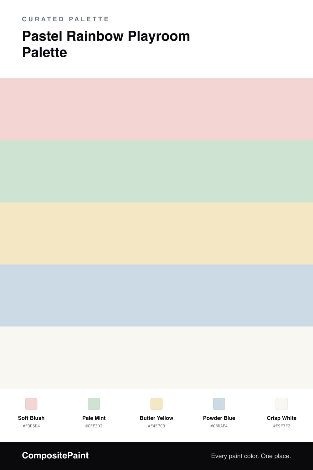
A pastel rainbow is the happiest a kids’ room can get without tipping into a sugar rush. The trick is softness — these blush, mint, butter, and powder-blue tints are all gentle and slightly grayed, so together they feel cheerful and sweet rather than loud and primary.

A crisp white carries most of the walls and trim, and that’s the secret to keeping five colors calm. The white gives everything room to breathe, so the pastels land as happy little pops instead of a wall of noise.

From there, sprinkle the color where it counts: one blush or mint accent wall, plus butter yellow and powder blue through bins, furniture, art, and bedding. Spread the rainbow across small things and the room stays playful, pretty, and easy to grow with. White leads, and the pastels just bring the joy.

Buy These Colors

Each color matched to the closest real paint in every brand, by ΔE2000. Kompozit first; take any SKU to the store — these mix on demand.

Soft Blush
#F3D6D4 · LRV 72 · Accent Wall
Kompozit Rose Shadow · 0082 ΔE 0.98
Backdrop Cookies & Cream · BD-CC ΔE 15.48
Behr Resort Sunrise · M180-2 ΔE 2.11
Benjamin Moore Rose Rococo · 1275 ΔE 0.23
Clare Baby Soft · PNT100-LT-25 ΔE 4.32
Dunn-Edwards Tan Whirl · DE6086 ΔE 3.62
Farrow & Ball Pink Ground · No. 202 ΔE 6.63
Magnolia Home Dutch Tulip · JG-34 ΔE 10.01
PPG / Glidden Scented Valentine · 1187-1 ΔE 1.28
Sherwin-Williams Alyssum · SW 6589 ΔE 1.75
Valspar Gentle Kiss · V080-1 ΔE 2.11
Pale Mint
#CFE3D2 · LRV 73 · Accent Wall
Kompozit Raindance · 0474 ΔE 5.65
Backdrop Cookies & Cream · BD-CC ΔE 11.59
Behr Flora · N390-2 ΔE 2.15
Benjamin Moore Leisure Green · 2035-60 ΔE 2.2
Clare Headspace · PNT100-LT-34 ΔE 5.73
Dunn-Edwards Green Mirror · DEC784 ΔE 3.64
Farrow & Ball Pale Powder · No. 204 ΔE 7.34
Magnolia Home Mineral Green · JG-67 ΔE 2.97
PPG / Glidden Peppermint Patty · 1226-2 ΔE 0.7
Sherwin-Williams Mint Condition · SW 6743 ΔE 0.67
Valspar Ultra Green · 6002-9A ΔE 2.21
Butter Yellow
#F4E7C3 · LRV 80 · Accent
Kompozit Autumn Child · 0909 ΔE 3.14
Backdrop Don't Eat the Yellow Snow · BD-DS ΔE 3.86
Behr Lightweight Beige · 330C-2 ΔE 1.23
Benjamin Moore Happy Valley · 212 ΔE 0.45
Clare Like Buttah · PNT100-LT-62 ΔE 5.98
Dunn-Edwards Melted Wax · DE6163 ΔE 1.8
Farrow & Ball House White · No. 2012 ΔE 1.79
Magnolia Home Ambient Light · JG-38 ΔE 1.71
PPG / Glidden Sausalito · 1209-2 ΔE 1.75
Sherwin-Williams Lily · SW 6693 ΔE 1.13
Valspar Desert Flower · 6008-5A ΔE 0.9
Powder Blue
#CBDAE4 · LRV 68 · Accent
Kompozit Simple Serenity · 0614 ΔE 0.96
Backdrop Real Real · BD-RR ΔE 14.31
Behr Siberian Ice · MQ3-57 ΔE 2.02
Benjamin Moore Breath of Fresh Air · 806 ΔE 2.43
Clare Nairobi Blue · PNT100-LT-36 ΔE 5.45
Dunn-Edwards Snow Lodge · DE5799 ΔE 1.05
Farrow & Ball Borrowed Light · No. 235 ΔE 5.14
Magnolia Home Yarn · JG-132 ΔE 9.79
PPG / Glidden Dartmoor Mist · 1154-3 ΔE 1.49
Sherwin-Williams Rhythmic Blue · SW 6806 ΔE 0.23
Valspar Blue Tulle · P036 ΔE 0.88
Crisp White
#F9F7F2 · LRV 93 · Main Walls & Trim
Kompozit Sugar Dust · 0011 ΔE 1.9
Backdrop Tabula Rasa · BD-TR ΔE 3
Behr Ultra Pure White® · PPU18-06 ΔE 1
Benjamin Moore Snowfall White · 2144-70 ΔE 2.65
Clare Whipped · PNT100-LT-02 ΔE 1.61
Dunn-Edwards Milk Glass · DEW358 ΔE 0.94
Farrow & Ball All White · No. 2005 ΔE 0.85
Magnolia Home True White · JG-21 ΔE 1.52
PPG / Glidden Delicate White · 1001-1 ΔE 1.84
Sherwin-Williams High Reflective White · SW 7757 ΔE 1.22
Valspar Ultra White · 7006-24 ΔE 1

Questions

won't five colors make a playroom feel chaotic?

Not if white does the heavy lifting. Keep most of the walls and trim white, then bring in the blush, mint, butter, and blue in smaller doses — one accent wall, furniture, bins, or art. The white space keeps the rainbow cheerful instead of busy.

how do i keep pastel rainbow from looking like a daycare?

Choose soft, slightly grayed tints rather than bright primaries, like the ones here. Muted pastels read as gentle and design-forward, so the room feels playful and pretty rather than loud and plasticky.

Similar Palettes

Closest schemes by color — not by label.