CP

Spring Color Palette — Fresh Bud

A five-color spring scheme of soft green, blossom pink, buttery yellow, and sky blue grounded by a clean off-white — every color matched to real paint you can buy.

By Jessica Williams · Color Stylist & Interior Editor

New Leaf Green
Dominant
Kompozit Belladonna's Leaf · 0743
#ADC3A7
LRV 51
Blossom Pink
Secondary
Kompozit Rose Shadow · 0082
#F4D6D6
LRV 72
Buttered Daffodil
Support
Kompozit Sweetie Pie · 0804
#F5E5B5
LRV 79
First Sky Blue
Accent
Kompozit Simple Serenity · 0614
#C8D9E5
LRV 68
Petal White
Base
Kompozit Sugar Dust · 0011
#F8F6ED
LRV 92
View palette in

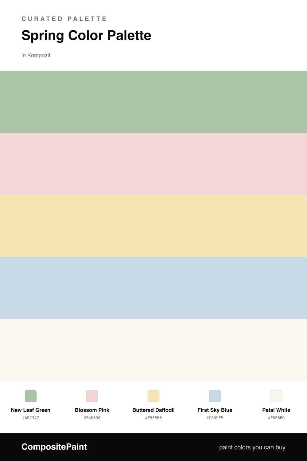
Spring is the moment everything softens at once, and this scheme bottles that feeling. New Leaf Green leads the way — a gentle, slightly grayed sage that reads fresh without going neon, the color of a bud just breaking open. It is the calm green of a 2026 living room, easy to live with and never sweet.

Around it, Blossom Pink and Buttered Daffodil add the warmth. The pink is barely there, a blush you notice more in feeling than in color, while the buttery yellow keeps things sunny and grounded. A whisper of First Sky Blue cools the mix like morning light through a window, the perfect spark of contrast against all that green and gold.

To keep it airy, let Petal White carry the walls and trim so the colors land as accents — a green sofa, a yellow throw, a pink-and-blue stack of cushions. Lead with the green, dot in the rest, and the whole room exhales spring.

Buy These Colors

Each color matched to the closest real paint in every brand, by ΔE2000. Kompozit first; take any SKU to the store — these mix on demand.

New Leaf Green
#A9C49A · LRV 50 · Dominant
Kompozit Belladonna's Leaf · 0743 ΔE 4.13
Backdrop Le Freak · BD-LF ΔE 9.96
Behr Laurel Mist · 430E-3 ΔE 1.83
Benjamin Moore Lily Pad · 480 ΔE 5.83
Clare Avocado Toast · PNT100-MD-49 ΔE 4.14
Dunn-Edwards Praying Mantis · DE5591 ΔE 2.21
Farrow & Ball Vert de Terre · No. 234 ΔE 10.33
Magnolia Home Sour Apple · JG-50 ΔE 8.95
PPG / Glidden Harmonious · 1120-5 ΔE 2.59
Sherwin-Williams Seawashed Glass · SW 9034 ΔE 1.42
Valspar Green Eggs & Cam · V061-3 ΔE 2.43
Blossom Pink
#F2D4D8 · LRV 71 · Secondary
Kompozit Rose Shadow · 0082 ΔE 1.73
Backdrop Cookies & Cream · BD-CC ΔE 17.96
Behr Ole Pink · S170-1 ΔE 1.5
Benjamin Moore Pink Dynasty · 1352 ΔE 0.52
Clare Baby Soft · PNT100-LT-25 ΔE 6.09
Dunn-Edwards Short and Sweet · DE6023 ΔE 1.36
Farrow & Ball Calamine · No. 230 ΔE 6.03
Magnolia Home Dutch Tulip · JG-34 ΔE 12.44
PPG / Glidden Cradle Pink · 1183-2 ΔE 0.84
Sherwin-Williams Alyssum · SW 6589 ΔE 0.93
Valspar Pink Diamond · 8002-4A ΔE 1.75
Buttered Daffodil
#F4E4B0 · LRV 78 · Support
Kompozit Sweetie Pie · 0804 ΔE 1.01
Backdrop Don't Eat the Yellow Snow · BD-DS ΔE 7.89
Behr Brushstroke · M320-3 ΔE 1.95
Benjamin Moore Harp Strings · 213 ΔE 0.59
Clare Lemonade · PNT100-MD-22 ΔE 4.05
Dunn-Edwards Gold Sand · DE5429 ΔE 1.79
Farrow & Ball Dayroom Yellow · No. 233 ΔE 3.71
Magnolia Home Ambient Light · JG-38 ΔE 3.94
PPG / Glidden Butter Cookie · 1108-3 ΔE 1.35
Sherwin-Williams Lantern Light · SW 6687 ΔE 1.2
Valspar Laughing Liam · 8001-26B ΔE 1.82
First Sky Blue
#C9DCE8 · LRV 69 · Accent
Kompozit Simple Serenity · 0614 ΔE 0.95
Backdrop Real Real · BD-RR ΔE 15.57
Behr Summer Sky · HDC-CT-15 ΔE 2.04
Benjamin Moore Breath of Fresh Air · 806 ΔE 2.03
Clare Nairobi Blue · PNT100-LT-36 ΔE 5.21
Dunn-Edwards Alaskan Skies · DE5876 ΔE 3.21
Farrow & Ball Borrowed Light · No. 235 ΔE 6.31
Magnolia Home Yarn · JG-132 ΔE 11.05
PPG / Glidden Simply Elegant · 10-26 ΔE 1.43
Sherwin-Williams Rhythmic Blue · SW 6806 ΔE 1.37
Valspar Tourmaline · V036-1 ΔE 1.44
Petal White
#F6F4EC · LRV 90 · Base
Kompozit Sugar Dust · 0011 ΔE 0.6
Backdrop Tabula Rasa · BD-TR ΔE 1.42
Behr Whisper White · HDC-MD-08 ΔE 0.96
Benjamin Moore Mountain Peak White · 2148-70 ΔE 0.92
Clare Timeless · PNT100-LT-04 ΔE 0.52
Dunn-Edwards Droplets · DEW381 ΔE 1.43
Farrow & Ball Wimborne White · No. 239 ΔE 1.43
Magnolia Home True White · JG-21 ΔE 1.8
PPG / Glidden Delicate White · 1001-1 ΔE 2.15
Sherwin-Williams High Reflective White · SW 7757 ΔE 1.3
Valspar Ivory Keys · 8007-4A ΔE 0.57

Questions

how do i keep this many soft colors from looking like a nursery?

Let the green lead and keep the pink, yellow, and blue as small accents rather than full walls. Grounding everything on the warm Petal White and choosing the slightly grayed sage over a minty green keeps the scheme feeling current and grown-up.

which color should go on the walls?

Petal White on the walls and trim is the easiest path, then bring in New Leaf Green as your largest accent through a sofa, cabinet, or feature wall. Save the blossom pink, buttery yellow, and sky blue for textiles and smaller pieces so they read as fresh pops, not chaos.

Similar Palettes

Closest schemes by color — not by label.