CP

Spring Color Palette — Spring Blossom

A fresh five-color spring scheme of soft green, blossom pink, buttery yellow, and sky blue, balanced by warm white — every color matched to real paint you can buy.

By David Chen · Formulation Lead & Resident Chemist

New Leaf Green
Dominant
Kompozit Garland Pine · 0757
#B9CFA6
LRV 58
Blossom Pink
Secondary
Kompozit Sullivan's Heart · 1132
#F7C5D1
LRV 64
Buttery Yellow
Support
Kompozit Lemon Filling · 0861
#F9E4A6
LRV 78
Clear Sky Blue
Accent
Kompozit Bridgewater Bay · 0650
#BCD7E2
LRV 65
Petal White
Base
Kompozit Sugar Dust · 0011
#F8F6ED
LRV 92
View palette in

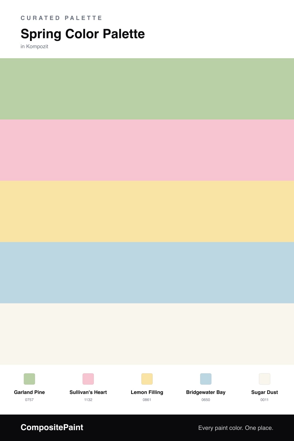
Spring is really a story about new growth, so this scheme starts where the season does — with a soft, leafy New Leaf Green as the dominant color. It is the green of a garden waking up, fresh but not loud, and it sets a calm stage for everything else.

On top of that base sit three blooms. Blossom Pink brings the cherry-tree softness, Buttery Yellow adds a warm shot of morning sun, and Clear Sky Blue opens the whole palette up like a bright April afternoon. Used in small doses, the three of them feel cheerful rather than busy.

Petal White ties it all together. It is a warm, slightly creamy white that keeps the brights from floating apart, and it leans into the soft, airy look that feels right for 2026. Let the green carry the room, white do the quiet work, and the pink, yellow, and blue land as little sparks of the season.

Buy These Colors

Each color matched to the closest real paint in every brand, by ΔE2000. Kompozit first; take any SKU to the store — these mix on demand.

New Leaf Green
#BBD3A6 · LRV 60 · Dominant
Kompozit Garland Pine · 0757 ΔE 1.35
Backdrop Real Real · BD-RR ΔE 14.47
Behr Urban Nature · S380-3 ΔE 1.43
Benjamin Moore Landscape · 430 ΔE 2.96
Clare High Vibe · PNT100-MD-63 ΔE 7.59
Dunn-Edwards Flower Stem · DE5605 ΔE 3.23
Farrow & Ball Cooking Apple Green · No. 32 ΔE 7.6
Magnolia Home Tapestry Thread · JG-105 ΔE 11.21
PPG / Glidden Bleached Spruce · 1223-4 ΔE 1.98
Sherwin-Williams Jardin · SW 6723 ΔE 2.38
Valspar Fava Bean · V060-3 ΔE 1.48
Blossom Pink
#F4CAD2 · LRV 66 · Secondary
Kompozit Sullivan's Heart · 1132 ΔE 2.46
Backdrop August · BD-AU ΔE 12.36
Behr Salmon Tint · 200E-2 ΔE 0.75
Benjamin Moore Unspoken Love · 1269 ΔE 2.22
Clare Pop · PNT100-LT-26 ΔE 11.09
Dunn-Edwards Sweet Sixteen · DE5079 ΔE 2.97
Farrow & Ball Calamine · No. 230 ΔE 9.37
Magnolia Home Ella Rose · JG-24 ΔE 11.91
PPG / Glidden Mountain Laurel · 1181-3 ΔE 1.86
Sherwin-Williams Impatiens Petal · SW 6582 ΔE 3.57
Valspar Sweet Pink · 1004-2B ΔE 1.63
Buttery Yellow
#F6E7A8 · LRV 80 · Support
Kompozit Lemon Filling · 0861 ΔE 1.93
Backdrop Don't Eat the Yellow Snow · BD-DS ΔE 10.02
Behr Wickerware · 360C-2 ΔE 1.82
Benjamin Moore Yellow Lilies · 346 ΔE 1.33
Clare Lemonade · PNT100-MD-22 ΔE 5.7
Dunn-Edwards Gold Sand · DE5429 ΔE 1.22
Farrow & Ball Dayroom Yellow · No. 233 ΔE 2.23
Magnolia Home Ambient Light · JG-38 ΔE 6.21
PPG / Glidden Wright Cornfield Tan · FLLW785 ΔE 0.97
Sherwin-Williams Venetian Yellow · SW 1666 ΔE 1.49
Valspar Dainty Daisy · V018-1 ΔE 1.52
Clear Sky Blue
#BFD9E8 · LRV 67 · Accent
Kompozit Bridgewater Bay · 0650 ΔE 2.01
Backdrop Real Real · BD-RR ΔE 17.31
Behr Celestial Light · MQ3-24 ΔE 2.62
Benjamin Moore Jet Stream · 814 ΔE 1.62
Clare Nairobi Blue · PNT100-LT-36 ΔE 5.28
Dunn-Edwards Falling Tears · DE5792 ΔE 2.86
Farrow & Ball Borrowed Light · No. 235 ΔE 8.28
Magnolia Home Dark Moon · JG-74 ΔE 9.59
PPG / Glidden Touch Of Blue · 1242-2 ΔE 2.57
Sherwin-Williams Atmospheric · SW 6505 ΔE 3.85
Valspar Lingerie Blue · V034-1 ΔE 0.37
Petal White
#F7F4EC · LRV 91 · Base
Kompozit Sugar Dust · 0011 ΔE 0.84
Backdrop Tabula Rasa · BD-TR ΔE 1.64
Behr Simply White · BWC-01 ΔE 0.61
Benjamin Moore Mountain Peak White · 2148-70 ΔE 1.16
Clare Timeless · PNT100-LT-04 ΔE 1
Dunn-Edwards Droplets · DEW381 ΔE 1.37
Farrow & Ball Wimborne White · No. 239 ΔE 1.31
Magnolia Home True White · JG-21 ΔE 2.13
PPG / Glidden Delicate White · 1001-1 ΔE 2.42
Sherwin-Williams High Reflective White · SW 7757 ΔE 1.61
Valspar Ivory Keys · 8007-4A ΔE 0.46

Questions

How do I keep four spring colors from looking like a nursery?

Let the soft green lead and use it on the largest surface, then sprinkle the pink, yellow, and blue in small doses. When one color clearly dominates and the others stay as touches, the scheme reads grown-up and calm rather than like a baby room.

Which color should I paint the walls?

Reach for New Leaf Green or the warm Petal White for walls. Both are gentle enough to live with all day, and they give the brighter blossom pink, buttery yellow, and sky blue something quiet to pop against.

Similar Palettes

Closest schemes by color — not by label.