CP

Spring Color Palette — Spring Dawn

A fresh five-color spring scheme of soft green, blossom pink, buttery yellow, and a wash of sky blue over a creamy base — every color matched to real paint you can buy.

By Jessica Williams · Color Stylist & Interior Editor

New Leaf Green
Dominant
Kompozit Belladonna's Leaf · 0743
#ADC3A7
LRV 51
Blossom Pink
Secondary
Kompozit First Daughter · 1140
#F7D2D8
LRV 71
Soft Linen
Base
Kompozit Bunny Cake · 0012
#F5EFE2
LRV 87
Buttery Yellow
Support
Kompozit Gold Strand · 0812
#F3DFA6
LRV 75
Clear Sky Blue
Accent
Kompozit Bridgewater Bay · 0650
#BCD7E2
LRV 65
View palette in

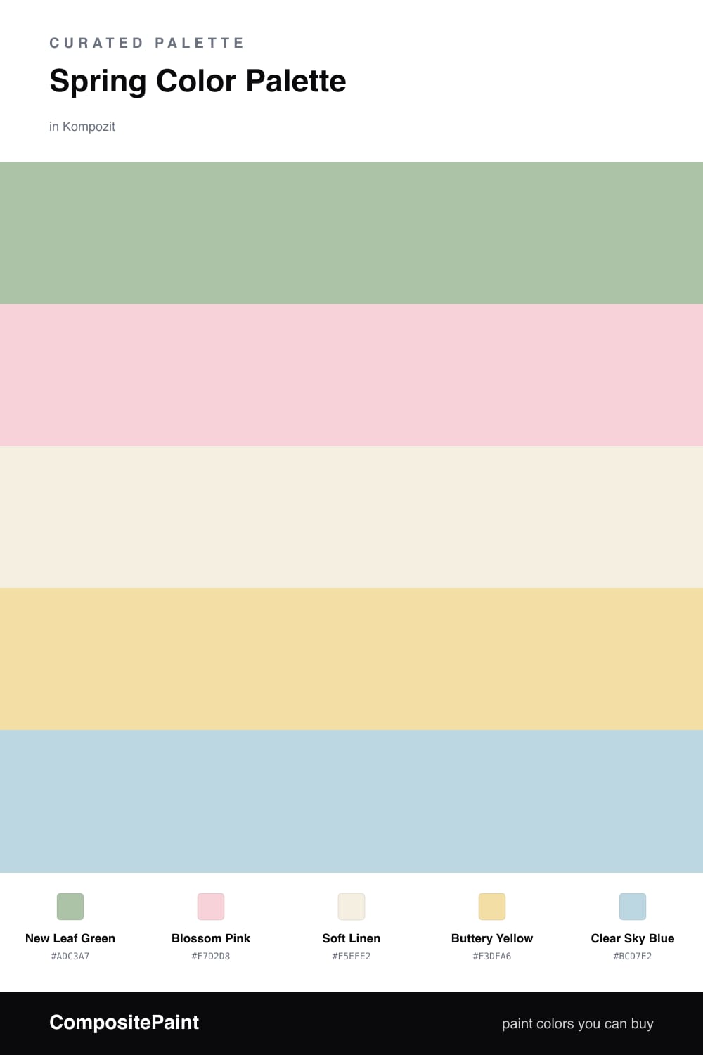
Spring Dawn is the feeling of an early April morning, when the light is thin and everything looks freshly washed. The scheme is built on a soft, leafy New Leaf Green that carries the whole room without ever feeling heavy.

Against it, Blossom Pink brings the first-bloom warmth and Buttery Yellow adds a quiet sunshine glow. A creamy Soft Linen keeps the trim and ceilings restful, so the colors have room to breathe. For 2026 this kind of low-contrast, nature-led mix feels especially current.

The smallest dose is Clear Sky Blue, used as your accent in a throw or a vase. It cools the palette just enough to keep it crisp rather than sweet. Keep the green dominant, let the others play in supporting roles, and the room will feel like a fresh start.

Buy These Colors

Each color matched to the closest real paint in every brand, by ΔE2000. Kompozit first; take any SKU to the store — these mix on demand.

New Leaf Green
#A7C4A0 · LRV 50 · Dominant
Kompozit Belladonna's Leaf · 0743 ΔE 2.93
Backdrop Underdog · BD-UD ΔE 17.72
Behr Laurel Mist · 430E-3 ΔE 1.31
Benjamin Moore Lily Pad · 480 ΔE 6.08
Clare Avocado Toast · PNT100-MD-49 ΔE 3.6
Dunn-Edwards Spring Leaves · DE5640 ΔE 3.36
Farrow & Ball Vert de Terre · No. 234 ΔE 10.27
Magnolia Home Texas Summer · JG-64 ΔE 8.55
PPG / Glidden French Market · 1131-4 ΔE 1.98
Sherwin-Williams Seawashed Glass · SW 9034 ΔE 2.86
Valspar Green Eggs & Cam · V061-3 ΔE 3.4
Blossom Pink
#F2D2D6 · LRV 70 · Secondary
Kompozit First Daughter · 1140 ΔE 1.7
Backdrop Cookies & Cream · BD-CC ΔE 18.43
Behr Angelico · S180-1 ΔE 0.82
Benjamin Moore Tippy Toes · 1282 ΔE 2.53
Clare Baby Soft · PNT100-LT-25 ΔE 6.64
Dunn-Edwards Short and Sweet · DE6023 ΔE 1.62
Farrow & Ball Calamine · No. 230 ΔE 6.36
Magnolia Home Dutch Tulip · JG-34 ΔE 12.88
PPG / Glidden Cradle Pink · 1183-2 ΔE 1
Sherwin-Williams Impatiens Petal · SW 6582 ΔE 0.49
Valspar Pink Diamond · 8002-4A ΔE 1.63
Soft Linen
#F4EFE3 · LRV 87 · Base
Kompozit Bunny Cake · 0012 ΔE 0.53
Backdrop Tabula Rasa · BD-TR ΔE 1.5
Behr Nude W-f-210 · W-F-210 ΔE 1.48
Benjamin Moore Woodland Snow · 2161-70 ΔE 1.42
Clare Wing It · PNT100-LT-24 ΔE 3.23
Dunn-Edwards Trite White · DE6204 ΔE 0.76
Farrow & Ball Pointing · No. 2003 ΔE 0.93
Magnolia Home Silos White · JG-107 ΔE 2.3
PPG / Glidden White Chip · 15-06 ΔE 0.87
Sherwin-Williams Whitetail · SW 7103 ΔE 0.44
Valspar Wings of an Angel · V153 ΔE 0.21
Buttery Yellow
#F2E2A8 · LRV 76 · Support
Kompozit Gold Strand · 0812 ΔE 1.42
Backdrop Cookies & Cream · BD-CC ΔE 9.04
Behr Refreshing Tea · PPU8-12 ΔE 1.51
Benjamin Moore Hawthorne Yellow · HC-4 ΔE 1.31
Clare Lemonade · PNT100-MD-22 ΔE 4.35
Dunn-Edwards Sugar Cookie · DE5450 ΔE 0.86
Farrow & Ball Dayroom Yellow · No. 233 ΔE 2.51
Magnolia Home Ambient Light · JG-38 ΔE 5.15
PPG / Glidden Butterfly Bush · 1214-4 ΔE 0.83
Sherwin-Williams Optimistic Yellow · SW 6900 ΔE 1.24
Valspar Kelsey's Curls · 8002-25C ΔE 0.9
Clear Sky Blue
#BCD6E6 · LRV 64 · Accent
Kompozit Bridgewater Bay · 0650 ΔE 2.36
Backdrop Real Real · BD-RR ΔE 17.59
Behr Millstream · PPU14-16 ΔE 2.21
Benjamin Moore Jet Stream · 814 ΔE 1.31
Clare Nairobi Blue · PNT100-LT-36 ΔE 5.76
Dunn-Edwards Two Harbors · DE5813 ΔE 1.56
Farrow & Ball Skylight · No. 205 ΔE 10.16
Magnolia Home Dark Moon · JG-74 ΔE 9.74
PPG / Glidden Touch Of Blue · 1242-2 ΔE 2.28
Sherwin-Williams Something Blue · SW 6800 ΔE 3.52
Valspar Cache Blue · V072-1 ΔE 1.92

Questions

Why do these spring colors work together?

They are all soft and slightly muted, so nothing shouts. The green and pink sit near opposite each other on the wheel for a gentle lift, while the yellow and blue keep the mood light and airy.

How do I use them in a room?

Let the green lead on the walls, keep the linen as your ceiling and trim, then add pink, yellow, and blue in small doses through textiles and decor — roughly a 60/30/10 split.

Similar Palettes

Closest schemes by color — not by label.