CP

Spring Color Palette — Spring Dusk

A soft five-color spring scheme of fresh green, blossom pink, buttery yellow, and a hint of sky blue, with every color matched to real paint you can buy.

By Emily Roberts · DIY Editor & First-Timer's Guide

Meadow Green
Dominant
Kompozit Belladonna's Leaf · 0743
#ADC3A7
LRV 51
Blossom Pink
Secondary
Kompozit Baby Bunting · 0110
#EDC9CD
LRV 64
Warm Linen
Base
Kompozit Bunny Cake · 0012
#F5EFE2
LRV 87
Butter Yellow
Support
Kompozit Gold Strand · 0812
#F3DFA6
LRV 75
Soft Sky
Accent
Kompozit Abstract Idea · 0643
#B9D1DD
LRV 61
View palette in

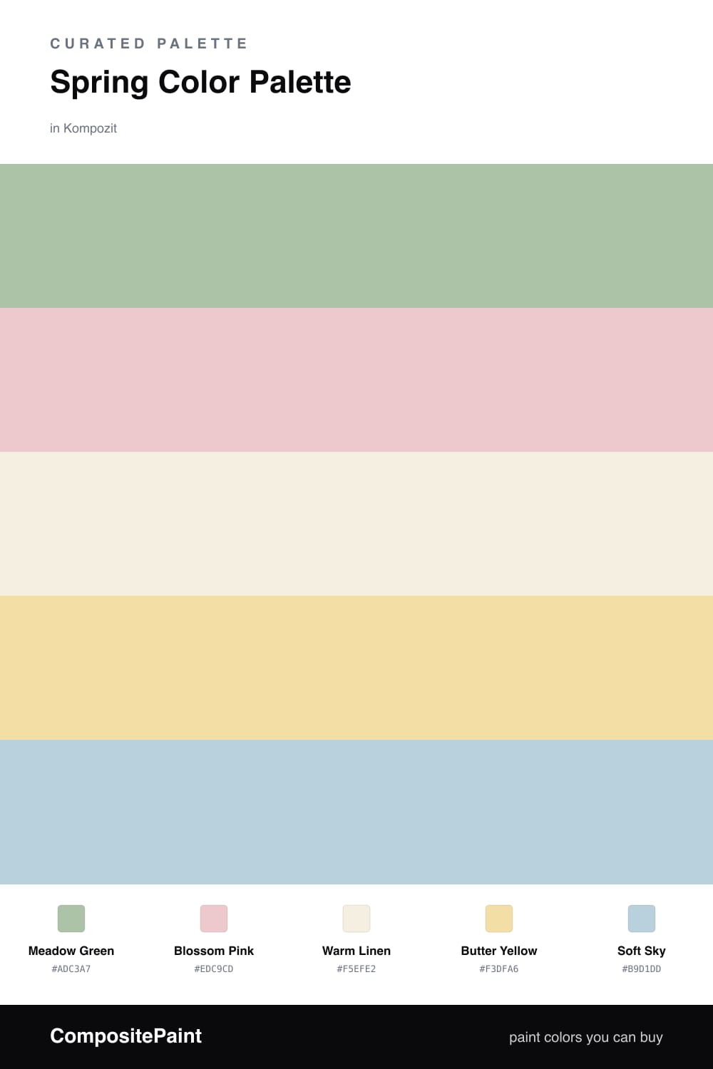
This is the palette I reach for when I want a room to feel like a sunny morning in April. Meadow Green is the quiet leader here — a soft, slightly grayed green that feels calm rather than minty, which makes it easy to live with all year.

Around it, Blossom Pink and Butter Yellow add the gentle warmth of flowers just starting to open. Warm Linen is your breathing room — the soft off-white that ties everything together and keeps the look airy instead of busy.

The little spark is Soft Sky, a barely-there blue that nods to a clear spring day. Use it in tiny doses, like a vase or a lampshade, and it lifts the whole scheme. This mix feels right at home in a 2026 space — fresh, soft, and a little bit playful without trying too hard.

Buy These Colors

Each color matched to the closest real paint in every brand, by ΔE2000. Kompozit first; take any SKU to the store — these mix on demand.

Meadow Green
#A8C39A · LRV 50 · Dominant
Kompozit Belladonna's Leaf · 0743 ΔE 3.92
Backdrop Le Freak · BD-LF ΔE 9.72
Behr Laurel Mist · 430E-3 ΔE 1.82
Benjamin Moore Lily Pad · 480 ΔE 5.8
Clare Avocado Toast · PNT100-MD-49 ΔE 3.9
Dunn-Edwards Praying Mantis · DE5591 ΔE 2.24
Farrow & Ball Vert de Terre · No. 234 ΔE 10.23
Magnolia Home Sour Apple · JG-50 ΔE 9.04
PPG / Glidden Harmonious · 1120-5 ΔE 2.69
Sherwin-Williams Seawashed Glass · SW 9034 ΔE 1.42
Valspar Green Eggs & Cam · V061-3 ΔE 2.43
Blossom Pink
#EBC7CA · LRV 63 · Secondary
Kompozit Baby Bunting · 0110 ΔE 0.64
Backdrop August · BD-AU ΔE 9.79
Behr Almond Willow · 210E-3 ΔE 1.05
Benjamin Moore Petunia Pink · 1276 ΔE 0.41
Clare Meet Cute · PNT100-LT-60 ΔE 8.25
Dunn-Edwards Pale Berries · DE6051 ΔE 6.21
Farrow & Ball Calamine · No. 230 ΔE 7.05
Magnolia Home Cabbage Rose · JG-26 ΔE 6.08
PPG / Glidden Pink Cardoon · 1051-2 ΔE 0.98
Sherwin-Williams Bella Pink · SW 6596 ΔE 2.7
Valspar Cat Nose · 8001-9B ΔE 0.99
Warm Linen
#F3EEE2 · LRV 86 · Base
Kompozit Bunny Cake · 0012 ΔE 0.58
Backdrop Jane · BD-JA ΔE 1.51
Behr Vanilla Frost · BWC-23 ΔE 1.58
Benjamin Moore Arbor White · ES-01 ΔE 0.89
Clare Wing It · PNT100-LT-24 ΔE 3.26
Dunn-Edwards Bone China · DEW339 ΔE 1.22
Farrow & Ball Pointing · No. 2003 ΔE 1.04
Magnolia Home Silos White · JG-107 ΔE 2.3
PPG / Glidden Accolade · 1208-1 ΔE 0.99
Sherwin-Williams Westhighland White · SW 7566 ΔE 0.44
Valspar Wings of an Angel · V153 ΔE 0
Butter Yellow
#F0DFA8 · LRV 74 · Support
Kompozit Gold Strand · 0812 ΔE 0.98
Backdrop Cookies & Cream · BD-CC ΔE 8.4
Behr Refreshing Tea · PPU8-12 ΔE 1.11
Benjamin Moore Ray of Light · CSP-910 ΔE 0.67
Clare Lemonade · PNT100-MD-22 ΔE 3.45
Dunn-Edwards Hazy Moon · DE5443 ΔE 1.46
Farrow & Ball Dayroom Yellow · No. 233 ΔE 3.03
Magnolia Home Ambient Light · JG-38 ΔE 4.63
PPG / Glidden Turning Oakleaf · 1107-3 ΔE 1.74
Sherwin-Williams Butter Up · SW 6681 ΔE 2.49
Valspar Kelsey's Curls · 8002-25C ΔE 0.43
Soft Sky
#BCD2DD · LRV 62 · Accent
Kompozit Abstract Idea · 0643 ΔE 0.7
Backdrop Real Real · BD-RR ΔE 15.55
Behr Millstream · PPU14-16 ΔE 1.81
Benjamin Moore Grand Rapids · 835 ΔE 0.45
Clare Nairobi Blue · PNT100-LT-36 ΔE 4.41
Dunn-Edwards Two Harbors · DE5813 ΔE 1.58
Farrow & Ball Skylight · No. 205 ΔE 8.31
Magnolia Home Dark Moon · JG-74 ΔE 7.94
PPG / Glidden Sleep Baby Sleep · 1161-2 ΔE 2.88
Sherwin-Williams Wondrous Blue · SW 6807 ΔE 2.66
Valspar Faded Indigo · V109-2 ΔE 2.45

Questions

Why do these spring colors work together?

They are all gentle, low-saturation versions of colors you see outside in early spring, so nothing shouts. The soft green leads, the pink and yellow add warmth, and the sky blue keeps it feeling fresh and modern.

How do I use them in a room?

Let the green do most of the work on walls, then bring in pink and yellow through pillows, art, or a small piece of furniture. Save the sky blue for one little accent so it stays a happy surprise.

Similar Palettes

Closest schemes by color — not by label.