CP

Spring Color Palette — Loam & Blossom

A fresh five-color spring scheme pairing soft green and blossom pink with buttery yellow, a creamy base, and a clear sky blue accent — every color matched to real paint you can buy.

By Jessica Williams · Color Stylist & Interior Editor

Sprout Green
Dominant
Kompozit Belladonna's Leaf · 0743
#ADC3A7
LRV 51
Blossom Pink
Secondary
Kompozit Fantastic Pink · 0076
#E6C8C9
LRV 62
Soft Cream
Base
Kompozit Bunny Cake · 0012
#F5EFE2
LRV 87
Butter Yellow
Support
Kompozit Mella Yella · 0805
#F0DDA2
LRV 73
Clear Sky
Accent
Kompozit Dancing in the Rain · 0644
#ABC5D6
LRV 53
View palette in

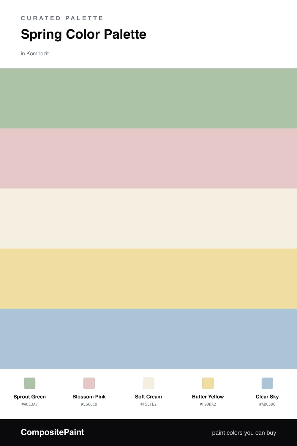
This is spring caught at its gentlest moment, just after the first warm rain. Sprout Green leads the way, a soft, leafy tone that feels alive without going bright. It is the color of new growth, and it sets a calm, hopeful mood the moment you walk in.

Against that green, Blossom Pink brings a flush of warmth, like petals opening overhead. Soft Cream is the breath between everything, keeping the scheme open and uncluttered, while Butter Yellow adds a low, sunny glow that makes the whole palette feel kind.

The little spark is Clear Sky, a cool blue that lifts the warmer tones and keeps them honest. Use it sparingly — a cushion, a vase, a painted edge. In 2026 these soft, washed-out naturals feel right at home, easy to live with and easy to love.

Buy These Colors

Each color matched to the closest real paint in every brand, by ΔE2000. Kompozit first; take any SKU to the store — these mix on demand.

Sprout Green
#A7C49A · LRV 50 · Dominant
Kompozit Belladonna's Leaf · 0743 ΔE 4.27
Backdrop Le Freak · BD-LF ΔE 10.2
Behr Laurel Mist · 430E-3 ΔE 1.55
Benjamin Moore Lily Pad · 480 ΔE 6.28
Clare Avocado Toast · PNT100-MD-49 ΔE 4.39
Dunn-Edwards Praying Mantis · DE5591 ΔE 2.37
Farrow & Ball Vert de Terre · No. 234 ΔE 10.72
Magnolia Home Sour Apple · JG-50 ΔE 9.43
PPG / Glidden Harmonious · 1120-5 ΔE 3.06
Sherwin-Williams Seawashed Glass · SW 9034 ΔE 1.79
Valspar Green Eggs & Cam · V061-3 ΔE 2.91
Blossom Pink
#EBC4C8 · LRV 61 · Secondary
Kompozit Fantastic Pink · 0076 ΔE 3.05
Backdrop August · BD-AU ΔE 10.52
Behr Almond Willow · 210E-3 ΔE 2.14
Benjamin Moore Petunia Pink · 1276 ΔE 1.31
Clare Meet Cute · PNT100-LT-60 ΔE 8.98
Dunn-Edwards Rose Reminder · DE5093 ΔE 3.38
Farrow & Ball Calamine · No. 230 ΔE 8.07
Magnolia Home Cabbage Rose · JG-26 ΔE 6.52
PPG / Glidden Pink Cardoon · 1051-2 ΔE 1.96
Sherwin-Williams Loveable · SW 6590 ΔE 2.16
Valspar Pocketful of Promise · V078-2 ΔE 4.46
Soft Cream
#F4EFE2 · LRV 86 · Base
Kompozit Bunny Cake · 0012 ΔE 0.49
Backdrop Tabula Rasa · BD-TR ΔE 1.56
Behr Nude W-f-210 · W-F-210 ΔE 1.66
Benjamin Moore Woodland Snow · 2161-70 ΔE 1.38
Clare Wing It · PNT100-LT-24 ΔE 3.63
Dunn-Edwards Trite White · DE6204 ΔE 0.52
Farrow & Ball Pointing · No. 2003 ΔE 0.69
Magnolia Home Silos White · JG-107 ΔE 2.65
PPG / Glidden White Chip · 15-06 ΔE 0.46
Sherwin-Williams Whitetail · SW 7103 ΔE 0.87
Valspar Wings of an Angel · V153 ΔE 0.47
Butter Yellow
#EBD9A0 · LRV 70 · Support
Kompozit Mella Yella · 0805 ΔE 1.04
Backdrop Cookies & Cream · BD-CC ΔE 8.9
Behr Harmonious Gold · M300-3 ΔE 1.74
Benjamin Moore Valley View · 214 ΔE 0.78
Clare Lemonade · PNT100-MD-22 ΔE 3.09
Dunn-Edwards Bamboo Mat · DE5457 ΔE 2.33
Farrow & Ball Dorset Cream · No. 68 ΔE 3.15
Magnolia Home Lemony · JG-42 ΔE 4.31
PPG / Glidden Demeter · 11-01 ΔE 0.68
Sherwin-Williams Sunbeam Yellow · SW 78 ΔE 3.88
Valspar Tomatillo · 8001-26C ΔE 1.7
Clear Sky
#A9C7DB · LRV 54 · Accent
Kompozit Dancing in the Rain · 0644 ΔE 1.3
Backdrop Lost in the 80s · BD-LO ΔE 2.16
Behr Caspian Tide · PPU14-13 ΔE 1.51
Benjamin Moore Palatial Skies · 800 ΔE 1.27
Clare Summer Friday · PNT100-LT-37 ΔE 6.48
Dunn-Edwards Afternoon Sky · DE5877 ΔE 4.04
Farrow & Ball Blue Ground · No. 210 ΔE 8.41
Magnolia Home Vibrant Horizon · JG-88 ΔE 7.29
PPG / Glidden Sonata · 1157-3 ΔE 1.58
Sherwin-Williams Vast Sky · SW 6506 ΔE 2.9
Valspar Sailboat · 4005-5B ΔE 1.9

Questions

Why do these spring colors work together?

They share the same soft, slightly hazy quality, so nothing shouts. The green leads, the pink warms it up, and the cream keeps the whole thing feeling light and airy.

How do I use them in a room?

Let the green do most of the work on walls or a large piece, lean on cream for the quiet space, and save the pink, yellow, and sky blue for smaller touches like textiles or a single chair.

Similar Palettes

Closest schemes by color — not by label.