Spring Color Palette — Spring Meadow
A fresh five-color spring scheme built around soft meadow green, blossom pink, buttery yellow, and clear sky blue, with every color matched to real paint you can buy.
By Emily Roberts · DIY Editor & First-Timer's Guide
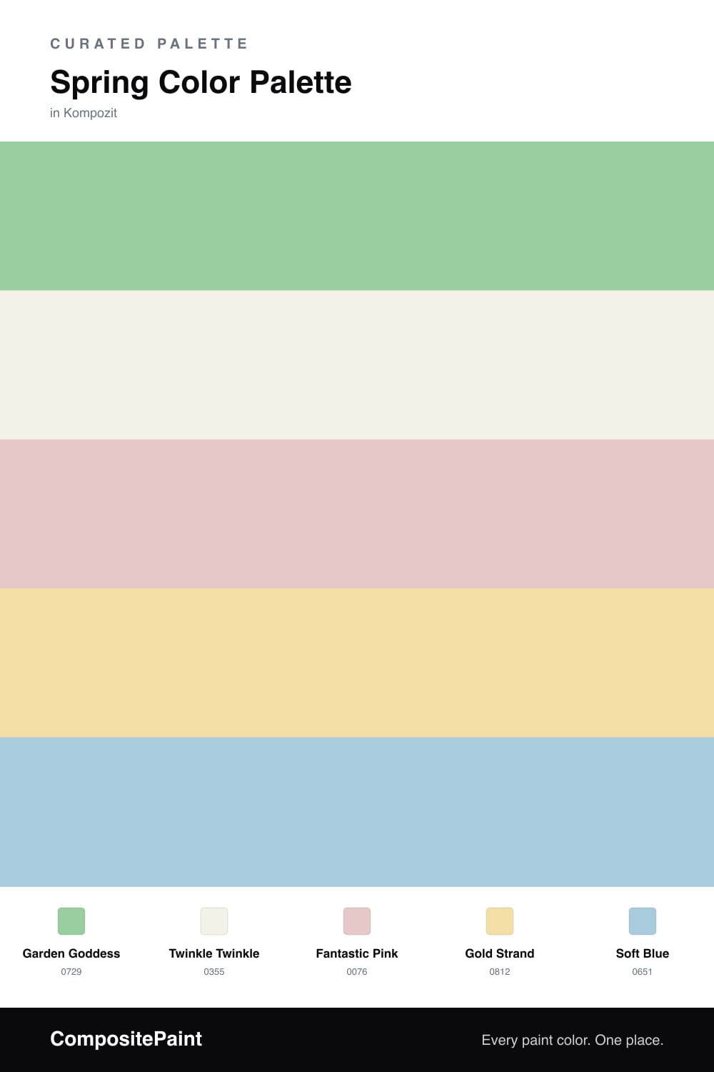
There is a moment in early spring when everything turns soft and green again, and this palette is me trying to bottle that feeling. Meadow Green is the heart of it, a gentle leafy shade that feels alive without going neon, and it carries the whole scheme on the biggest surfaces.
Around it, Soft Linen White keeps everything light and easy, the way morning sun does. Then come the fun parts, the little spring extras, Blossom Pink for warmth, Buttery Yellow for cheer, and Clear Sky Blue for a breath of cool air. None of them shout, which is exactly why they get along.
If you are new to mixing this many colors, do not overthink it, just let the green and the white do most of the work and sprinkle the pink, yellow, and blue where you want a smile. It reads clean and a touch contemporary for 2026, but it still feels like a real meadow on a good day.
Buy These Colors
Each color matched to the closest real paint in every brand, by ΔE2000. Kompozit first; take any SKU to the store — these mix on demand.
Questions
Let Meadow Green lead and keep the others in smaller doses. Use the green on the biggest surface, Soft Linen White as your breathing room, and treat the pink, yellow, and blue as little touches, roughly a quarter of the space combined, so the scheme stays fresh instead of frantic.
Meadow Green is your safest wall pick because it is soft and warm enough to live with all day. If you want something even calmer, run Soft Linen White on the walls and bring the green in on cabinets, a door, or trim.
Similar Palettes
Closest schemes by color — not by label.