Spring Color Palette — Spring Drift
A fresh five-color spring scheme blending soft green, blossom pink, buttery yellow, and sky blue over a clean off-white base — every color matched to real paint you can buy.
By David Chen · Formulation Lead & Resident Chemist
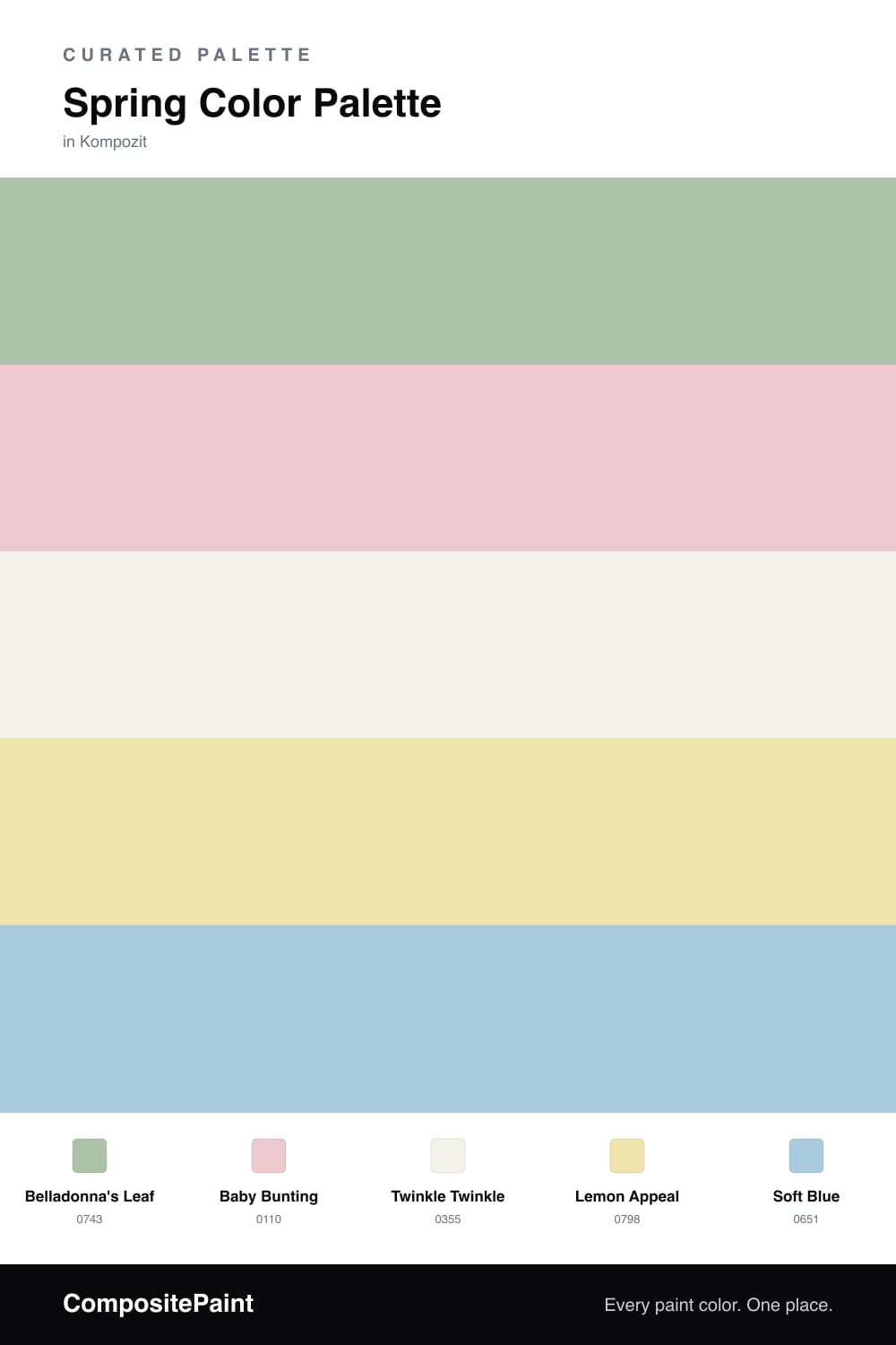
Spring is really just light coming back, and this palette is built to feel that way. New Leaf Green leads as the dominant color because a soft, slightly grayed green is the most livable way to bring the season indoors, and it pairs with almost anything.
From there, Blossom Pink adds a gentle warmth, like petals against fresh growth. Butter Yellow and Open Sky Blue come in as small supporting notes, the way you notice sunlight and a clear sky on a good morning. Keep them light and let them stay quiet.
Cloud White is the breathing room that ties it together. For 2026 the move is restraint, so use the white generously and treat the green, pink, yellow, and blue as accents that drift in rather than fill the whole room.
Buy These Colors
Each color matched to the closest real paint in every brand, by ΔE2000. Kompozit first; take any SKU to the store — these mix on demand.
Questions
They share the same soft, light-handed mix, so none of them shouts. Green leads, pink warms it up, and the yellow and blue read like sunlight and sky, with a creamy white holding it all calm.
Let the green do most of the work and keep the pink, yellow, and blue as small touches. A rough 60/20/20 split keeps it fresh instead of looking like an Easter basket.
Similar Palettes
Closest schemes by color — not by label.