Spring Color Palette — Spring Wren
A fresh five-color spring scheme of soft green, blossom pink, buttery yellow, and sky blue grounded by a warm off-white, with every color matched to real paint you can buy.
By Maya Patel · Reviews Editor & Product Tester
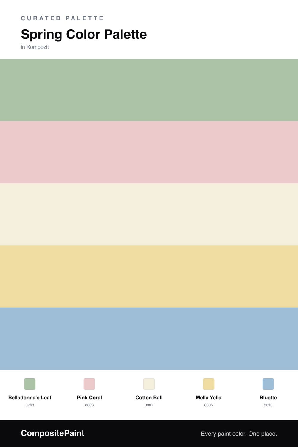
Spring palettes go wrong when every color fights for attention. This one stays quiet on purpose. Wren Green is the dominant shade, a soft sage that reads fresh without tipping into mint, and it carries the bulk of the scheme.
Around it, Blossom Pink and Butter Yellow add warmth, while Robin Sky keeps things from feeling sweet. Morning Cream is the base that lets all four breathe, so nothing has to work too hard.
For a 2026 feel, lean into the green and use the brighter colors sparingly — a pillow here, a door there. That restraint is what makes this read like spring rather than a nursery.
Buy These Colors
Each color matched to the closest real paint in every brand, by ΔE2000. Kompozit first; take any SKU to the store — these mix on demand.
Questions
They are all soft, low-saturation versions of green, pink, yellow, and blue, so none of them shouts. Pulling every color back to the same gentle level is what keeps the mix feeling fresh instead of busy.
Let the green lead on the largest surfaces, then sprinkle the pink, yellow, and blue in smaller doses. Roughly a 60/40 split between the green and everything else keeps it calm and modern.
Similar Palettes
Closest schemes by color — not by label.