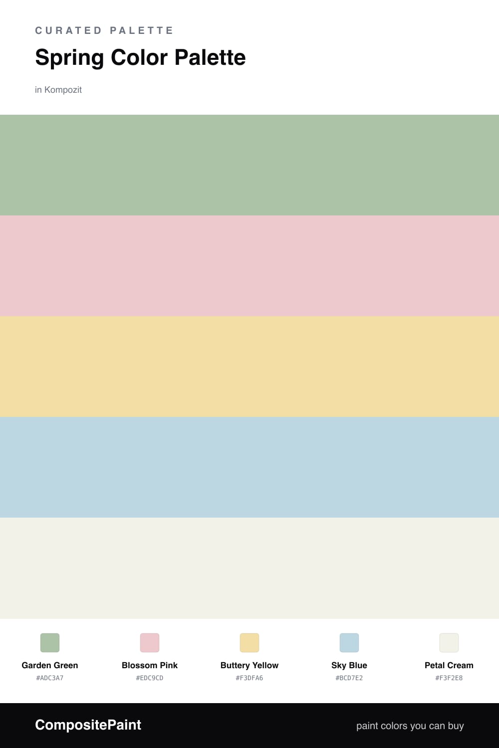
Spring Color Palette — Spring Garden
A fresh five-color spring scheme pairing soft garden green with blossom pink, buttery yellow, and clear sky blue, grounded by a creamy white — every color matched to real paint you can buy.
By Emily Roberts · DIY Editor & First-Timer's Guide
Spring is the easiest season to borrow a palette from, because nothing in a garden clashes. This scheme starts with a soft Garden Green as the dominant color, the kind of gentle leaf tone that feels alive without going minty or loud.
Then come the flowers. Blossom Pink brings a warm, hand-on-heart softness, Buttery Yellow adds a little sunshine, and a clear Sky Blue lifts everything and keeps it feeling fresh rather than sweet. A few touches of each is all you need, so they read as happy little accents.
Holding it all together is Petal Cream, a warm off-white that gives your eyes somewhere to rest. It feels right at home in a 2026 room, where the trend is soft, light-filled color over anything stark. Use the green widely, the cream as your backdrop, and sprinkle the pink, yellow, and blue where you want a smile.
Buy These Colors
Each color matched to the closest real paint in every brand, by ΔE2000. Kompozit first; take any SKU to the store — these mix on demand.
Questions
Let the green lead and keep the others as smaller touches. Garden Green covers the most space, Petal Cream fills the quiet gaps, and the pink, yellow, and blue show up in little doses like cushions or art. That roughly 60/30/10 split keeps it calm instead of cluttered.
Petal Cream. It is a soft warm off-white that goes with everything else here, so you can paint big areas with it first, then add the green and the brighter spring tones once you see how the light falls.
Similar Palettes
Closest schemes by color — not by label.