CP

Spring Color Palette — Birch Meadow

A fresh five-color spring scheme pairing soft leaf green with blossom pink, buttery yellow, and sky blue over a birch-white base — every color matched to real paint you can buy.

By Jessica Williams · Color Stylist & Interior Editor

Leaf Green
Dominant
Kompozit Belladonna's Leaf · 0743
#ADC3A7
LRV 51
Blossom Pink
Secondary
Kompozit Rose Shadow · 0082
#F4D6D6
LRV 72
Birch White
Base
Kompozit Twinkle Twinkle · 0355
#F3F2E8
LRV 88
Buttery Yellow
Support
Kompozit Gold Strand · 0812
#F3DFA6
LRV 75
Sky Blue
Accent
Kompozit Abstract Idea · 0643
#B9D1DD
LRV 61
View palette in

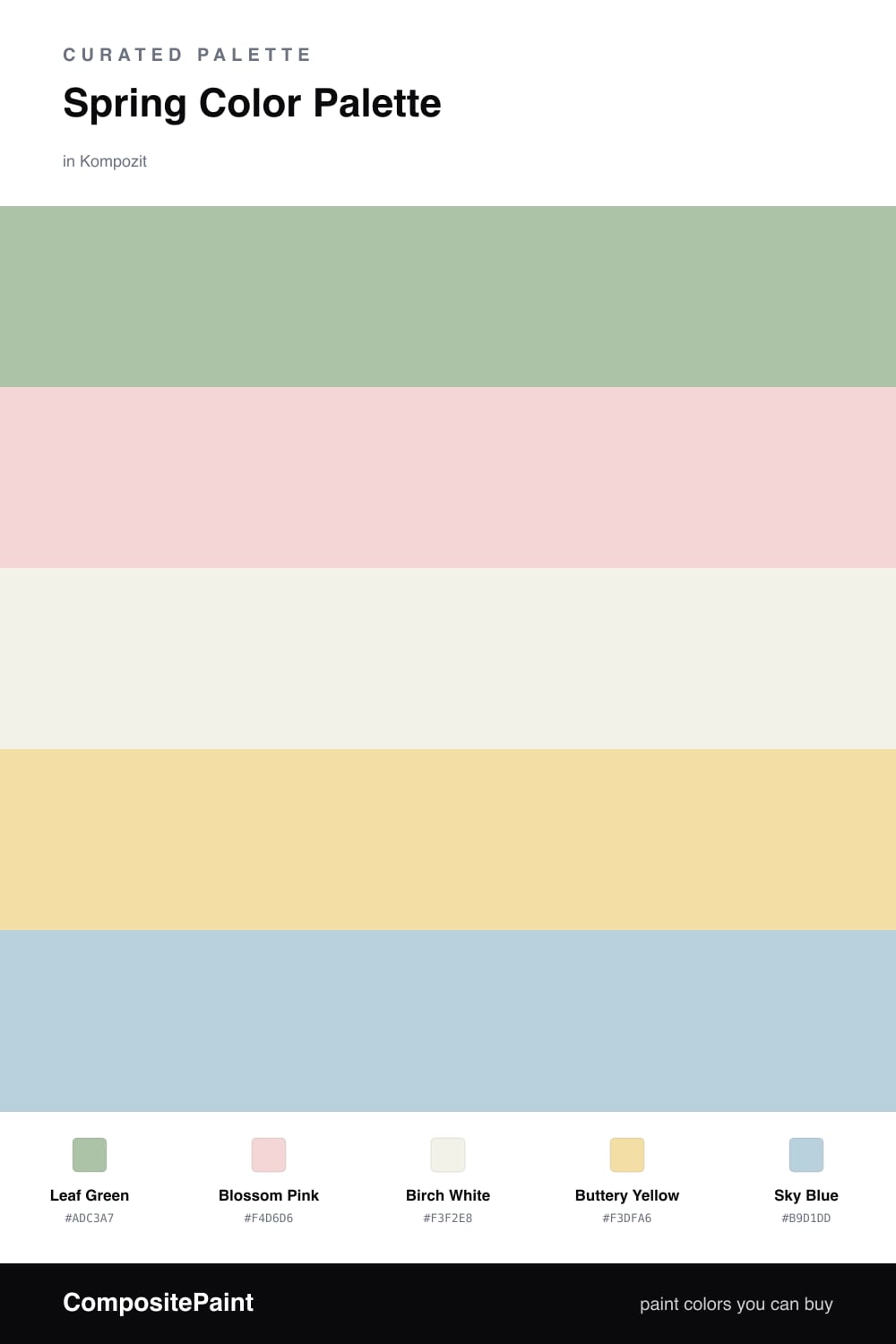
There is a moment in early spring when everything turns soft and a little hazy, and that is exactly what this palette holds. Leaf Green leads as the dominant, gentle and a touch grayed so it feels current rather than minty, and it carries the whole scheme like new growth.

Against it, Blossom Pink and Buttery Yellow add warmth without tipping into sugar, while a quiet wash of Sky Blue lifts the edges and keeps the air feeling clean. The Birch White base ties it all together — a warm, paper-pale neutral that lets the colors breathe.

For 2026 I would lean into the green on a feature wall or cabinetry, keep the white wide and open, and let the pink, yellow, and blue arrive in the small things you can change with the season.

Buy These Colors

Each color matched to the closest real paint in every brand, by ΔE2000. Kompozit first; take any SKU to the store — these mix on demand.

Leaf Green
#A7C49A · LRV 50 · Dominant
Kompozit Belladonna's Leaf · 0743 ΔE 4.27
Backdrop Le Freak · BD-LF ΔE 10.2
Behr Laurel Mist · 430E-3 ΔE 1.55
Benjamin Moore Lily Pad · 480 ΔE 6.28
Clare Avocado Toast · PNT100-MD-49 ΔE 4.39
Dunn-Edwards Praying Mantis · DE5591 ΔE 2.37
Farrow & Ball Vert de Terre · No. 234 ΔE 10.72
Magnolia Home Sour Apple · JG-50 ΔE 9.43
PPG / Glidden Harmonious · 1120-5 ΔE 3.06
Sherwin-Williams Seawashed Glass · SW 9034 ΔE 1.79
Valspar Green Eggs & Cam · V061-3 ΔE 2.91
Blossom Pink
#F3D4D6 · LRV 71 · Secondary
Kompozit Rose Shadow · 0082 ΔE 1.01
Backdrop Cookies & Cream · BD-CC ΔE 17.47
Behr Ole Pink · S170-1 ΔE 2.23
Benjamin Moore Pink Dynasty · 1352 ΔE 1.07
Clare Baby Soft · PNT100-LT-25 ΔE 5.81
Dunn-Edwards Short and Sweet · DE6023 ΔE 1.25
Farrow & Ball Pink Ground · No. 202 ΔE 8.59
Magnolia Home Dutch Tulip · JG-34 ΔE 11.94
PPG / Glidden Cradle Pink · 1183-2 ΔE 1.67
Sherwin-Williams Alyssum · SW 6589 ΔE 0.64
Valspar Pink Diamond · 8002-4A ΔE 2.5
Birch White
#F4F1E8 · LRV 88 · Base
Kompozit Twinkle Twinkle · 0355 ΔE 1.19
Backdrop Tabula Rasa · BD-TR ΔE 1.14
Behr Nude W-f-210 · W-F-210 ΔE 0.8
Benjamin Moore Pink Damask · 890 ΔE 1.5
Clare Wing It · PNT100-LT-24 ΔE 2.95
Dunn-Edwards Wishful White · DE6260 ΔE 0
Farrow & Ball Wimborne White · No. 239 ΔE 0.97
Magnolia Home Silos White · JG-107 ΔE 1.01
PPG / Glidden Crumb Cookie · 18-01 ΔE 0.8
Sherwin-Williams White Flour · SW 7102 ΔE 1.01
Valspar Crisp Cotton · 7007-4 ΔE 1.27
Buttery Yellow
#F2E2A8 · LRV 76 · Support
Kompozit Gold Strand · 0812 ΔE 1.42
Backdrop Cookies & Cream · BD-CC ΔE 9.04
Behr Refreshing Tea · PPU8-12 ΔE 1.51
Benjamin Moore Hawthorne Yellow · HC-4 ΔE 1.31
Clare Lemonade · PNT100-MD-22 ΔE 4.35
Dunn-Edwards Sugar Cookie · DE5450 ΔE 0.86
Farrow & Ball Dayroom Yellow · No. 233 ΔE 2.51
Magnolia Home Ambient Light · JG-38 ΔE 5.15
PPG / Glidden Butterfly Bush · 1214-4 ΔE 0.83
Sherwin-Williams Optimistic Yellow · SW 6900 ΔE 1.24
Valspar Kelsey's Curls · 8002-25C ΔE 0.9
Sky Blue
#B8D4E3 · LRV 63 · Accent
Kompozit Abstract Idea · 0643 ΔE 1.46
Backdrop Lost in the 80s · BD-LO ΔE 4.61
Behr Millstream · PPU14-16 ΔE 1.32
Benjamin Moore Mediterranean Breeze · 799 ΔE 0.64
Clare Nairobi Blue · PNT100-LT-36 ΔE 5.31
Dunn-Edwards Two Harbors · DE5813 ΔE 2.13
Farrow & Ball Skylight · No. 205 ΔE 10.23
Magnolia Home Dark Moon · JG-74 ΔE 9.85
PPG / Glidden Sleep Baby Sleep · 1161-2 ΔE 3.26
Sherwin-Williams Something Blue · SW 6800 ΔE 2.67
Valspar Escape · 4007-7B ΔE 1.83

Questions

Why do these spring colors work together?

They all share a soft, slightly chalky quality, so nothing shouts. The green leads, the pink and yellow warm it, and the blue keeps it from feeling sweet — like a meadow on the first mild morning.

How do I use them without it feeling like a nursery?

Let the green do most of the work and keep the pastels in small doses — a pillow, a vase, a single painted door. Grounding everything on the birch-white base reads calm and grown-up rather than childish.

Similar Palettes

Closest schemes by color — not by label.