Mustard Study Palette — Aged Mustard & Walnut Shelf
A warm five-color study scheme led by aged mustard with a soft greige backdrop, crisp ceiling white, walnut wood, and a deep ink accent — every color matched to real paint you can buy.
By David Chen · Formulation Lead & Resident Chemist
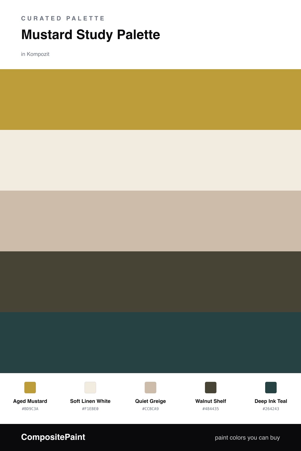
Think of mustard the way you would think of a well-steeped tea — it is yellow that has been slowed down, dimmed, and warmed by a little brown. That is why Aged Mustard on the walls feels right for a study. It gives you color and warmth without the glare of a bright primary, so your eyes settle instead of darting.
Around it, I keep things quiet. Soft Linen White on the trim and ceiling lifts the corners, and Quiet Greige on cabinets or built-ins acts as the neutral go-between that lets the mustard breathe. Walnut Shelf on the floor and wood pulls the whole room toward that grounded, library feeling.
For 2026 the move is one clean, modern punctuation mark — here it is Deep Ink Teal, used sparingly on a single accent. It is cool enough to balance all that warmth and dark enough to add depth. One small dose is plenty.
Buy These Colors
Each color matched to the closest real paint in every brand, by ΔE2000. Kompozit first; take any SKU to the store — these mix on demand.
Questions
Mustard is a warm, low-glare yellow that reads as focused rather than sunny. It holds light without bouncing it around, so the room feels calm and grounded — exactly what you want for reading and long stretches of work.
Treat it like a spice, not the whole meal. Let the greige and linen white carry most of the room, anchor the floor in walnut, and use the deep ink teal in one small dose — a chair, a frame, a shelf back.
Similar Palettes
Closest schemes by color — not by label.