Gold Dining Room Palette — Warm Gold & Cream Classic
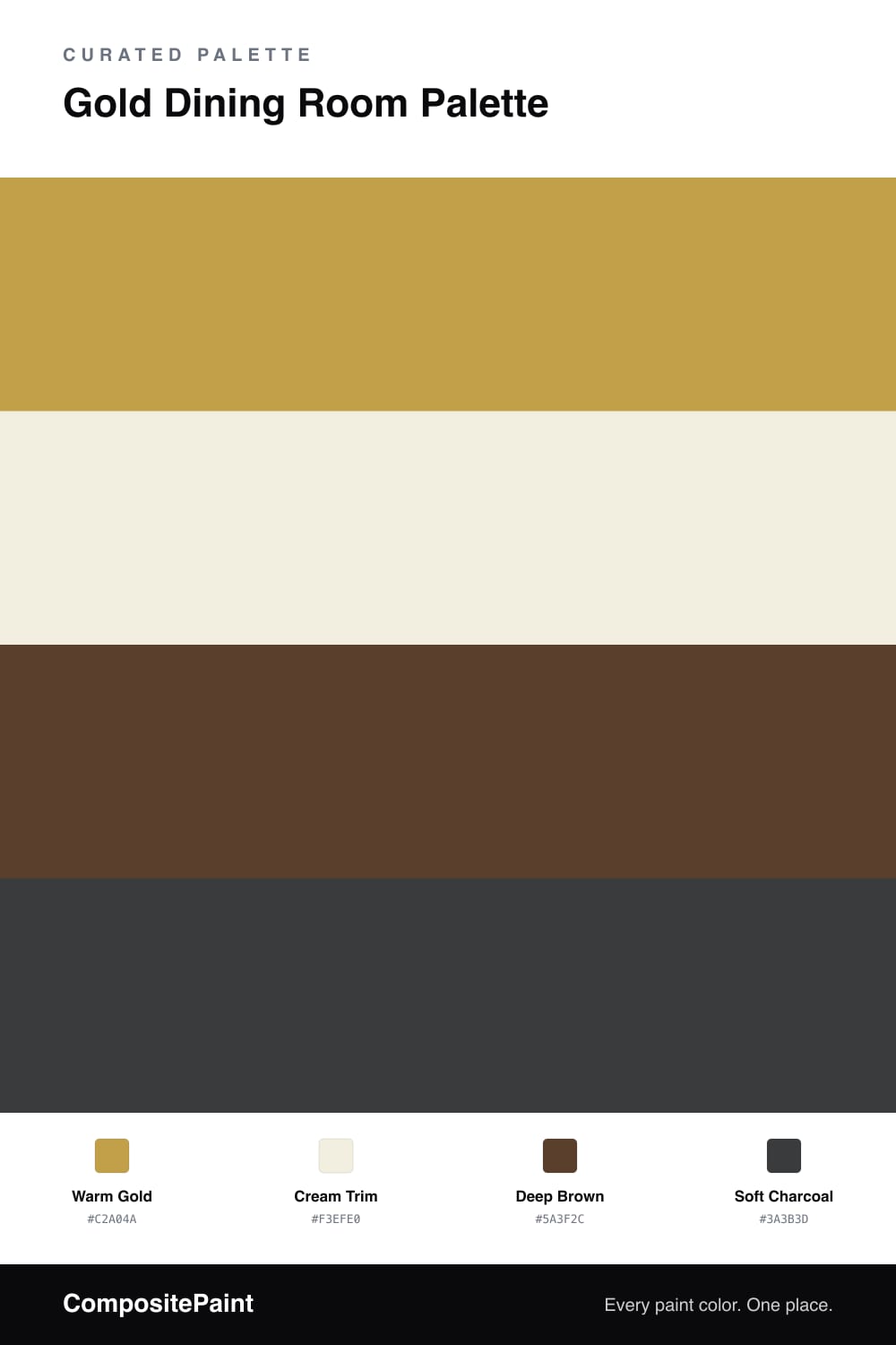
A rich, classic 4-color scheme for dining rooms: warm gold walls, crisp cream trim, a deep brown accent, and charcoal for depth. Every color matched to real paint you can buy.
By Jessica Williams · Color Stylist & Interior Editor
A gold dining room is built for evenings — for warm light, long dinners, and a room that feels a little dressed up. This palette wraps the walls in a warm gold, deep enough to feel classic but soft enough to stay welcoming under lamplight and candles.
Cream trim runs the baseboards, casings, and ceiling, framing the gold so the edges stay crisp and the room never feels heavy. Deep brown comes through the table, chairs, or a sideboard, grounding the warmth with something solid and traditional.
A few touches of soft charcoal — a chandelier finish, a frame, a runner — add quiet depth without cooling the scheme. Keep the gold as the star, let the cream do the framing, and the room feels timeless rather than trendy. It is a scheme that flatters food, faces, and good company.
Buy These Colors
Each color matched to the closest real paint in every brand, by ΔE2000. Tap a swatch for its full guide or + to save it — take any SKU to the store, they mix on demand.
Questions
In a dining room it usually works, because it is a room you light warmly and use in the evening. The gold catches candlelight beautifully, and the cream trim keeps the edges crisp so it never feels closed in.
A flat or eggshell finish keeps the gold soft and even. Higher gloss tends to make a strong color look harder and shows every wall flaw, which you do not want on a feature color.
Similar Palettes
Closest schemes by color — not by label.