CP

Forest Color Palette — Forest & Cocoa Retreat

A grounded five-color scheme led by deep forest green with warm cocoa and soft neutrals, finished with a brass accent — every color matched to real paint you can buy.

By Emily Roberts · DIY Editor & First-Timer's Guide

Deep Forest Green
Dominant
Kompozit Atlantic Waves · 0473
#264243
LRV 5
Warm Cocoa Brown
Secondary
Kompozit Deep Shadow · 0445
#514A3D
LRV 7
Soft Linen
Base
Kompozit Hint of Vanilla · 0001
#EEE8DC
LRV 81
Mushroom Taupe
Support
Kompozit Moth Wing · 0183
#CCBCA9
LRV 52
Antique Brass
Accent
Kompozit Jungle Expedition · 0885
#B49356
LRV 31
View palette in

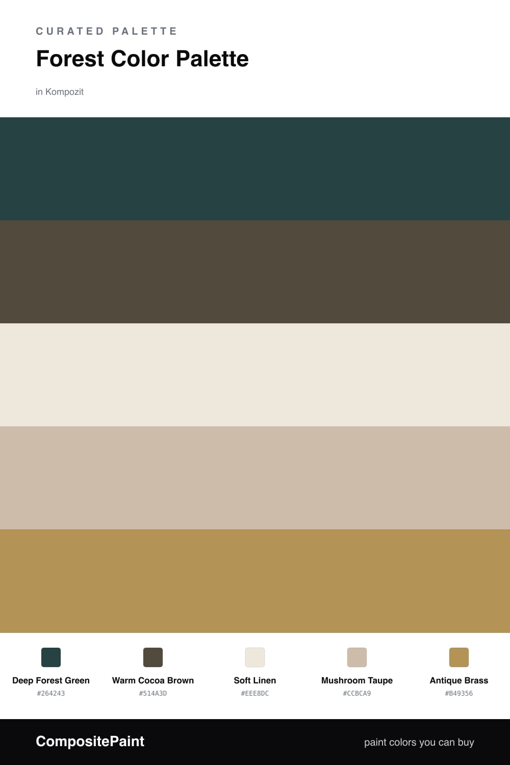
Forest green is having a real moment in 2026, and it is easy to see why. A Deep Forest Green feels calm and a little dramatic at the same time, which makes it a great color to build a whole room around.

Here it leads the way, with Warm Cocoa Brown stepping in as a softer partner. Think of it like a walk in the woods, where the green of the leaves meets the brown of the trunks. To keep things from feeling too dark, Soft Linen and Mushroom Taupe open everything up and let the room breathe.

The little surprise is Antique Brass. You only need a small amount, on a faucet, a frame, or a lamp base, to add a quiet shine that ties the whole palette together. Start with the green, layer in the cocoa, and let the neutrals carry the rest.

Buy These Colors

Each color matched to the closest real paint in every brand, by ΔE2000. Kompozit first; take any SKU to the store — these mix on demand.

Deep Forest Green
#2F4233 · LRV 5 · Dominant
Kompozit Atlantic Waves · 0473 ΔE 8.5
Backdrop After Hours · BD-AH ΔE 8.82
Behr Deep Forest · BXC-12 ΔE 1.35
Benjamin Moore Hunter Green · 2041-10 ΔE 4.2
Clare Blackish · PNT100-DP-54 ΔE 12.93
Dunn-Edwards Refined Green · DEA181 ΔE 7.62
Farrow & Ball Pitch Black · No. 256 ΔE 13.88
Magnolia Home Moments · JG-150 ΔE 17.84
PPG / Glidden Dark As Night · 14-05 ΔE 9.23
Sherwin-Williams Roycroft Bottle Green · SW 2847 ΔE 3.98
Valspar Aged Pine · 6011-5 ΔE 5.08
Warm Cocoa Brown
#5A4536 · LRV 7 · Secondary
Kompozit Deep Shadow · 0445 ΔE 7.63
Backdrop It's a Date · BD-IT ΔE 1.43
Behr Moose Trail · N190-7 ΔE 0.95
Benjamin Moore Deep Taupe · 2111-10 ΔE 0.79
Clare Blackish · PNT100-DP-54 ΔE 10.94
Dunn-Edwards Northern Territory · DEA158 ΔE 3.41
Farrow & Ball Mahogany · No. 36 ΔE 7.06
Magnolia Home Wooded Acres · JG-122 ΔE 5.6
PPG / Glidden Racy Raisin · 16-24 ΔE 5.69
Sherwin-Williams Well-Bred Brown · SW 7027 ΔE 1.9
Valspar Momentous Occasion · 8005-10G ΔE 3.05
Soft Linen
#EFE9DC · LRV 82 · Base
Kompozit Hint of Vanilla · 0001 ΔE 0.48
Backdrop Jane · BD-JA ΔE 2.14
Behr Ivory Palace · PPU10-14 ΔE 0.54
Benjamin Moore Stoneware · CSP-245 ΔE 1.12
Clare Like Buttah · PNT100-LT-62 ΔE 2.59
Dunn-Edwards Abstract White · DE6232 ΔE 0.94
Farrow & Ball James White · No. 2010 ΔE 2.17
Magnolia Home Antique Rose · JG-23 ΔE 0.22
PPG / Glidden Cream Puff · 1078-1 ΔE 0.5
Sherwin-Williams Creamy · SW 7012 ΔE 0.52
Valspar Shell White · 7007-12 ΔE 0.85
Mushroom Taupe
#C9BBA6 · LRV 51 · Support
Kompozit Moth Wing · 0183 ΔE 1.58
Backdrop Boy Meets Girl · BD-BG ΔE 11.8
Behr Celery Powder · PPU8-18 ΔE 2.96
Benjamin Moore Brick House Tan · CW-145 ΔE 0.99
Clare Greige · PNT100-LT-13 ΔE 6.46
Dunn-Edwards Rustic Taupe · DE6129 ΔE 2.54
Farrow & Ball Drop Cloth · No. 283 ΔE 1.5
Magnolia Home Solid Wood · JG-109 ΔE 2.46
PPG / Glidden Dusty Trail · 1097-4 ΔE 1.18
Sherwin-Williams Relaxed Khaki · SW 6149 ΔE 1.45
Valspar Dust Bunny · 2005-10B ΔE 5.08
Antique Brass
#B08D4F · LRV 29 · Accent
Kompozit Jungle Expedition · 0885 ΔE 1.93
Backdrop Anita · BD-AN ΔE 12.72
Behr Asian Pear · HDC-FL14-7 ΔE 1.91
Benjamin Moore Renaissance Gold · 280 ΔE 2.56
Clare Good as Gold · PNT100-DP-59 ΔE 5.94
Dunn-Edwards Bread Crust · DE5370 ΔE 2.83
Farrow & Ball Yeabridge Green · No. 287 ΔE 16.81
Magnolia Home Vintage Crown · JG-152 ΔE 5.69
PPG / Glidden Gathering Field · 12-24 ΔE 2.22
Sherwin-Williams Peristyle Brass · SW 43 ΔE 2.86
Valspar Sand Mountain · 8003-21E ΔE 2.13

Questions

Why does forest green work so well with cocoa brown?

They are next-door neighbors in nature, like leaves and bark, so your eye already reads them as a set. The green stays cool and the brown brings warmth, which keeps the pairing rich instead of flat.

How much of each color should I use?

Let the forest green lead on the biggest surfaces and keep cocoa as a secondary layer. The linen and taupe do the quiet background work, and the brass shows up only in small touches like hardware or a lamp.

Similar Palettes

Closest schemes by color — not by label.