Mint Color Palette — Mint Bloom
A fresh five-color scheme led by soft mint, balanced by warm white and greige neutrals with a deep forest accent — every color matched to real paint you can buy.
By Maya Patel · Reviews Editor & Product Tester
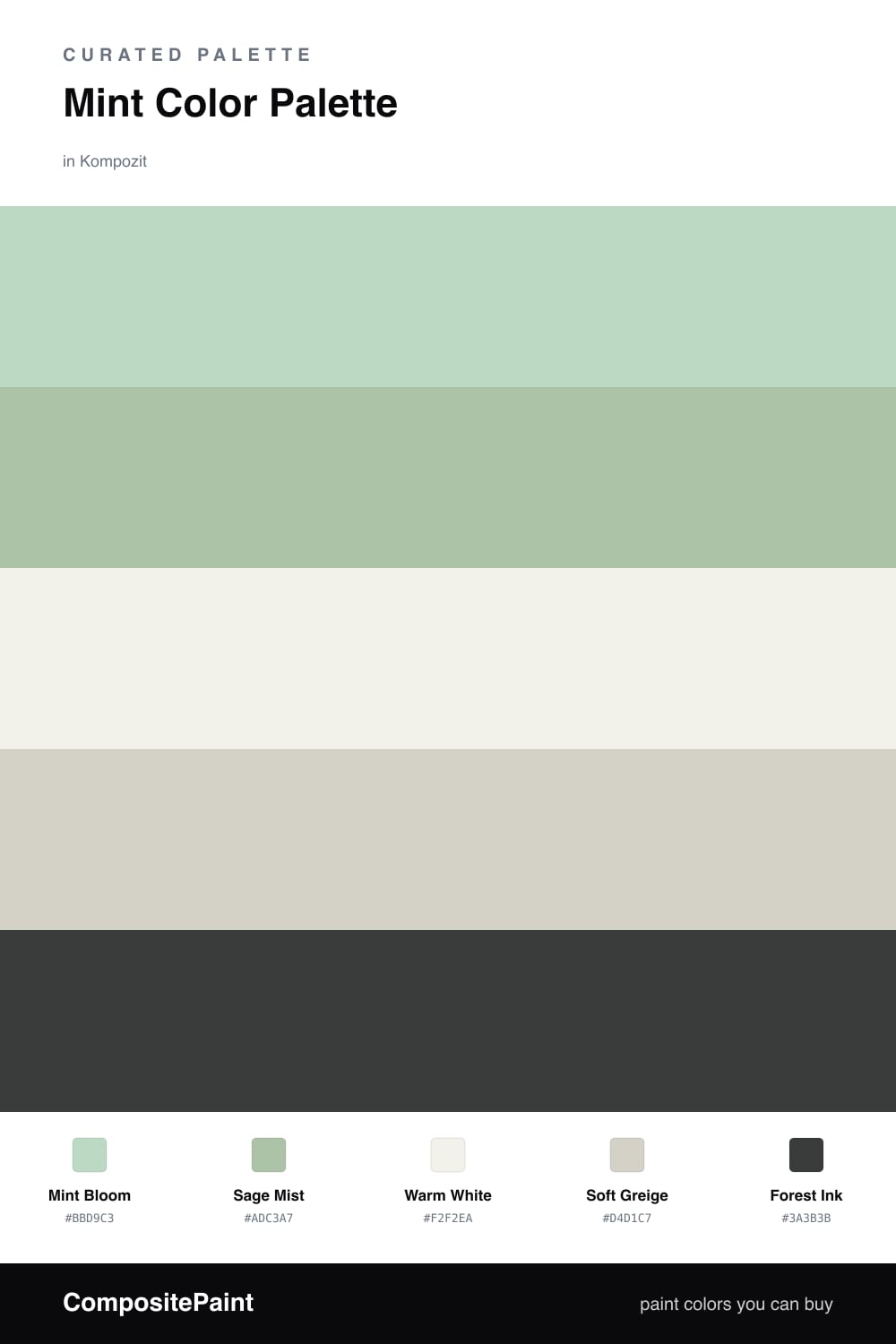
Mint is having a real moment, and Mint Bloom leans into the soft, airy version rather than the retro candy one. This is the green that makes a small room feel like it just got a window, and it carries the whole scheme as the dominant color.
I paired it with Sage Mist, a slightly deeper, grayer green that lets you layer cabinetry or a feature wall without losing the freshness. Warm White and Soft Greige do the quiet work, keeping everything grounded and warm so the mint never tips into cold or clinical.
The move that makes it feel current is Forest Ink. A deep, near-black green used sparingly — think a single door or a slim shelf — gives the palette contrast and a bit of backbone. Keep mint as roughly two-thirds of the room and let the rest play support.
Buy These Colors
Each color matched to the closest real paint in every brand, by ΔE2000. Kompozit first; take any SKU to the store — these mix on demand.
Questions
Mint reads clean and a little nostalgic at once, which is why it keeps showing up in 2026 interiors. Pairing it with warm neutrals instead of stark white keeps it modern rather than minty-sweet.
Lean on the warm white and greige to add warmth, then use the forest accent in small doses — a door, a frame, a single piece of furniture — to give the soft greens something to push against.
Similar Palettes
Closest schemes by color — not by label.