Seafoam Color Palette — Seafoam & Sable
A soft five-color scheme led by airy seafoam green, warmed by sandy neutrals and grounded with a deep sable accent — every color matched to real paint you can buy.
By Emily Roberts · DIY Editor & First-Timer's Guide
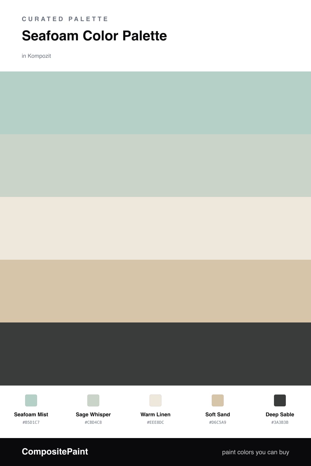
Seafoam is one of those colors that just makes a room exhale. This scheme keeps Seafoam Mist front and center, with a quieter Sage Whisper close behind so the green reads soft and layered instead of flat.
To keep that cool green feeling fresh rather than cold, I leaned on warm neutrals. Warm Linen opens things up as a light base, and Soft Sand adds a little sun-bleached warmth underneath. Together they give seafoam room to breathe.
The magic is the Deep Sable accent. Just a touch of that grounded brown-black, on a door or a slim trim line, snaps the whole palette into focus and gives it a calm, modern edge that feels right for 2026.
Buy These Colors
Each color matched to the closest real paint in every brand, by ΔE2000. Kompozit first; take any SKU to the store — these mix on demand.
Questions
Seafoam is a cool, watery green, so the warm sand and linen tones keep it from feeling chilly. The two temperatures balance each other and make the whole room feel relaxed instead of clinical.
Let seafoam lead on the biggest surfaces, roughly two-thirds of the space, then layer the neutrals as your supporting cast. Save the deep sable for small doses like a door, a frame, or trim.
Similar Palettes
Closest schemes by color — not by label.