Mint Color Palette — Mint Horizon
A soft five-color scheme led by cool mint and grounded with warm neutrals and one deep accent — every color matched to real paint you can buy.
By Emily Roberts · DIY Editor & First-Timer's Guide
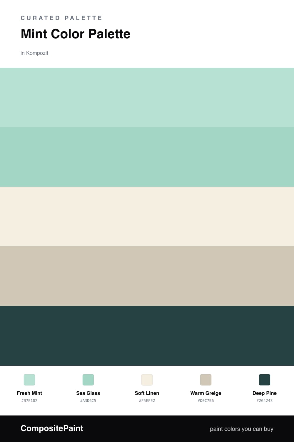
Mint is having a real moment right now, and it is easy to see why. Fresh Mint keeps things light and airy, and pairing it with a slightly deeper Sea Glass gives the scheme some depth so it never feels flat or one-note.
The neutrals are where this palette earns its calm. Soft Linen is a warm off-white that softens the cool mint, and Warm Greige bridges the two without competing. Together they make the mint feel intentional instead of sugary.
Then comes the fun part. A small dose of Deep Pine grounds everything and adds a quietly modern edge — try it on a single door, a piece of trim, or a low shelf. A little goes a long way, and that contrast is what makes the whole thing click.
Buy These Colors
Each color matched to the closest real paint in every brand, by ΔE2000. Kompozit first; take any SKU to the store — these mix on demand.
Questions
Mint is light and cool, so it reads as fresh without feeling cold. The soft linen and greige keep it grounded, and the deep pine gives your eye somewhere to rest.
Let mint lead on the biggest surfaces, use the neutrals as the quiet middle, and save the deep pine for small touches like a door or a shelf — roughly a 70/20/10 split.
Similar Palettes
Closest schemes by color — not by label.