CP

Seafoam Color Palette — Seafoam Frost

A soft five-color scheme led by cool seafoam green, balanced with frosted neutrals and one deep teal accent, with every color matched to real paint you can buy.

By Maya Patel · Reviews Editor & Product Tester

Seafoam Frost
Dominant
Kompozit Uninhibited · 0700
#B5D1C7
LRV 60
Misted Sage
Secondary
Kompozit Lickety Split · 0699
#C2D9D1
LRV 66
Frosted White
Base
Kompozit Cyprus Spring · 0411
#F2F2EA
LRV 88
Pale Driftwood
Support
Kompozit Power Lunch · 0572
#D4D1C7
LRV 64
Deep Teal
Accent
Kompozit Frozen Stream · 0669
#30555D
LRV 8
View palette in

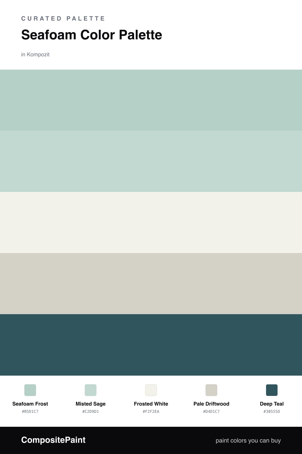
Seafoam is having a real moment in 2026, and Seafoam Frost shows why. It is the kind of cool, watery green that feels fresh without trying too hard, so I let it lead and pulled everything else in around it.

Misted Sage softens the edges as a quiet second, while Frosted White and Pale Driftwood keep the base grounded and warm so the green never feels clinical. That driftwood tone is the trick here, it adds just enough sand to balance the cool.

The winner of the whole scheme is Deep Teal. Use it sparingly, on a single door or a chair, and it does the heavy lifting, turning a pretty pastel set into something with real depth and intent.

Buy These Colors

Each color matched to the closest real paint in every brand, by ΔE2000. Kompozit first; take any SKU to the store — these mix on demand.

Seafoam Frost
#AFD3C4 · LRV 60 · Dominant
Kompozit Uninhibited · 0700 ΔE 2.96
Backdrop Real Real · BD-RR ΔE 15.5
Behr Greenwich Village · N440-3 ΔE 2.39
Benjamin Moore Let It Rain · 639 ΔE 1.95
Clare Views · PNT100-LT-35 ΔE 6.43
Dunn-Edwards Steamy Spring · DE5709 ΔE 3.3
Farrow & Ball Teresa's Green · No. 236 ΔE 7.37
Magnolia Home Vibrant Horizon · JG-88 ΔE 8.63
PPG / Glidden Cassiopeia · 1141-3 ΔE 3.29
Sherwin-Williams Blue Sky · SW 63 ΔE 2.83
Valspar Sea Inspired · V064-2 ΔE 3.25
Misted Sage
#CADBD0 · LRV 68 · Secondary
Kompozit Lickety Split · 0699 ΔE 2.42
Backdrop Real Real · BD-RR ΔE 10.29
Behr Heath Gray · N380-2 ΔE 1.22
Benjamin Moore Colony Green · 694 ΔE 1.58
Clare Rain Check · PNT100-LT-69 ΔE 4.99
Dunn-Edwards Sculptural Silver · DE6296 ΔE 4.29
Farrow & Ball Pale Powder · No. 204 ΔE 5.76
Magnolia Home Mineral Green · JG-67 ΔE 2.71
PPG / Glidden Tenderness · 1133-2 ΔE 1.11
Sherwin-Williams Breaktime · SW 6463 ΔE 1.53
Valspar Ocean Silk · V064-1 ΔE 1.59
Frosted White
#F2F4F0 · LRV 90 · Base
Kompozit Cyprus Spring · 0411 ΔE 1.97
Backdrop Tabula Rasa · BD-TR ΔE 3.37
Behr White Fur · W-F-610 ΔE 0.49
Benjamin Moore Distant Gray · 2124-70 ΔE 0.5
Clare Timeless · PNT100-LT-04 ΔE 2.12
Dunn-Edwards Wind Chill · DEW369 ΔE 1
Farrow & Ball Wimborne White · No. 239 ΔE 3.77
Magnolia Home True White · JG-21 ΔE 0.75
PPG / Glidden Delicate White · 1001-1 ΔE 0.61
Sherwin-Williams High Reflective White · SW 7757 ΔE 1.37
Valspar Tell Me a Secret · 8007-2B ΔE 0.65
Pale Driftwood
#D7CFC2 · LRV 63 · Support
Kompozit Power Lunch · 0572 ΔE 2.45
Backdrop Real Real · BD-RR ΔE 1.96
Behr Aged Beige · PPU7-09 ΔE 0.44
Benjamin Moore Cedar Key · 982 ΔE 0.86
Clare Flatiron · PNT100-LT-17 ΔE 1.49
Dunn-Edwards Fine Grain · DE6213 ΔE 0.52
Farrow & Ball Shaded White · No. 201 ΔE 2.03
Magnolia Home Stoneware Pieces · JG-55 ΔE 3.91
PPG / Glidden Cool Concrete · 1023-2 ΔE 0.86
Sherwin-Williams Modern Gray · SW 7632 ΔE 0.94
Valspar Gentle Shadows · 8005-5A ΔE 1.39
Deep Teal
#2D5C5A · LRV 9 · Accent
Kompozit Frozen Stream · 0669 ΔE 6.61
Backdrop We Three Kings · BD-WK ΔE 16.37
Behr Silken Pine · N430-7 ΔE 3.83
Benjamin Moore Pine Green · 2051-20 ΔE 0.63
Clare Deep Dive · PNT100-MD-40 ΔE 7.54
Dunn-Edwards Enchanting Ivy · DEA179 ΔE 1.71
Farrow & Ball Hague Blue · No. 30 ΔE 12.15
Magnolia Home Weekend · JG-04 ΔE 6.5
PPG / Glidden Crystal Ball · 1144-7 ΔE 2.56
Sherwin-Williams Deep Sea Dive · SW 7618 ΔE 5.05
Valspar Zephyr · T604 ΔE 6.76

Questions

Why does seafoam read as calm rather than cold?

Seafoam sits between green and blue, so it carries a touch of warmth from the green side. Pairing it with a soft driftwood neutral keeps it from tipping icy and gives the whole scheme a relaxed, lived-in feel.

How do I keep this palette from looking washed out?

Anchor it with the deep teal accent. The dominant seafoam and frosted neutrals are all light, so one saturated dark color on a door, frame, or piece of furniture gives the eye somewhere to land and sharpens everything around it.

Similar Palettes

Closest schemes by color — not by label.