Seafoam Living Room Palette — Soft Seafoam & Warm Sand
A calm, breezy 4-color living room scheme with soft seafoam walls, crisp white trim, a warm sand neutral, and a deep teal accent for a fresh, airy space. Every color matched to real paint you can buy.
By Jessica Williams · Color Stylist & Interior Editor
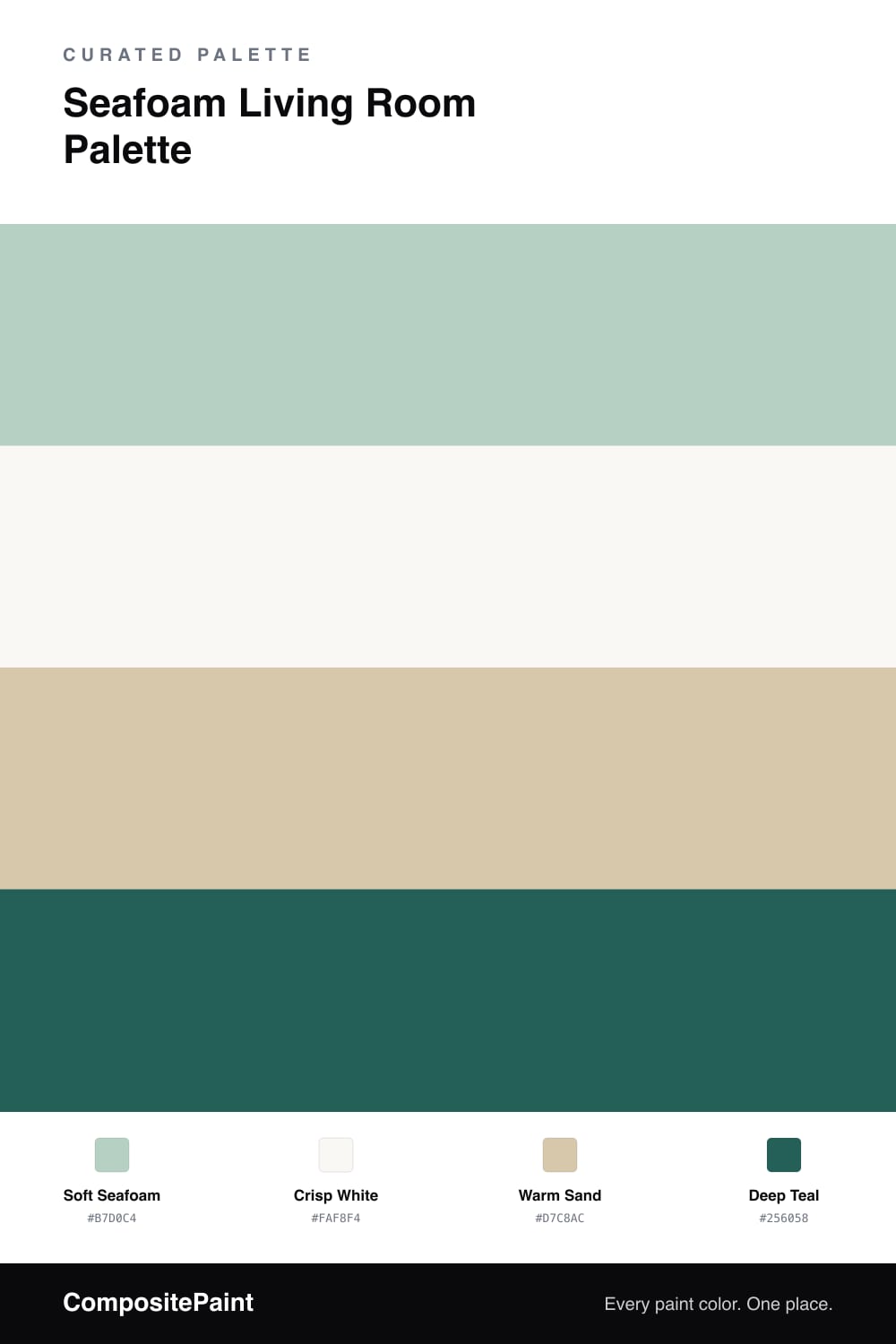
Seafoam is the color of calm water, and a living room is a lovely place to borrow that feeling. Soft seafoam on the walls is a gentle green that leans just slightly toward blue, fresh and airy without being the bright mint that color used to mean. It sets a breezy, easygoing tone the moment you walk in.
A crisp white on the trim and ceiling keeps everything clean and lets the seafoam read clearly against bright edges. Warm sand through the floor, a jute rug, or woven texture is what keeps the cool color from feeling chilly, grounding the room with a soft, sun-warmed neutral. A deep teal then turns up in small doses — a cushion, a vase, a piece of art — echoing the seafoam but with real depth. Together they make a living room that feels coastal and calm without leaning into theme-y beach decor.
Buy These Colors
Each color matched to the closest real paint in every brand, by ΔE2000. Tap a swatch for its full guide or + to save it — take any SKU to the store, they mix on demand.
Questions
The dated version was a bright, minty seafoam from decades past. This soft, slightly grayed seafoam reads as a calm modern green-blue and pairs with warm sand and deep teal to stay fresh rather than retro.
Seafoam leans toward blue and teal, giving it a cooler, beachier feel, while sage leans gray-green and warmer. If you want a breezy, coastal calm rather than an earthy one, seafoam is the better pick.
Similar Palettes
Closest schemes by color — not by label.