Spa Bathroom Palette — Watery Blue-Green & Soft Greige
A serene 5-color spa bathroom scheme with watery blue-green walls, crisp white, pale greige, and a deeper teal accent for a calm, restful feel. Every color matched to real paint you can buy.
By Jessica Williams · Color Stylist & Interior Editor
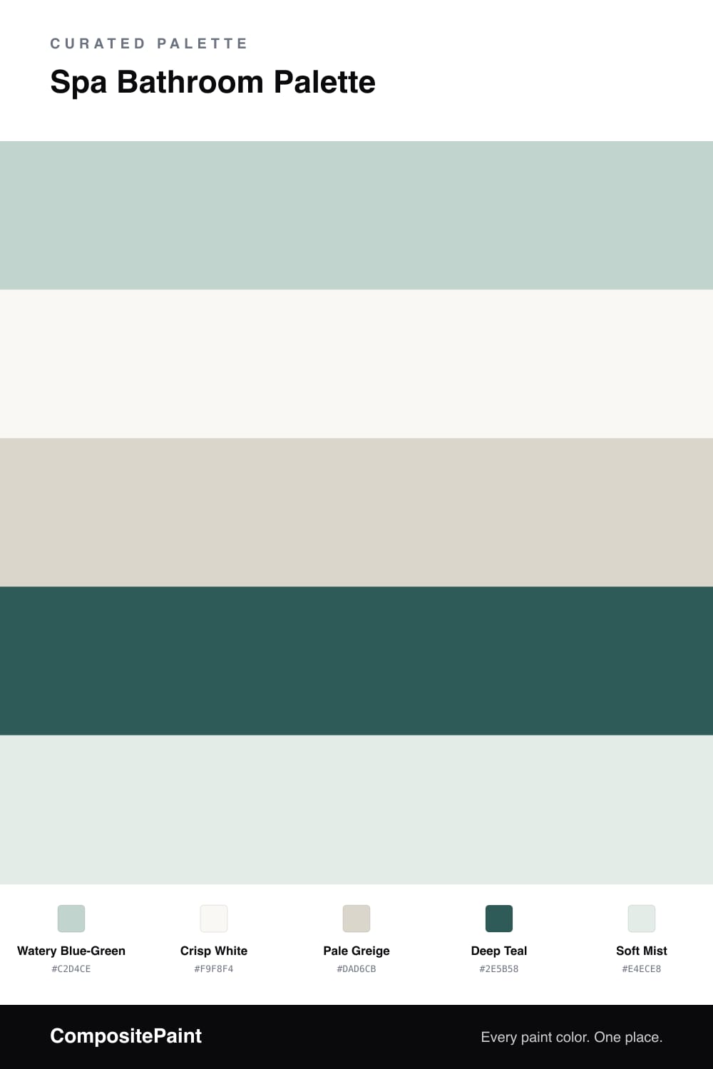
A spa bathroom is really about water and light, so this palette starts with a watery blue-green on the walls — soft, a little grayed, the color of shallow water on a calm day. It is cool but never cold, the kind of tone that lets your shoulders drop the moment you walk in.
A crisp white on the trim and ceiling keeps everything feeling clean and bright, while a pale greige on the vanity or floor tile grounds the scheme and adds a quiet bit of warmth. Soft mist, a touch lighter than the walls, carries through in towels and small details so the room feels layered rather than flat.
The one deeper note is a deep teal, used sparingly on a vanity or framed mirror. It anchors the lightness and gives the whole bathroom a sense of calm depth.
Buy These Colors
Each color matched to the closest real paint in every brand, by ΔE2000. Tap a swatch for its full guide or + to save it — take any SKU to the store, they mix on demand.
Questions
Not if you keep it soft. This blue-green is light and slightly grayed, so it stays restful rather than icy, and the pale greige and warm-leaning white around it add just enough warmth to balance the cool wall color.
Reserve it for a small surface — a vanity, a single accent wall, or framed mirrors and shelving. The deeper teal gives the eye a place to rest, but on too much of the room it overwhelms the airy, watery feeling you want in a spa bathroom.
Similar Palettes
Closest schemes by color — not by label.