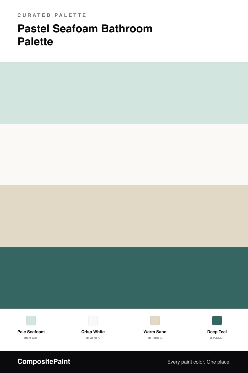
Pastel Seafoam Bathroom Palette — Pale Seafoam & Crisp White
A fresh, coastal pastel seafoam bathroom scheme: pale seafoam walls, crisp white trim, a warm sand neutral, and a deep teal accent for contrast. Every color matched to real paint you can buy.
By Jessica Williams · Color Stylist & Interior Editor
A pale seafoam brings the calm of the coast into a bathroom. With its soft, watery blue-green tint, it feels fresh and spa-like, reading cooler and breezier than a true mint. It is gentle enough to live with daily and never overwhelming.
A crisp white on the trim and ceiling keeps the room bright and airy, the ideal partner for a soft green in a smaller space. A warm sand on the vanity or through stone adds the warmth that keeps seafoam from feeling chilly, grounding the cool tones with an earthy balance.
For contrast, a deep teal accent in tile, towels, or a mirror frame adds depth and a coastal richness. Used in small doses, it anchors the lighter colors and gives the whole bathroom a polished, considered feel.
Buy These Colors
Each color matched to the closest real paint in every brand, by ΔE2000. Tap a swatch for its full guide or + to save it — take any SKU to the store, they mix on demand.
Questions
Seafoam leans a touch more blue-green and watery, while mint sits closer to pure green. Both are soft pastels, but seafoam has a slightly cooler, more coastal feel, which makes it lovely for bathrooms where you want a fresh, spa-like calm.
A warm sand neutral on the vanity or in stone instantly balances the cool green, and natural wood, woven textures, and warm metal fixtures add cozy contrast. Crisp white keeps the room bright while the sand keeps it from feeling cold.
Similar Palettes
Closest schemes by color — not by label.