CP

Mint Color Palette — Reed & River

A fresh five-color scheme led by soft mint, balanced with warm white, greige, and a deep pine accent — every color matched to real paint you can buy.

By Maya Patel · Reviews Editor & Product Tester

Reed Mint
Dominant
Kompozit Cool Spring · 0735
#BBD9C3
LRV 64
Sea Glass
Secondary
Kompozit Plunge · 0701
#A4C2B9
LRV 50
Warm White
Base
Kompozit Cyprus Spring · 0411
#F2F2EA
LRV 88
River Greige
Support
Kompozit Hearthstone · 0567
#C7BEB2
LRV 52
Deep Pine
Accent
Kompozit Atlantic Waves · 0473
#264243
LRV 5
View palette in

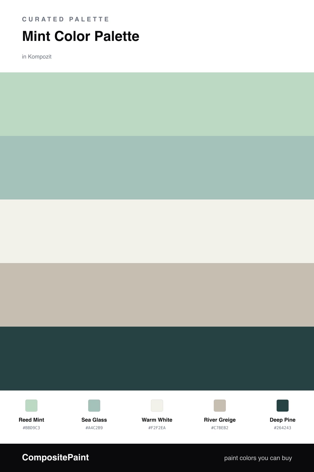
Mint has grown up. The 2026 version is less candy and more sage-adjacent, and Reed Mint is exactly that — a soft, cool green that holds a wall beautifully without shouting. It leads here, and a slightly deeper Sea Glass backs it up for a layered, tonal feel.

The neutrals do the quiet work. Warm White keeps everything from tipping cold, and River Greige adds a grown-up middle tone that bridges the greens and the woodwork in most homes.

The move that makes this palette is Deep Pine. Drop it on trim, a built-in, or a single statement piece and the whole scheme snaps into focus. Keep mint at roughly two-thirds of the room and let the pine stay rare — that contrast is what reads modern instead of pastel.

Buy These Colors

Each color matched to the closest real paint in every brand, by ΔE2000. Kompozit first; take any SKU to the store — these mix on demand.

Reed Mint
#BFD9C7 · LRV 65 · Dominant
Kompozit Cool Spring · 0735 ΔE 1.8
Backdrop Real Real · BD-RR ΔE 12.95
Behr Riverdale · N410-3 ΔE 1.44
Benjamin Moore Aberdeen Green · 631 ΔE 2.79
Clare Two Scoops · PNT100-LT-46 ΔE 4.74
Dunn-Edwards Misty Afternoon · DE5639 ΔE 1.84
Farrow & Ball Teresa's Green · No. 236 ΔE 5.59
Magnolia Home Mineral Green · JG-67 ΔE 4.43
PPG / Glidden Malted Mint · 1139-2 ΔE 1.82
Sherwin-Williams Topiary Tint · SW 6449 ΔE 3.31
Valspar Sunlit Sea · M323 ΔE 2.63
Sea Glass
#9FC4B4 · LRV 50 · Secondary
Kompozit Plunge · 0701 ΔE 3.36
Backdrop Underdog · BD-UD ΔE 12.72
Behr Garden Vista · N430-3 ΔE 2.14
Benjamin Moore Dreamcatcher · 640 ΔE 0.85
Clare Avocado Toast · PNT100-MD-49 ΔE 7.51
Dunn-Edwards Spring Leaves · DE5640 ΔE 4.28
Farrow & Ball Green Blue · No. 84 ΔE 6.68
Magnolia Home Texas Summer · JG-64 ΔE 4.22
PPG / Glidden Green Silk · 1139-3 ΔE 1.56
Sherwin-Williams Kind Green · SW 6457 ΔE 3.67
Valspar Tranquil Bay · 5004-5B ΔE 3.65
Warm White
#F3F1E9 · LRV 88 · Base
Kompozit Cyprus Spring · 0411 ΔE 0.99
Backdrop Tabula Rasa · BD-TR ΔE 1.35
Behr Solid Opal · BWC-06 ΔE 1.42
Benjamin Moore Gardenia · AF-10 ΔE 0.79
Clare Wing It · PNT100-LT-24 ΔE 3.17
Dunn-Edwards Wishful White · DE6260 ΔE 0.57
Farrow & Ball Wimborne White · No. 239 ΔE 1.49
Magnolia Home Silos White · JG-107 ΔE 0.61
PPG / Glidden Crumb Cookie · 18-01 ΔE 0.94
Sherwin-Williams White Flour · SW 7102 ΔE 1.52
Valspar Crisp Cotton · 7007-4 ΔE 1.53
River Greige
#C9C2B4 · LRV 54 · Support
Kompozit Hearthstone · 0567 ΔE 1.83
Backdrop Real Real · BD-RR ΔE 3.39
Behr Armadillo · N230-3 ΔE 1.37
Benjamin Moore Seattle Mist · 1535 ΔE 1.58
Clare Motor City · PNT100-LT-09 ΔE 5.9
Dunn-Edwards Birchwood · DEC752 ΔE 3.28
Farrow & Ball Elephant's Breath · No. 229 ΔE 3.5
Magnolia Home Anatolian · JG-127 ΔE 3.07
PPG / Glidden Great Gray · 15-28 ΔE 1.75
Sherwin-Williams Colonnade Gray · SW 7641 ΔE 1.77
Valspar Feathers of a Dove · M111 ΔE 1.03
Deep Pine
#2C443A · LRV 5 · Accent
Kompozit Atlantic Waves · 0473 ΔE 5.92
Backdrop After Hours · BD-AH ΔE 8.89
Behr Black Swan · 710F-7 ΔE 3.9
Benjamin Moore Hunter Green · 2041-10 ΔE 1.31
Clare Blackish · PNT100-DP-54 ΔE 13.05
Dunn-Edwards Refined Green · DEA181 ΔE 6.49
Farrow & Ball Pitch Black · No. 256 ΔE 14.13
Magnolia Home Arches · JG-97 ΔE 12.89
PPG / Glidden Dark As Night · 14-05 ΔE 8.46
Sherwin-Williams Roycroft Bottle Green · SW 2847 ΔE 3.9
Valspar Peacock House · 5010-4 ΔE 2.2

Questions

Why does mint work as the lead color?

Mint reads soft and cool without going icy, so it carries a whole room without feeling heavy. Pairing it with warm white and greige keeps it grounded instead of minty-fresh in a dated way.

How do I keep this scheme from looking too pastel?

Lean on the deep pine accent and the greige support to add weight. Use them on trim, a single door, or hardware so the mint feels intentional rather than sweet.

Similar Palettes

Closest schemes by color — not by label.