CP

Greige Study Palette — Drift Greige & Espresso Walnut

A calm five-color study scheme built on warm greige walls, a soft backdrop neutral, a clean trim white, walnut wood, and a deep espresso accent — every color matched to real paint you can buy.

By Maya Patel · Reviews Editor & Product Tester

Drift Greige
Walls
Kompozit Moth Wing · 0183
#CCBCA9
LRV 52
Linen Mist
Cabinets or Vanity
Kompozit White Elephant · 0223
#E3DBC8
LRV 71
Quiet White
Trim & Ceiling
Kompozit Twinkle Twinkle · 0355
#F3F2E8
LRV 88
Walnut Brown
Wood & Floors
Kompozit Fall in Season · 0179
#7F6144
LRV 13
Espresso Bark
Accent
Kompozit Silent Sea · 0515
#2A2B2C
LRV 2
View palette in

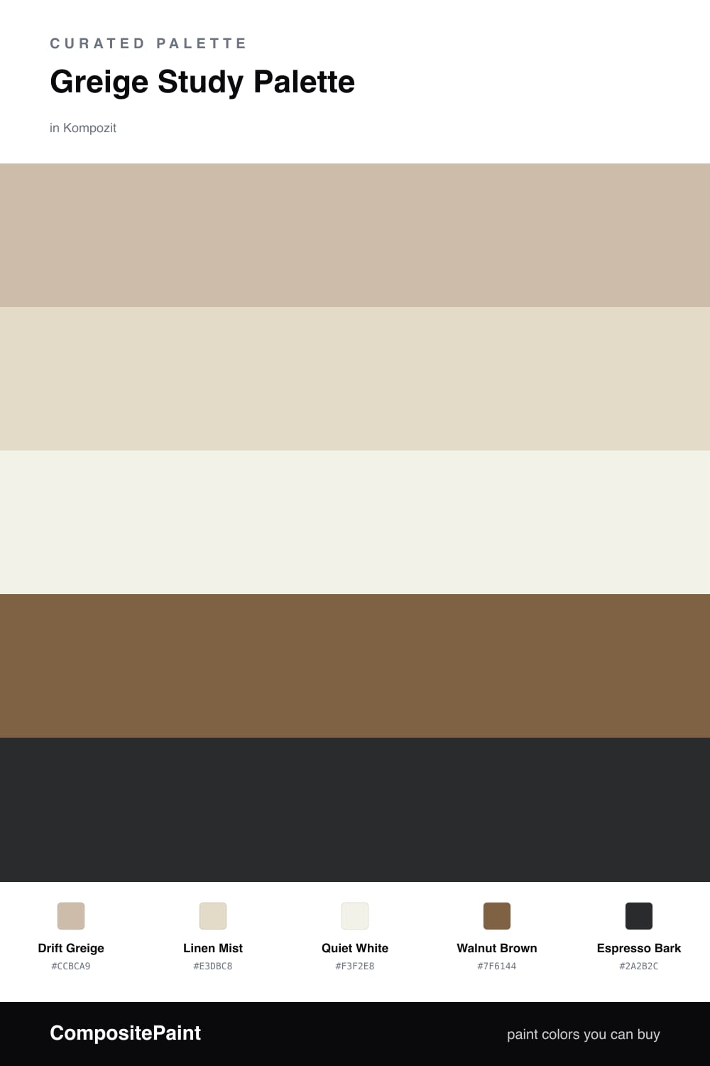
A study should feel quiet and grounded, and Drift Greige does the heavy lifting here. It is the warm, in-between neutral that reads soft in morning light and never turns chilly at night, which makes it the right pick for a room where you actually want to settle in and think.

I kept the supporting cast deliberately low-key. Linen Mist on built-ins or a vanity adds a faint lift against the walls, while Quiet White keeps the trim and ceiling fresh without going stark. The contrast lives in the Walnut Brown floor and a few Espresso Bark accents — bookshelf edges, a desk base, a frame — that anchor the whole space.

If you want a 2026 feel, push the greige toward its warmer side and let the wood tones do the talking. This is a scheme that rewards restraint, so resist adding a fifth bright color and let the texture of the walnut and the depth of the espresso carry the interest.

Buy These Colors

Each color matched to the closest real paint in every brand, by ΔE2000. Kompozit first; take any SKU to the store — these mix on demand.

Drift Greige
#C7BCAB · LRV 51 · Walls
Kompozit Moth Wing · 0183 ΔE 2.2
Backdrop Boy Meets Girl · BD-BG ΔE 12.06
Behr Creamy Mushroom · PPU5-13 ΔE 2.02
Benjamin Moore Greenwich Gate · CSP-170 ΔE 2.04
Clare Greige · PNT100-LT-13 ΔE 5.18
Dunn-Edwards Birchwood · DEC752 ΔE 1.49
Farrow & Ball Drop Cloth · No. 283 ΔE 0.96
Magnolia Home Solid Wood · JG-109 ΔE 0.85
PPG / Glidden Stonington · 15-25 ΔE 0.5
Sherwin-Williams Shiitake · SW 9173 ΔE 0.5
Valspar Mother Nature · 8004-26C ΔE 3.86
Linen Mist
#E4DCCD · LRV 72 · Cabinets or Vanity
Kompozit White Elephant · 0223 ΔE 1.67
Backdrop Cookies & Cream · BD-CC ΔE 3.37
Behr Vintage Linen · PPU7-16 ΔE 0.23
Benjamin Moore Fossil · AF-65 ΔE 1
Clare No Filter · PNT100-LT-19 ΔE 1.89
Dunn-Edwards Stucco Tan · DE6205 ΔE 1.04
Farrow & Ball School House White · No. 291 ΔE 0.83
Magnolia Home Castle Cream · JG-153 ΔE 0.6
PPG / Glidden Fossil Stone · 1102-2 ΔE 1.5
Sherwin-Williams Divine White · SW 6105 ΔE 0.99
Valspar Cream in My Coffee · 3003-10C ΔE 0.91
Quiet White
#F4F0E7 · LRV 87 · Trim & Ceiling
Kompozit Twinkle Twinkle · 0355 ΔE 1.68
Backdrop Tabula Rasa · BD-TR ΔE 1.54
Behr Nude W-f-210 · W-F-210 ΔE 1.21
Benjamin Moore Pink Damask · 890 ΔE 1
Clare Wing It · PNT100-LT-24 ΔE 2.49
Dunn-Edwards Antique Paper · DE6218 ΔE 0.47
Farrow & Ball Pointing · No. 2003 ΔE 2.1
Magnolia Home Silos White · JG-107 ΔE 1.17
PPG / Glidden Crumb Cookie · 18-01 ΔE 1.21
Sherwin-Williams White Flour · SW 7102 ΔE 0.58
Valspar Crisp Cotton · 7007-4 ΔE 0.81
Walnut Brown
#7A5C42 · LRV 12 · Wood & Floors
Kompozit Fall in Season · 0179 ΔE 2.13
Backdrop Buenos Aires · BD-BA ΔE 1.3
Behr Molasses · S220-7 ΔE 3
Benjamin Moore Marsh Brown · 2164-20 ΔE 2.96
Clare Coffee Date · PNT100-DP-53 ΔE 10.5
Dunn-Edwards Rodeo · DEA163 ΔE 1.96
Farrow & Ball Salon Drab · No. 290 ΔE 7.15
Magnolia Home Cognac · JG-164 ΔE 2.52
PPG / Glidden Spiced Cinnamon · 1071-7 ΔE 4.66
Sherwin-Williams Burnished Brandy · SW 7523 ΔE 1.04
Valspar Muddy Mississippi · 3004-9A ΔE 0.87
Espresso Bark
#33291F · LRV 2 · Accent
Kompozit Silent Sea · 0515 ΔE 8.57
Backdrop Hocus Pocus · BD-HP ΔE 11
Behr Beluga · 770F-7 ΔE 12.16
Benjamin Moore Bucktrout Brown · CW-180 ΔE 5.04
Clare Blackish · PNT100-DP-54 ΔE 11.35
Dunn-Edwards Black · DEA187 ΔE 8.86
Farrow & Ball Pitch Black · No. 256 ΔE 8.04
Magnolia Home Blackboard · JG-05 ΔE 11.6
PPG / Glidden Black Magic · 1001-7 ΔE 10.1
Sherwin-Williams Raisin · SW 7630 ΔE 8.47
Valspar Tomcat · 8006-12G ΔE 7.81

Questions

Why is greige a good choice for a study?

Greige sits between gray and beige, so it stays calm without going cold. That neutral warmth keeps a study restful for long stretches of focus while still pairing easily with wood and dark accents.

How do I keep the scheme from feeling flat?

Lean on contrast in the wood and accent — the walnut floor and espresso details give the soft greige something to push against, so the room reads layered instead of washed out.

Similar Palettes

Closest schemes by color — not by label.