CP

Fall Color Palette — Maple & Linen

A warm five-color autumn scheme pairing burnt orange and maple red with ochre, olive, and deep brown, every color matched to real paint you can buy.

By Emily Roberts · DIY Editor & First-Timer's Guide

Burnt Orange
Dominant
Kompozit Orange Ballad · 1019
#B56D41
LRV 21
Maple Red
Secondary
Kompozit April Love · 1061
#8B3D2F
LRV 9
Warm Linen
Base
Kompozit Tawny Daylilly · 0327
#EEE4D1
LRV 78
Soft Ochre
Support
Kompozit Sunrise Heat · 0920
#CAA061
LRV 39
Deep Olive Brown
Accent
Kompozit Film Noir · 0144
#473933
LRV 5
View palette in

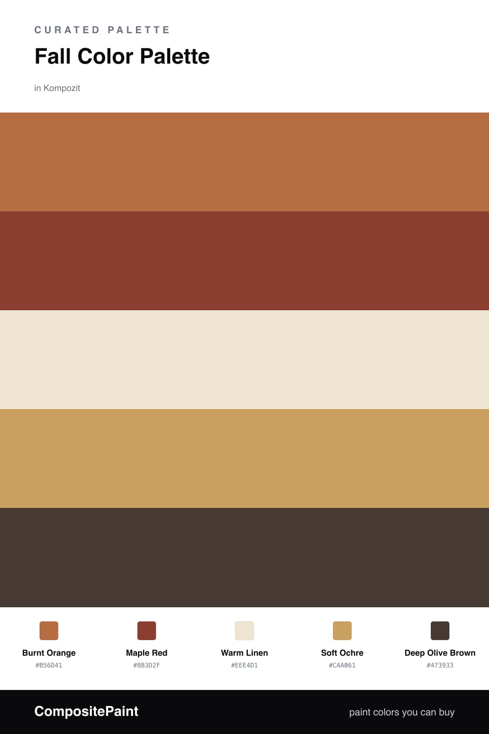
This is the palette I reach for when I want a room to feel like a crisp October afternoon. Burnt Orange leads the way with that toasty, glowing warmth, and Maple Red deepens it like leaves a week later. Together they carry all the cozy energy of the season without tipping into Halloween territory.

To keep things calm and current, I rest everything on a soft Warm Linen. It is the quiet backdrop that lets the bolder shades breathe, which is exactly how 2026 rooms are leaning right now — warm and lived-in, not loud. Soft Ochre bridges the gap, adding a golden, honey note that ties the oranges and the neutral together.

For the finishing touch, a little Deep Olive Brown grounds the whole scheme. Use it sparingly — a lampshade, a cushion, a painted door — and it reads like the rich soil under all those fall colors. Start with the linen on your walls, layer the warm tones in next, and let the olive brown do the quiet anchoring.

Buy These Colors

Each color matched to the closest real paint in every brand, by ΔE2000. Kompozit first; take any SKU to the store — these mix on demand.

Burnt Orange
#C0612F · LRV 20 · Dominant
Kompozit Orange Ballad · 1019 ΔE 4.63
Backdrop Bahaus · BD-BH ΔE 18.52
Behr Chivalry Copper · 240D-6 ΔE 2.96
Benjamin Moore Fall Harvest · 2168-10 ΔE 2.56
Clare Fire Sign · PNT100-DP-74 ΔE 6.58
Dunn-Edwards Clay Pot · DE5174 ΔE 3.23
Farrow & Ball Charlotte's Locks · No. 268 ΔE 6.79
Magnolia Home Work Worn Wood · JG-35 ΔE 6.03
PPG / Glidden Sesame Crunch · 1198-7 ΔE 2.91
Sherwin-Williams Robust Orange · SW 6628 ΔE 3.69
Valspar Storybook Sundown · V010-3 ΔE 2.85
Maple Red
#8E3B2E · LRV 9 · Secondary
Kompozit April Love · 1061 ΔE 0.9
Backdrop Punk Rock · BD-PR ΔE 5.81
Behr Firebrick · 210D-7 ΔE 2.64
Benjamin Moore Copper Clay · 2172-10 ΔE 2.39
Clare Vintage · PNT100-DP-67 ΔE 9.93
Dunn-Edwards Deep Crimson · DEA152 ΔE 3.99
Farrow & Ball Incarnadine · No. 248 ΔE 6.75
Magnolia Home Create · JG-28 ΔE 8.23
PPG / Glidden Brick Dust · 1056-7 ΔE 5.04
Sherwin-Williams Bolero · SW 7600 ΔE 2.79
Valspar Decadent Red · 2002-5A ΔE 0.57
Warm Linen
#EDE3D1 · LRV 78 · Base
Kompozit Tawny Daylilly · 0327 ΔE 0.45
Backdrop Don't Eat the Yellow Snow · BD-DS ΔE 3.06
Behr Weathered Sandstone · 290E-1 ΔE 1.52
Benjamin Moore Sparkling Wine · 949 ΔE 1.08
Clare Like Buttah · PNT100-LT-62 ΔE 0.85
Dunn-Edwards Siamese Kitten · DE6121 ΔE 2.72
Farrow & Ball Dimity · No. 2008 ΔE 1.13
Magnolia Home Soft Landing · JG-17 ΔE 1.99
PPG / Glidden Glazed Pears · 1095-2 ΔE 1.2
Sherwin-Williams Casa Blanca · SW 7571 ΔE 0.95
Valspar Honey Moon · 8003-22A ΔE 0.96
Soft Ochre
#C99A4E · LRV 36 · Support
Kompozit Sunrise Heat · 0920 ΔE 2.95
Backdrop Carry the Two · BD-CT ΔE 15.59
Behr Solid Gold · M280-6 ΔE 0.87
Benjamin Moore Maple Sugar · 2160-30 ΔE 1.55
Clare Good as Gold · PNT100-DP-59 ΔE 4.69
Dunn-Edwards Gingerbread House · DE5334 ΔE 0.71
Farrow & Ball India Yellow · No. 66 ΔE 1.69
Magnolia Home Juniper Tree · JG-166 ΔE 13.92
PPG / Glidden Allspice · 1207-6 ΔE 2
Sherwin-Williams Alchemy · SW 6395 ΔE 1.49
Valspar Wild Mustard Seed · M159 ΔE 2.72
Deep Olive Brown
#403726 · LRV 4 · Accent
Kompozit Film Noir · 0144 ΔE 7.76
Backdrop After Hours · BD-AH ΔE 10.22
Behr Bison Brown · 780B-7 ΔE 7.84
Benjamin Moore Bittersweet Chocolate · 2114-10 ΔE 6.94
Clare Blackish · PNT100-DP-54 ΔE 9.71
Dunn-Edwards Black · DEA187 ΔE 9.5
Farrow & Ball Pitch Black · No. 256 ΔE 8.73
Magnolia Home Moments · JG-150 ΔE 7.29
PPG / Glidden Black Magic · 1001-7 ΔE 9.84
Sherwin-Williams Black Bean · SW 6006 ΔE 9.13
Valspar Black Raisin · 4002-2C ΔE 7.89

Questions

Why do these autumn colors work together?

They all share a warm, earthy undertone, so they feel like one family pulled straight from a fall walk. The pale linen gives your eye a place to rest between the richer oranges and reds.

How do I use these in a real room?

Let the linen lead on big surfaces, then bring in burnt orange and maple red on a feature wall or in textiles. Save the deep olive brown for small grounding touches like a frame or a chair.

Similar Palettes

Closest schemes by color — not by label.