Retro Color Palette — Velvet Seventies
A warm five-color scheme that channels the 1970s with burnt orange, avocado green, mustard, and cocoa brown over a soft cream base — every color matched to real paint you can buy.
By Emily Roberts · DIY Editor & First-Timer's Guide
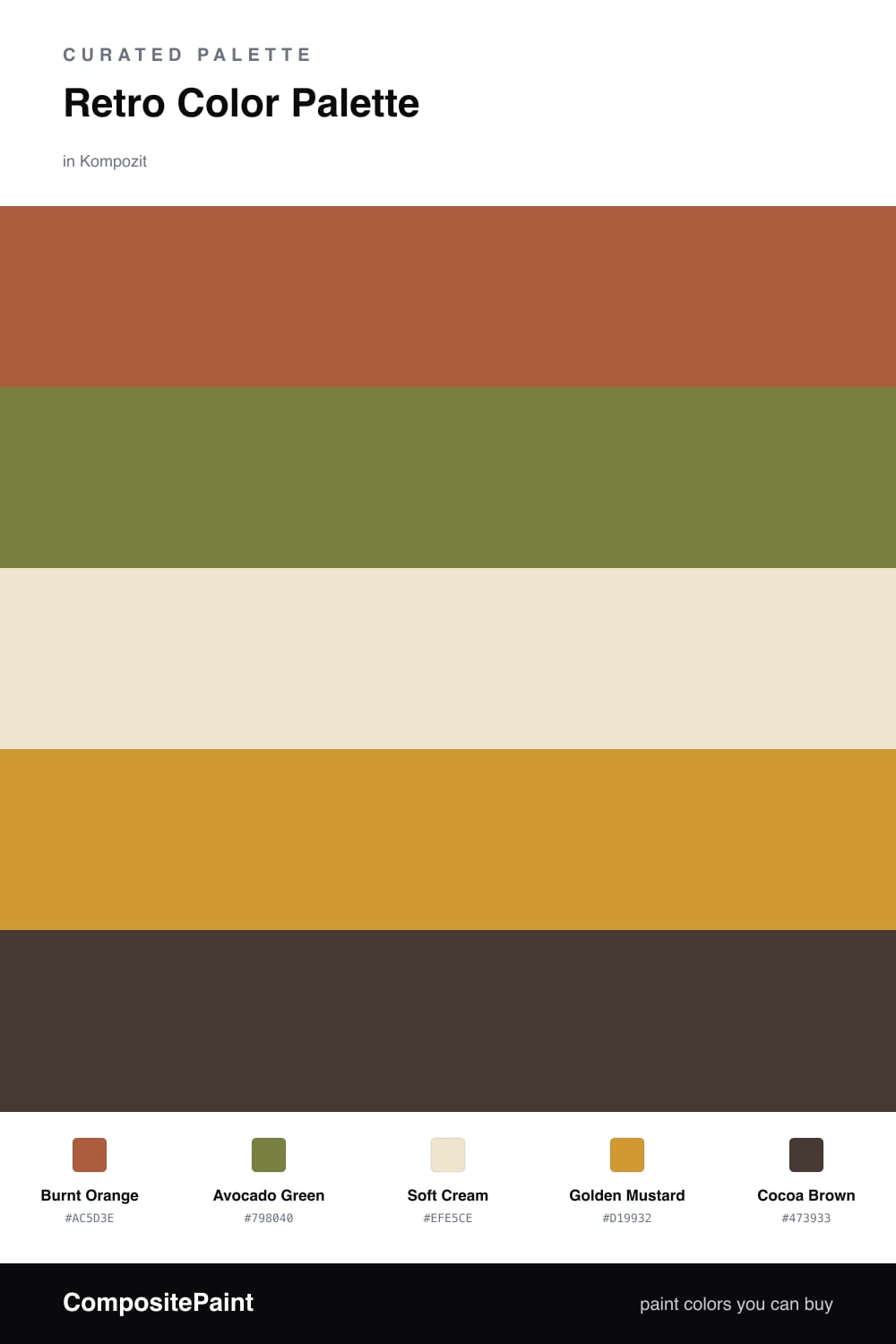
There is something so comforting about a 70s color story, and this one keeps all the warmth without feeling like a costume. Burnt Orange leads the way, that toasty terracotta that instantly makes a space feel lived-in and a little sun-baked.
From there, Avocado Green and Golden Mustard do the supporting work — they are the colors you remember from a grandparent’s kitchen, but used gently here so they feel intentional rather than retro for the sake of it. A wide Soft Cream base keeps everything breathing, which is the trick to making these tones land as modern in 2026.
Finally, Cocoa Brown grounds the whole palette. Use it for the heaviest, darkest moment in the room — a wood tone, a frame, a bit of trim — and the warm colors above it suddenly look richer and more deliberate.
Buy These Colors
Each color matched to the closest real paint in every brand, by ΔE2000. Kompozit first; take any SKU to the store — these mix on demand.
Questions
Yes, when you let the cream do most of the talking. Modern retro is about warmth, not a full time-warp — use the burnt orange and mustard in smaller doses and the room reads cozy and grounded rather than dated.
Lead with the burnt orange on one feature wall or a big piece of furniture, then sprinkle the avocado and mustard through textiles and decor. The cocoa brown is your anchor — think a wood console or a single dark trim moment.
Similar Palettes
Closest schemes by color — not by label.