CP

Retro Color Palette — Groovy Sunroom

A warm five-color scheme rooted in 1970s style — burnt orange, avocado green, and mustard grounded by warm brown and cream, with every color matched to real paint you can buy.

By Jessica Williams · Color Stylist & Interior Editor

Burnt Orange
Dominant
Kompozit Pretty Parasol · 1039
#AC5D3E
LRV 17
Avocado Green
Secondary
Kompozit Green Glow · 0788
#798040
LRV 20
Golden Mustard
Accent
Kompozit Yellow Shout · 0935
#D19932
LRV 37
Cocoa Brown
Support
Kompozit Hideaway · 0137
#654637
LRV 7
Soft Cream
Base
Kompozit Petticoat · 0010
#EFE5CE
LRV 79
View palette in

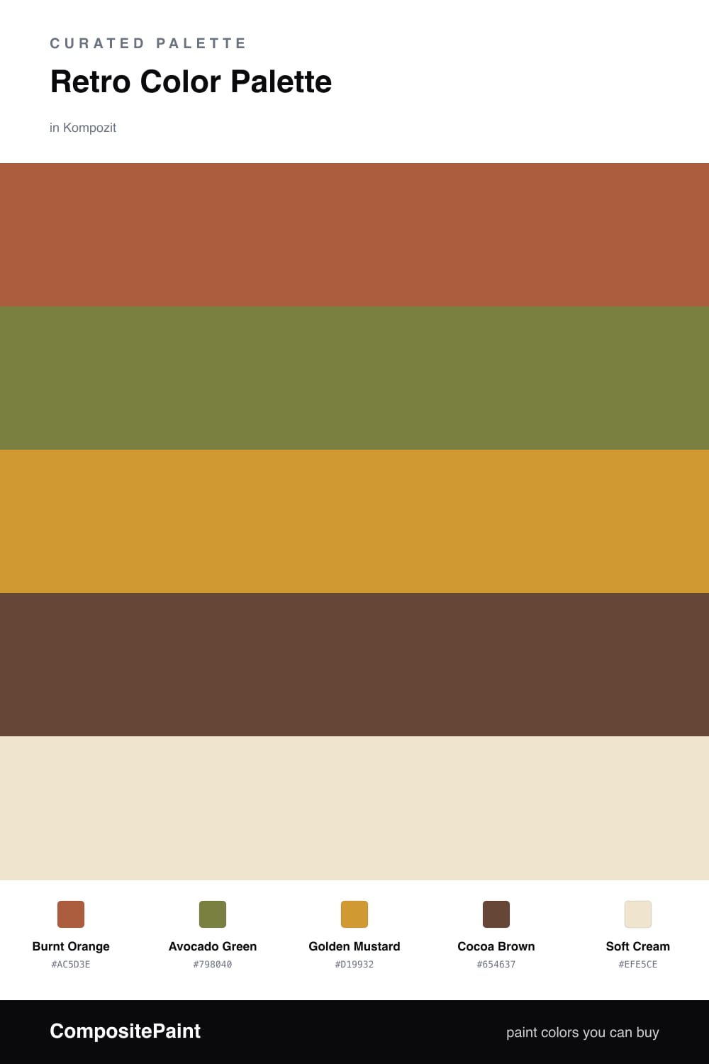
There is something deeply comforting about a 1970s color story, and this one leans into the best of it. Burnt Orange sets the mood — earthy, sun-warmed, the shade of a clay pot left out all summer — while Avocado Green answers it with that unmistakable muted, leafy depth. Together they feel nostalgic without tipping into costume.

A flicker of Golden Mustard keeps things lively, the way a brass lamp or a woven throw catches the light, and Cocoa Brown anchors the scheme with a grounded, chocolatey weight. I love these three doing the talking against a quiet backdrop.

That backdrop is Soft Cream, and it is the secret to making the palette feel 2026 rather than 1975. Let the cream carry your largest surfaces, then bring the orange, green, and mustard in as considered accents. The result reads warm, lived-in, and just retro enough.

Buy These Colors

Each color matched to the closest real paint in every brand, by ΔE2000. Kompozit first; take any SKU to the store — these mix on demand.

Burnt Orange
#B85C2E · LRV 18 · Dominant
Kompozit Pretty Parasol · 1039 ΔE 4.36
Backdrop Bahaus · BD-BH ΔE 16.5
Behr Jack O Lantern · M220-7 ΔE 2.88
Benjamin Moore Gold Rush · 2166-10 ΔE 3.65
Clare Sriracha · PNT100-DP-29 ΔE 12.03
Dunn-Edwards Georgia Clay · DE5181 ΔE 4.82
Farrow & Ball Blazer · No. 212 ΔE 12.12
Magnolia Home Work Worn Wood · JG-35 ΔE 6.33
PPG / Glidden Tabasco · 1192-7 ΔE 4.7
Sherwin-Williams Husky Orange · SW 6636 ΔE 3.4
Valspar Storybook Sundown · V010-3 ΔE 3.59
Avocado Green
#7B7A3A · LRV 18 · Secondary
Kompozit Green Glow · 0788 ΔE 3.11
Backdrop Old Soul · BD-OS ΔE 8.02
Behr Green Tea Leaf · M330-7 ΔE 2.07
Benjamin Moore Perfectly Pesto · CSP-895 ΔE 3.19
Clare Daily Greens · PNT100-DP-61 ΔE 11.62
Dunn-Edwards Tara's Drapes · DE5566 ΔE 3.92
Farrow & Ball Calke Green · No. 34 ΔE 12.09
Magnolia Home Celery Seeds · JG-58 ΔE 7.39
PPG / Glidden Lucky · 1118-7 ΔE 3.43
Sherwin-Williams Verdant · SW 6713 ΔE 3.05
Valspar Dried Bay Leaf · 8003-28F ΔE 3.18
Golden Mustard
#C8973A · LRV 35 · Accent
Kompozit Yellow Shout · 0935 ΔE 2.15
Backdrop Carry the Two · BD-CT ΔE 17.5
Behr Glazed Pears · M270-6 ΔE 2.05
Benjamin Moore Spicy Mustard · 2154-20 ΔE 2.16
Clare Good as Gold · PNT100-DP-59 ΔE 7.12
Dunn-Edwards Jackpot · DE5321 ΔE 3.14
Farrow & Ball India Yellow · No. 66 ΔE 4.35
Magnolia Home Vintage Crown · JG-152 ΔE 11.74
PPG / Glidden Mayan Treasure · 1208-6 ΔE 2.46
Sherwin-Williams Crispy Gold · SW 6699 ΔE 2.19
Valspar Ripe Banana · 8001-22G ΔE 2.19
Cocoa Brown
#5A4233 · LRV 6 · Support
Kompozit Hideaway · 0137 ΔE 3.43
Backdrop It's a Date · BD-IT ΔE 0.67
Behr Breakfast Blend · 280F-7 ΔE 2.9
Benjamin Moore Deep Taupe · 2111-10 ΔE 0.97
Clare Blackish · PNT100-DP-54 ΔE 12.03
Dunn-Edwards Northern Territory · DEA158 ΔE 2.96
Farrow & Ball Mahogany · No. 36 ΔE 7.54
Magnolia Home Wooded Acres · JG-122 ΔE 6.88
PPG / Glidden Racy Raisin · 16-24 ΔE 5.94
Sherwin-Williams Van Dyke Brown · SW 7041 ΔE 3.54
Valspar Piano Brown · 1004-9A ΔE 5.02
Soft Cream
#EFE6D2 · LRV 80 · Base
Kompozit Petticoat · 0010 ΔE 1.08
Backdrop Don't Eat the Yellow Snow · BD-DS ΔE 1.85
Behr Scroll · N280-1 ΔE 1.64
Benjamin Moore Cappuccino Froth · CSP-1055 ΔE 0.48
Clare Like Buttah · PNT100-LT-62 ΔE 1.48
Dunn-Edwards Rice Bowl · DE6170 ΔE 1.12
Farrow & Ball Dimity · No. 2008 ΔE 2.25
Magnolia Home Carter Crème · JG-16 ΔE 1.02
PPG / Glidden Instant Relief · 1096-1 ΔE 1.6
Sherwin-Williams Décor White · SW 7559 ΔE 1.74
Valspar Ivory Lace · 7003-6 ΔE 1.33

Questions

How do I use these 1970s colors without the room feeling dated?

Let the cream do most of the work on walls and keep the burnt orange and avocado as smaller, deliberate moments — a single chair, a cabinet, a length of trim. A heavy hand reads like a time capsule, but small doses against a clean cream feel collected and current.

Which color should I lead with?

Start with Burnt Orange as your hero in a roughly 60/30/10 split — orange leading, avocado green and cocoa brown sharing the middle, and a thin line of golden mustard as the spark. The cream sits underneath everything to keep it warm and breathable.

Similar Palettes

Closest schemes by color — not by label.