CP

Retro Color Palette — Sunbaked Seventies

A warm five-color scheme rooted in the 1970s — burnt orange, avocado green, mustard, and warm brown softened by cream, with every color matched to real paint you can buy.

By Jessica Williams · Color Stylist & Interior Editor

Burnt Orange
Dominant
Kompozit Pretty Parasol · 1039
#AC5D3E
LRV 17
Avocado Green
Secondary
Kompozit Wing Man · 0396
#7A6F39
LRV 16
Soft Cream
Base
Kompozit Ivory Parchment · 0300
#EFE3CA
LRV 78
Warm Cocoa Brown
Support
Kompozit Hideaway · 0137
#654637
LRV 7
Golden Mustard
Accent
Kompozit Yellow Shout · 0935
#D19932
LRV 37
View palette in

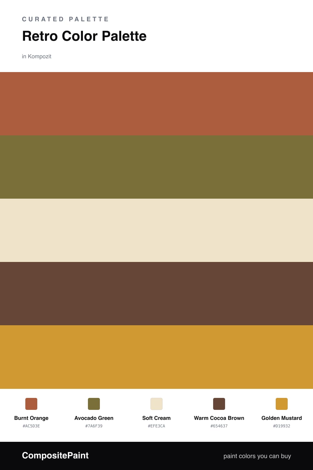
The 1970s are back, but the version people actually want to live with in 2026 is softer and warmer than the original. This palette keeps the spirit and tones down the volume. Burnt Orange leads as the dominant color, rich and a little smoky, the kind of shade that glows in afternoon light.

Avocado Green brings in that unmistakable retro earthiness, while Soft Cream opens everything up and keeps the room from feeling heavy. I lean on Warm Cocoa Brown to ground the lower half of a space — baseboards, a console, a leather chair — so the brighter tones have something steady to sit against.

The spark is Golden Mustard. Used in small touches, a lamp, a throw, a strip of trim, it ties the orange and green together and makes the whole scheme feel intentional rather than nostalgic. Keep cream as your biggest surface and this reads cozy and current, not like a time capsule.

Buy These Colors

Each color matched to the closest real paint in every brand, by ΔE2000. Kompozit first; take any SKU to the store — these mix on demand.

Burnt Orange
#B45A2A · LRV 17 · Dominant
Kompozit Pretty Parasol · 1039 ΔE 4.55
Backdrop Bahaus · BD-BH ΔE 16.45
Behr Thanksgiving · M210-7 ΔE 4.92
Benjamin Moore Pilgrimage Foliage · 2175-20 ΔE 3.18
Clare Sriracha · PNT100-DP-29 ΔE 12.83
Dunn-Edwards Georgia Clay · DE5181 ΔE 5.38
Farrow & Ball Blazer · No. 212 ΔE 12.58
Magnolia Home On Bosque · JG-36 ΔE 5.76
PPG / Glidden Fragrant Cloves · 1199-7 ΔE 3.31
Sherwin-Williams Earthen Jug · SW 7703 ΔE 3.56
Valspar Ripe Peach · P045 ΔE 2.49
Avocado Green
#6E7034 · LRV 15 · Secondary
Kompozit Wing Man · 0396 ΔE 4.79
Backdrop Old Soul · BD-OS ΔE 9.16
Behr Olive Shade · S330-7 ΔE 1.85
Benjamin Moore Avocado · 2145-10 ΔE 1.96
Clare Daily Greens · PNT100-DP-61 ΔE 11.02
Dunn-Edwards Dill Pickle · DE5573 ΔE 6.29
Farrow & Ball Bancha · No. 298 ΔE 6.43
Magnolia Home Landscape · JG-49 ΔE 7.02
PPG / Glidden Oakmoss · 1122-7 ΔE 3.66
Sherwin-Williams Relentless Olive · SW 6425 ΔE 2.13
Valspar Safari Green · M246 ΔE 1.34
Soft Cream
#EDE3CC · LRV 77 · Base
Kompozit Ivory Parchment · 0300 ΔE 0.94
Backdrop Don't Eat the Yellow Snow · BD-DS ΔE 1.8
Behr Raffia Cream · 710C-2 ΔE 0.72
Benjamin Moore Oatmeal · 268 ΔE 0.99
Clare Like Buttah · PNT100-LT-62 ΔE 2.32
Dunn-Edwards Navajo White · DEC772 ΔE 0.59
Farrow & Ball Dimity · No. 2008 ΔE 3.01
Magnolia Home Soft Landing · JG-17 ΔE 1.56
PPG / Glidden Morocco Sand · 1096-2 ΔE 0.47
Sherwin-Williams Classical White · SW 2829 ΔE 0.8
Valspar Ivory Essence · 3006-8C ΔE 0.8
Warm Cocoa Brown
#5A4332 · LRV 6 · Support
Kompozit Hideaway · 0137 ΔE 4.18
Backdrop It's a Date · BD-IT ΔE 1.31
Behr Breakfast Blend · 280F-7 ΔE 1.66
Benjamin Moore Deep Taupe · 2111-10 ΔE 0.9
Clare Blackish · PNT100-DP-54 ΔE 11.94
Dunn-Edwards Northern Territory · DEA158 ΔE 3.95
Farrow & Ball Mahogany · No. 36 ΔE 8.1
Magnolia Home Wooded Acres · JG-122 ΔE 6.69
PPG / Glidden Racy Raisin · 16-24 ΔE 6.67
Sherwin-Williams Van Dyke Brown · SW 7041 ΔE 2.81
Valspar Boston Brown Bread · 8005-9G ΔE 2.14
Golden Mustard
#C99A3B · LRV 36 · Accent
Kompozit Yellow Shout · 0935 ΔE 2.37
Backdrop Carry the Two · BD-CT ΔE 17.52
Behr Solid Gold · M280-6 ΔE 2.55
Benjamin Moore Fields of Gold · 203 ΔE 0.87
Clare Good as Gold · PNT100-DP-59 ΔE 7.12
Dunn-Edwards Roman Gold · DE5356 ΔE 2.17
Farrow & Ball India Yellow · No. 66 ΔE 4.45
Magnolia Home Bright Days · JG-45 ΔE 9.07
PPG / Glidden Golden Field · 1107-7 ΔE 2.91
Sherwin-Williams Crispy Gold · SW 6699 ΔE 1.65
Valspar Golden Avocado · 3008-5A ΔE 1.82

Questions

Why do these retro colors work together?

They all share a warm, earthy undertone, so even the brighter shades feel grounded rather than loud. The cream gives your eye a place to rest between the orange, green, and brown.

How do I keep a 1970s palette from feeling dated?

Use the cream as your largest surface and let burnt orange and mustard show up in smaller doses — think one accent wall, textiles, or a single piece of furniture rather than every surface at once.

Similar Palettes

Closest schemes by color — not by label.