Retro Color Palette — Retro Motel
A warm five-color scheme straight out of a 1970s roadside motel, pairing burnt orange and avocado green with mustard, warm brown, and cream — every color matched to real paint you can buy.
By Jessica Williams · Color Stylist & Interior Editor
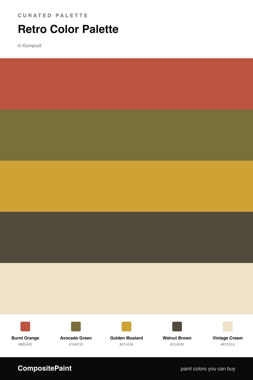
There is something about a sun-faded 1970s motel sign that still pulls at me — that confident Burnt Orange, the dusty Avocado Green, the wink of Golden Mustard. This scheme gathers all of it, but warms and softens the edges so it feels like a memory rather than a costume.
Walnut Brown does the grounding work here, the way real wood paneling once did, and a generous Vintage Cream keeps everything light and breathable. That cream is the trick — it gives the saturated colors somewhere to rest so they read as rich instead of loud.
For 2026 I would keep the orange as your one bold gesture, fold in the avocado and mustard as accents on a cabinet or a chair, and let cream cover the broad calm surfaces. Earthy, nostalgic, and surprisingly easy to live with.
Buy These Colors
Each color matched to the closest real paint in every brand, by ΔE2000. Kompozit first; take any SKU to the store — these mix on demand.
Questions
Use lots of the Vintage Cream and let the brights land in small, confident doses. A wall of Burnt Orange reads costume, but a single orange door or a mustard cabinet against soft cream feels collected and current.
Let Burnt Orange be your hero and Avocado Green play the steady supporting note, roughly a 60/40 lean. Mustard and walnut are seasoning, and cream is the breathing room that ties the whole thing together.
Similar Palettes
Closest schemes by color — not by label.