CP

Retro Color Palette — Retro Vinyl

A warm five-color scheme built on burnt orange, avocado green, and mustard, softened by cream and warm brown — every color matched to real paint you can buy.

By Emily Roberts · DIY Editor & First-Timer's Guide

Burnt Orange
Dominant
Kompozit Casa De Oro · 1026
#CF6837
LRV 23
Avocado Green
Secondary
Kompozit Green Glow · 0788
#798040
LRV 20
Golden Mustard
Accent
Kompozit Sin City · 0816
#CFA236
LRV 39
Toasted Walnut
Support
Kompozit Evolution · 0130
#704A3D
LRV 9
Soft Cream
Base
Kompozit Petticoat · 0010
#EFE5CE
LRV 79
View palette in

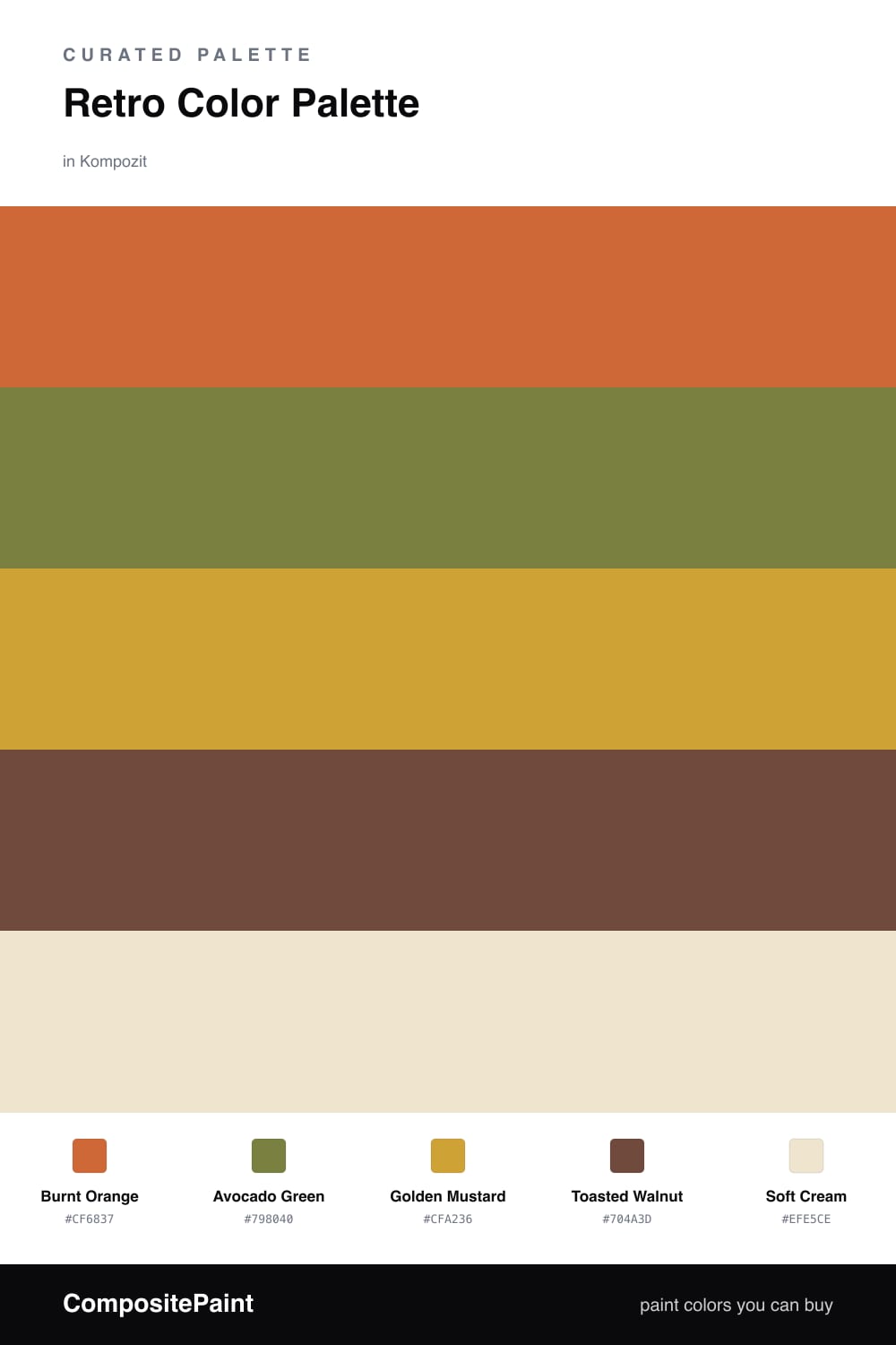
There is something cozy about 1970s color, and this scheme leans into it without going full disco. Burnt Orange does the heavy lifting as the dominant shade, that toasty, lived-in orange you remember from old kitchens, paired with a dusty Avocado Green that feels grown-up rather than loud.

Golden Mustard is your little spark of joy here, so use it in small doses on a door, a shelf, or a chair, where it can glow against the warmer tones. Toasted Walnut grounds everything like a good piece of wood furniture would, and Soft Cream keeps it all light and breathable so the room never feels heavy.

If you are nervous about committing, paint most of the space in Soft Cream first and add the bolder colors one at a time. That way you get the warm retro feeling on your own schedule, and every shade here maps to a real paint you can pick up and brush on this weekend.

Buy These Colors

Each color matched to the closest real paint in every brand, by ΔE2000. Kompozit first; take any SKU to the store — these mix on demand.

Burnt Orange
#C2632F · LRV 21 · Dominant
Kompozit Casa De Oro · 1026 ΔE 3.33
Backdrop Old Soul · BD-OS ΔE 26.04
Behr Chivalry Copper · 240D-6 ΔE 3.3
Benjamin Moore Fall Harvest · 2168-10 ΔE 2.3
Clare Fire Sign · PNT100-DP-74 ΔE 6.46
Dunn-Edwards Clay Pot · DE5174 ΔE 3.37
Farrow & Ball Charlotte's Locks · No. 268 ΔE 6.92
Magnolia Home Work Worn Wood · JG-35 ΔE 6.16
PPG / Glidden Sesame Crunch · 1198-7 ΔE 2.18
Sherwin-Williams Determined Orange · SW 6635 ΔE 2.06
Valspar Hot Wings · V046-5 ΔE 1.67
Avocado Green
#7B7A3C · LRV 18 · Secondary
Kompozit Green Glow · 0788 ΔE 3.06
Backdrop Old Soul · BD-OS ΔE 7.64
Behr Green Tea Leaf · M330-7 ΔE 2.42
Benjamin Moore Perfectly Pesto · CSP-895 ΔE 3.07
Clare Daily Greens · PNT100-DP-61 ΔE 11.27
Dunn-Edwards Tara's Drapes · DE5566 ΔE 3.57
Farrow & Ball Calke Green · No. 34 ΔE 11.77
Magnolia Home Celery Seeds · JG-58 ΔE 7.04
PPG / Glidden Lucky · 1118-7 ΔE 3.25
Sherwin-Williams Verdant · SW 6713 ΔE 3.29
Valspar Dried Bay Leaf · 8003-28F ΔE 2.9
Golden Mustard
#D6A23B · LRV 40 · Accent
Kompozit Sin City · 0816 ΔE 2.3
Backdrop Eames · BD-EA ΔE 10.78
Behr Plantain Chips · M290-6 ΔE 1.94
Benjamin Moore Golden Bounty · 294 ΔE 2.77
Clare Good as Gold · PNT100-DP-59 ΔE 8.34
Dunn-Edwards Fortune Cookie · DE5355 ΔE 1.07
Farrow & Ball India Yellow · No. 66 ΔE 5.37
Magnolia Home Bright Days · JG-45 ΔE 8.32
PPG / Glidden Curry Sauce · 1210-7 ΔE 1.35
Sherwin-Williams Glitzy Gold · SW 6691 ΔE 1.54
Valspar Ripe Pear · P091 ΔE 2.14
Toasted Walnut
#6B4A33 · LRV 8 · Support
Kompozit Evolution · 0130 ΔE 5.32
Backdrop It's a Date · BD-IT ΔE 4.75
Behr Outback Brown · BXC-65 ΔE 1.93
Benjamin Moore Forest Brown · 2105-10 ΔE 3.85
Clare Vintage · PNT100-DP-67 ΔE 12
Dunn-Edwards Chaps · DE6049 ΔE 5.79
Farrow & Ball Preference Red · No. 297 ΔE 13.91
Magnolia Home Mountain Currant · JG-171 ΔE 6.79
PPG / Glidden Bird House Brown · 1072-7 ΔE 4.48
Sherwin-Williams Sturdy Brown · SW 6097 ΔE 2.11
Valspar Cowboy Hat · 3010-8 ΔE 1.61
Soft Cream
#EFE4CE · LRV 78 · Base
Kompozit Petticoat · 0010 ΔE 0.72
Backdrop Don't Eat the Yellow Snow · BD-DS ΔE 2.13
Behr New Harvest Moon · BXC-83 ΔE 1.35
Benjamin Moore Wood Ash · 1065 ΔE 0.73
Clare Like Buttah · PNT100-LT-62 ΔE 1.66
Dunn-Edwards Marble Dust · DE6156 ΔE 1.59
Farrow & Ball Dimity · No. 2008 ΔE 2.42
Magnolia Home Carter Crème · JG-16 ΔE 2.05
PPG / Glidden Morocco Sand · 1096-2 ΔE 1.19
Sherwin-Williams Champagne · SW 6644 ΔE 2.07
Valspar Snow on the Pines · 8004-22A ΔE 1.8

Questions

Will these 1970s colors look dated in 2026?

Not if you keep one or two as the stars and let cream do most of the work. Burnt Orange on a single feature wall with Soft Cream everywhere else reads warm and current, not like a time capsule. The trick is restraint, not avoiding the colors.

Which color should I actually paint on the walls?

Start with Soft Cream as your main wall color since it is easy to live with. Then add Burnt Orange or Avocado Green on one wall or a built-in, and save Golden Mustard for small touches like a door or trim.

Similar Palettes

Closest schemes by color — not by label.