CP

Retro Color Palette — Ember Lounge

A warm five-color 1970s revival pairing burnt orange and avocado green with mustard, soft brown, and cream — every color matched to real paint you can buy.

By Jessica Williams · Color Stylist & Interior Editor

Burnt Ember
Dominant
Kompozit Pretty Parasol · 1039
#AC5D3E
LRV 17
Avocado Field
Secondary
Kompozit Green Glow · 0788
#798040
LRV 20
Soft Cream
Base
Kompozit Petticoat · 0010
#EFE5CE
LRV 79
Toasted Brown
Support
Kompozit Evolution · 0130
#704A3D
LRV 9
Golden Mustard
Accent
Kompozit Angel Food Cake · 0913
#D7A14F
LRV 41
View palette in

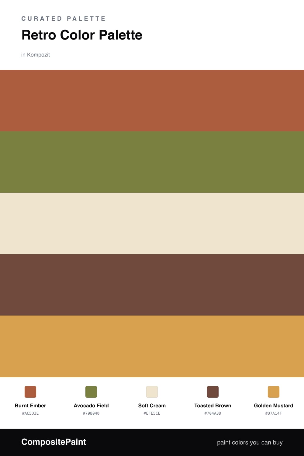
There is something deeply comforting about a 1970s palette done with a light hand. Burnt Ember leads here, a clay-warmed orange that glows in low afternoon light, while Avocado Field brings that unmistakable muted green back without tipping into nostalgia kitsch.

Soft Cream is the breathing room. Let it cover the largest surfaces so the warmer tones have somewhere to settle, and the whole scheme stays calm. Toasted Brown does the quiet structural work, grounding the ember and the green wherever they meet.

Save Golden Mustard for the smallest gestures — a single cabinet, a length of trim, a chair. Used sparingly, it sparks the room and pulls this retro mood into something that feels easy and current for 2026.

Buy These Colors

Each color matched to the closest real paint in every brand, by ΔE2000. Kompozit first; take any SKU to the store — these mix on demand.

Burnt Ember
#B5532A · LRV 16 · Dominant
Kompozit Pretty Parasol · 1039 ΔE 4.08
Backdrop Bahaus · BD-BH ΔE 13.71
Behr Thanksgiving · M210-7 ΔE 3.23
Benjamin Moore Pilgrimage Foliage · 2175-20 ΔE 2.52
Clare Sriracha · PNT100-DP-29 ΔE 11.3
Dunn-Edwards Red River · DE5125 ΔE 6.94
Farrow & Ball Blazer · No. 212 ΔE 10.31
Magnolia Home On Bosque · JG-36 ΔE 4.33
PPG / Glidden Orange Vermillion · 1194-7 ΔE 4.62
Sherwin-Williams Jalapeño · SW 6629 ΔE 5.11
Valspar Ripe Peach · P045 ΔE 3.91
Avocado Field
#7A7B3C · LRV 19 · Secondary
Kompozit Green Glow · 0788 ΔE 2.4
Backdrop Old Soul · BD-OS ΔE 7.81
Behr Green Tea Leaf · M330-7 ΔE 2.26
Benjamin Moore Perfectly Pesto · CSP-895 ΔE 3.52
Clare Daily Greens · PNT100-DP-61 ΔE 11.13
Dunn-Edwards Tara's Drapes · DE5566 ΔE 3.43
Farrow & Ball Calke Green · No. 34 ΔE 11.47
Magnolia Home Celery Seeds · JG-58 ΔE 6.86
PPG / Glidden Lucky · 1118-7 ΔE 2.69
Sherwin-Williams Verdant · SW 6713 ΔE 3.5
Valspar Dried Bay Leaf · 8003-28F ΔE 3.14
Soft Cream
#EFE6D2 · LRV 80 · Base
Kompozit Petticoat · 0010 ΔE 1.08
Backdrop Don't Eat the Yellow Snow · BD-DS ΔE 1.85
Behr Scroll · N280-1 ΔE 1.64
Benjamin Moore Cappuccino Froth · CSP-1055 ΔE 0.48
Clare Like Buttah · PNT100-LT-62 ΔE 1.48
Dunn-Edwards Rice Bowl · DE6170 ΔE 1.12
Farrow & Ball Dimity · No. 2008 ΔE 2.25
Magnolia Home Carter Crème · JG-16 ΔE 1.02
PPG / Glidden Instant Relief · 1096-1 ΔE 1.6
Sherwin-Williams Décor White · SW 7559 ΔE 1.74
Valspar Ivory Lace · 7003-6 ΔE 1.33
Toasted Brown
#6E4B33 · LRV 9 · Support
Kompozit Evolution · 0130 ΔE 5.25
Backdrop It's a Date · BD-IT ΔE 5.55
Behr Outback Brown · BXC-65 ΔE 2.09
Benjamin Moore Seed Brown · 2096-10 ΔE 2.02
Clare Vintage · PNT100-DP-67 ΔE 11.85
Dunn-Edwards Chaps · DE6049 ΔE 6.28
Farrow & Ball Preference Red · No. 297 ΔE 14.04
Magnolia Home Mountain Currant · JG-171 ΔE 7.12
PPG / Glidden Bird House Brown · 1072-7 ΔE 4.57
Sherwin-Williams Sturdy Brown · SW 6097 ΔE 2.31
Valspar Cowboy Hat · 3010-8 ΔE 1.51
Golden Mustard
#D2A24C · LRV 40 · Accent
Kompozit Angel Food Cake · 0913 ΔE 2.09
Backdrop Rosita · BD-RO ΔE 22.2
Behr Campground · 330D-5 ΔE 2.73
Benjamin Moore Buttercup · 2154-30 ΔE 1.15
Clare Good as Gold · PNT100-DP-59 ΔE 6.11
Dunn-Edwards Chipmunk · DE5376 ΔE 0.77
Farrow & Ball India Yellow · No. 66 ΔE 3.15
Magnolia Home Bright Days · JG-45 ΔE 7.05
PPG / Glidden Glorious Gold · 1107-6 ΔE 4.23
Sherwin-Williams Kingdom Gold · SW 6698 ΔE 3.75
Valspar Ripe Pear · P091 ΔE 2.36

Questions

Why do these retro colors still feel current?

They share a warm, earthy undertone, so even the bolder shades read as grounded rather than loud — that shared warmth is what keeps the seventies palette feeling collected instead of costume-y.

How do I keep the look from feeling too dated?

Lean on the cream as your largest field and use burnt orange and avocado in measured doses — a roughly 60/30/10 split lets the retro tones feel intentional and softly modern.

Similar Palettes

Closest schemes by color — not by label.