Retro Color Palette — Canyon Revival
A warm five-color 1970s revival scheme built on burnt orange, avocado green, mustard, and creamy brown — every color matched to real paint you can buy.
By Emily Roberts · DIY Editor & First-Timer's Guide
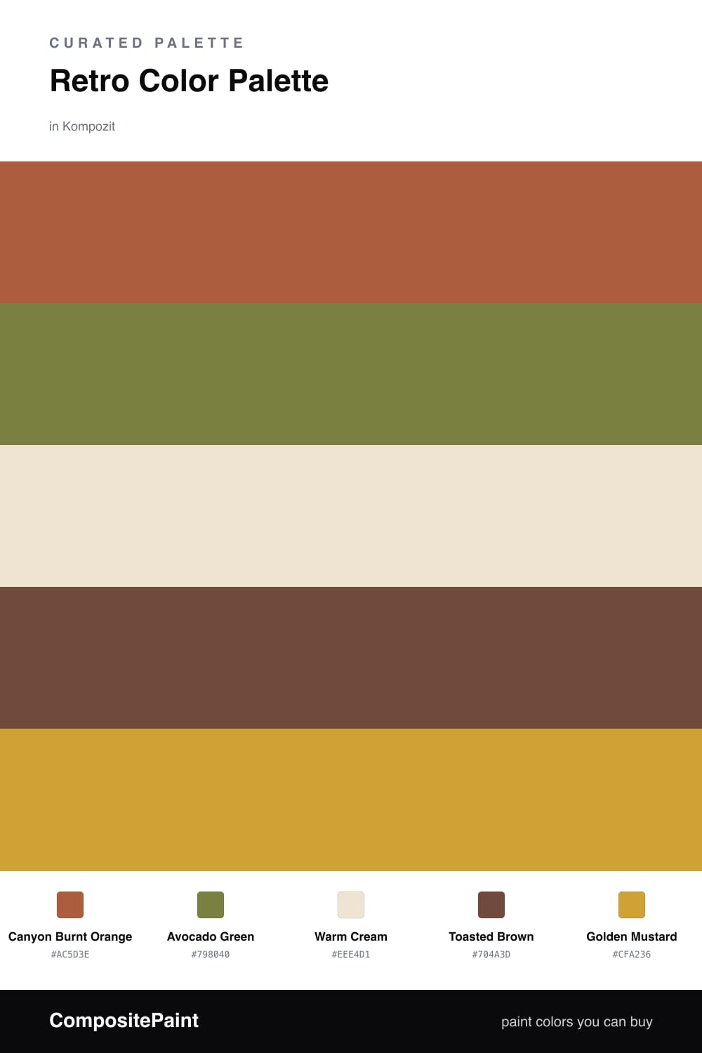
There is something so comforting about 1970s color, and this scheme leans right into it without feeling dated. Canyon Burnt Orange is the star here — warm, a little dusty, the kind of shade that makes a room feel lived-in the second you open the can.
From there, Avocado Green and Toasted Brown add that earthy, grounded layer the era is known for, while Warm Cream keeps everything light and breathable. Cream is your best friend in a palette like this — it gives your eyes a place to rest so the warm tones never feel heavy.
For 2026, the move is restraint. Use Golden Mustard in just a few small spots — a stool, a lampshade, a strip of trim — and let it pop against all that warmth. That little bit of contrast is what makes the whole thing feel fresh and intentional rather than retro for retro’s sake.
Buy These Colors
Each color matched to the closest real paint in every brand, by ΔE2000. Kompozit first; take any SKU to the store — these mix on demand.
Questions
The trick is balance. We keep one earthy warm tone leading and let cream do the heavy lifting, so the palette reads cozy and grounded instead of like a costume.
Let the burnt orange lead on roughly half the space, cream on a third, and save mustard for the smallest spark — a pillow, a door, or a single shelf.
Similar Palettes
Closest schemes by color — not by label.