CP

Retro Color Palette — Avocado Sunset

A warm five-color retro scheme built on burnt orange, avocado green, mustard, and cream — every color matched to real paint you can buy.

By Emily Roberts · DIY Editor & First-Timer's Guide

Burnt Orange
Dominant
Kompozit Pretty Parasol · 1039
#AC5D3E
LRV 17
Avocado Green
Secondary
Kompozit Green Glow · 0788
#798040
LRV 20
Golden Mustard
Accent
Kompozit Yellow Shout · 0935
#D19932
LRV 37
Toasted Walnut
Support
Kompozit Evolution · 0130
#704A3D
LRV 9
Soft Cream
Base
Kompozit Twill · 0014
#F0E8D3
LRV 81
View palette in

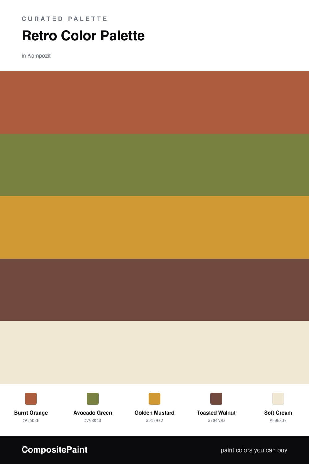
There is something genuinely cozy about a 1970s color scheme, and in 2026 it is having a real moment again. This palette pulls the best of that era together, anchored by a rich Burnt Orange that feels warm and grounded rather than loud.

Avocado Green brings in that unmistakable retro note, while Golden Mustard adds a little spark wherever you want the eye to land, think a lamp, a door, or a single chair. Toasted Walnut is the quiet bridge between everything, the wood-toned warmth that ties the brighter colors together.

To keep it feeling fresh and not like a costume, lean on Soft Cream as your base and let the bolder shades come in as accents. That balance is what makes this scheme read as warm and inviting today, with just enough of the seventies to make you smile.

Buy These Colors

Each color matched to the closest real paint in every brand, by ΔE2000. Kompozit first; take any SKU to the store — these mix on demand.

Burnt Orange
#B85C2E · LRV 18 · Dominant
Kompozit Pretty Parasol · 1039 ΔE 4.36
Backdrop Bahaus · BD-BH ΔE 16.5
Behr Jack O Lantern · M220-7 ΔE 2.88
Benjamin Moore Gold Rush · 2166-10 ΔE 3.65
Clare Sriracha · PNT100-DP-29 ΔE 12.03
Dunn-Edwards Georgia Clay · DE5181 ΔE 4.82
Farrow & Ball Blazer · No. 212 ΔE 12.12
Magnolia Home Work Worn Wood · JG-35 ΔE 6.33
PPG / Glidden Tabasco · 1192-7 ΔE 4.7
Sherwin-Williams Husky Orange · SW 6636 ΔE 3.4
Valspar Storybook Sundown · V010-3 ΔE 3.59
Avocado Green
#7A7A3C · LRV 18 · Secondary
Kompozit Green Glow · 0788 ΔE 2.84
Backdrop Old Soul · BD-OS ΔE 7.66
Behr Green Tea Leaf · M330-7 ΔE 2.34
Benjamin Moore Perfectly Pesto · CSP-895 ΔE 3.37
Clare Daily Greens · PNT100-DP-61 ΔE 11.1
Dunn-Edwards Tara's Drapes · DE5566 ΔE 3.38
Farrow & Ball Calke Green · No. 34 ΔE 11.61
Magnolia Home Celery Seeds · JG-58 ΔE 6.88
PPG / Glidden Lucky · 1118-7 ΔE 2.95
Sherwin-Williams Verdant · SW 6713 ΔE 3.54
Valspar Farm Fresh · V058-6 ΔE 3.91
Golden Mustard
#C99A3A · LRV 36 · Accent
Kompozit Yellow Shout · 0935 ΔE 2.37
Backdrop Carry the Two · BD-CT ΔE 17.61
Behr Glazed Pears · M270-6 ΔE 3.06
Benjamin Moore Fields of Gold · 203 ΔE 0.99
Clare Good as Gold · PNT100-DP-59 ΔE 7.24
Dunn-Edwards Roman Gold · DE5356 ΔE 2.11
Farrow & Ball India Yellow · No. 66 ΔE 4.58
Magnolia Home Bright Days · JG-45 ΔE 9.11
PPG / Glidden Golden Field · 1107-7 ΔE 2.9
Sherwin-Williams Crispy Gold · SW 6699 ΔE 1.55
Valspar Golden Avocado · 3008-5A ΔE 1.74
Toasted Walnut
#6B4A33 · LRV 8 · Support
Kompozit Evolution · 0130 ΔE 5.32
Backdrop It's a Date · BD-IT ΔE 4.75
Behr Outback Brown · BXC-65 ΔE 1.93
Benjamin Moore Forest Brown · 2105-10 ΔE 3.85
Clare Vintage · PNT100-DP-67 ΔE 12
Dunn-Edwards Chaps · DE6049 ΔE 5.79
Farrow & Ball Preference Red · No. 297 ΔE 13.91
Magnolia Home Mountain Currant · JG-171 ΔE 6.79
PPG / Glidden Bird House Brown · 1072-7 ΔE 4.48
Sherwin-Williams Sturdy Brown · SW 6097 ΔE 2.11
Valspar Cowboy Hat · 3010-8 ΔE 1.61
Soft Cream
#F0E6D2 · LRV 80 · Base
Kompozit Twill · 0014 ΔE 1.2
Backdrop Don't Eat the Yellow Snow · BD-DS ΔE 2.14
Behr Scroll · N280-1 ΔE 1.18
Benjamin Moore Cappuccino Froth · CSP-1055 ΔE 0
Clare Like Buttah · PNT100-LT-62 ΔE 1.09
Dunn-Edwards Rice Bowl · DE6170 ΔE 0.84
Farrow & Ball Dimity · No. 2008 ΔE 1.96
Magnolia Home Carter Crème · JG-16 ΔE 1.38
PPG / Glidden Instant Relief · 1096-1 ΔE 2.07
Sherwin-Williams Décor White · SW 7559 ΔE 1.32
Valspar Ivory Lace · 7003-6 ΔE 0.87

Questions

Will these 1970s colors feel dated in my home?

Not if you let cream do the heavy lifting. Paint most of the room in Soft Cream and use Burnt Orange and Avocado Green in smaller doses, like one accent wall or the trim. That keeps the retro mood playful and warm instead of looking like an old photograph.

How do I keep burnt orange and avocado green from clashing?

Keep them apart and give each some breathing room. Let Burnt Orange lead, treat Avocado Green as the supporting player, and use the cream and walnut tones in between so the two stronger colors never sit edge to edge.

Similar Palettes

Closest schemes by color — not by label.